SerumGetir Corporate Identity
Logo and corporate identity built from scratch for home healthcare brand SerumGetir — from sketches and eight presented directions to a logo whose t becomes a cross, and a 36-page brand guide.
Brief
SerumGetir is a home healthcare brand: wound care, dressing, stitches, injections, IV drips, home patient care and laboratory tests. One phone call and a healthcare team comes to your door. The logo, the colour system and every application were built from scratch.
The name already carried the promise. In Turkish, serum (an IV drip) is the service and getir (“bring”) is the movement. The identity’s job was to turn those two words into a single mark that feels trustworthy and is easy to remember.
Process
01 · Sketch
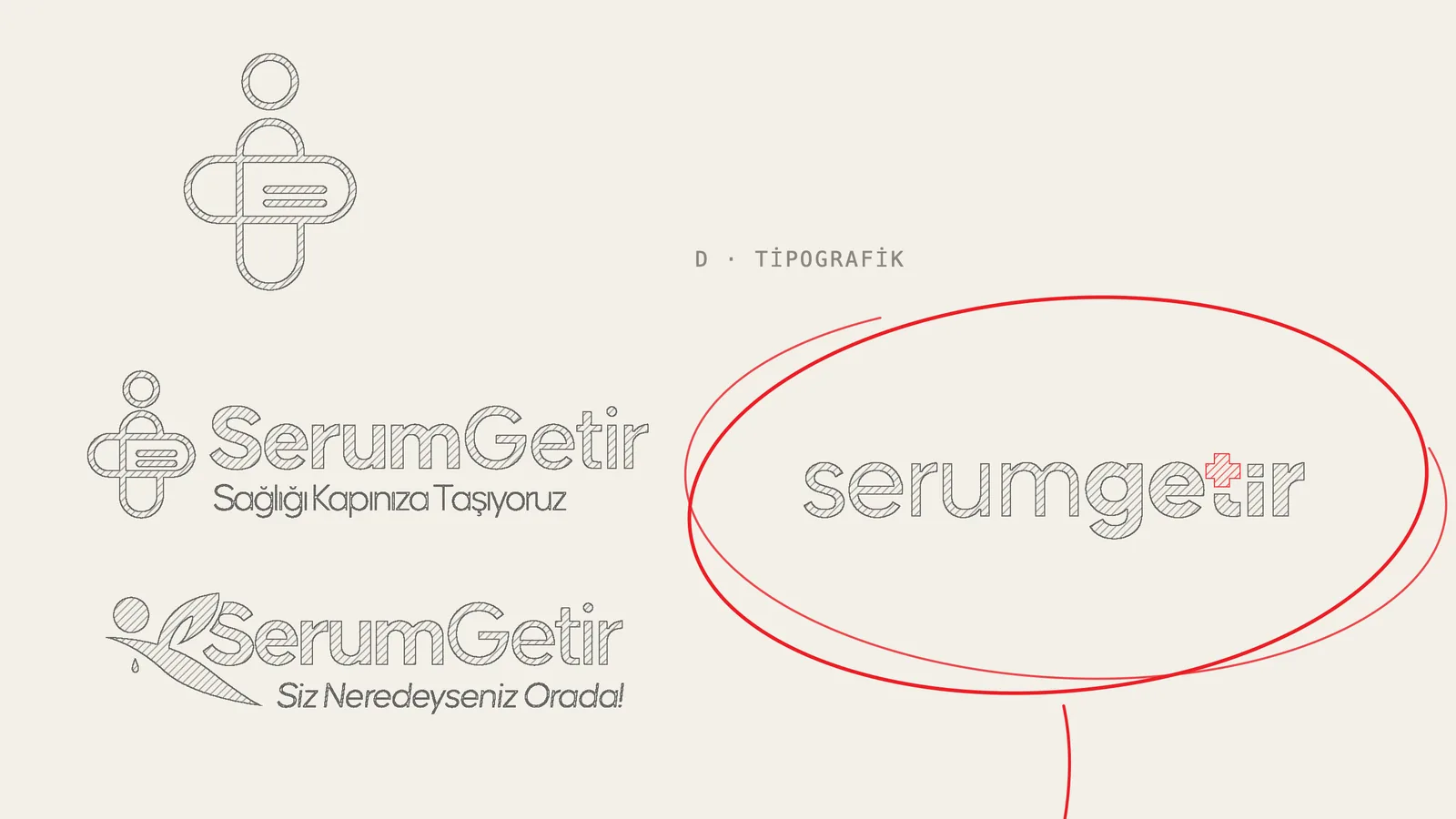
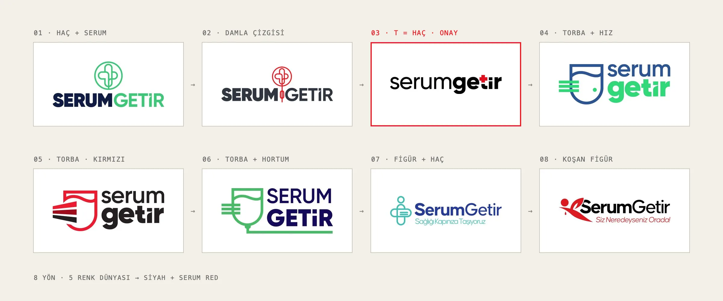
I drew eleven variations across four idea families:
- Cross + IV emblem: Round emblems with an IV line running through a cross.
- IV bag + speed: An IV bag in the shape of a shield, with speed lines for “bring”.
- Figure: A human figure merged with a cross, and a running figure.
- Typographic: No separate emblem; the symbol is the letter itself.
02 · Presentation
I presented eight directions, each with its own colour world and a short rationale. The options ranged across green and navy, blue and turquoise, charcoal and red, and black and red. The client chose the simplest one, 03.
03 · Chosen direction
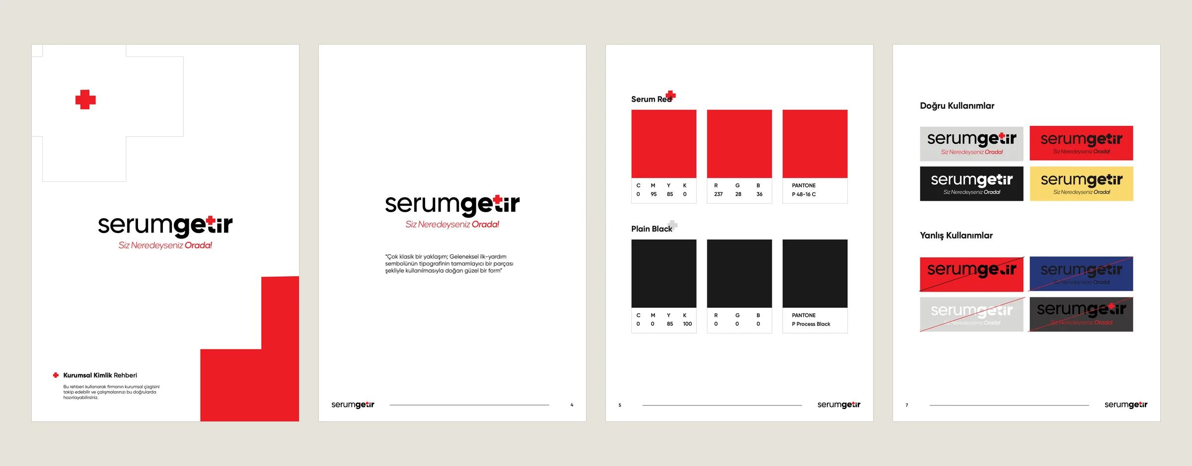
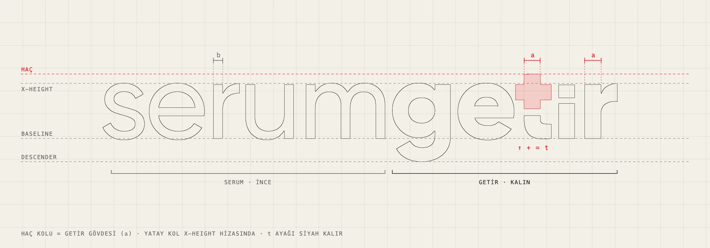
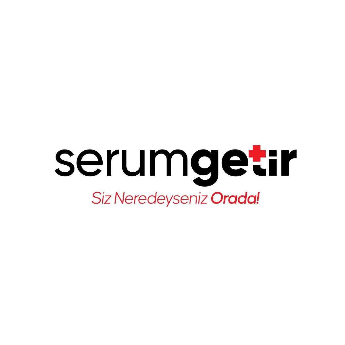
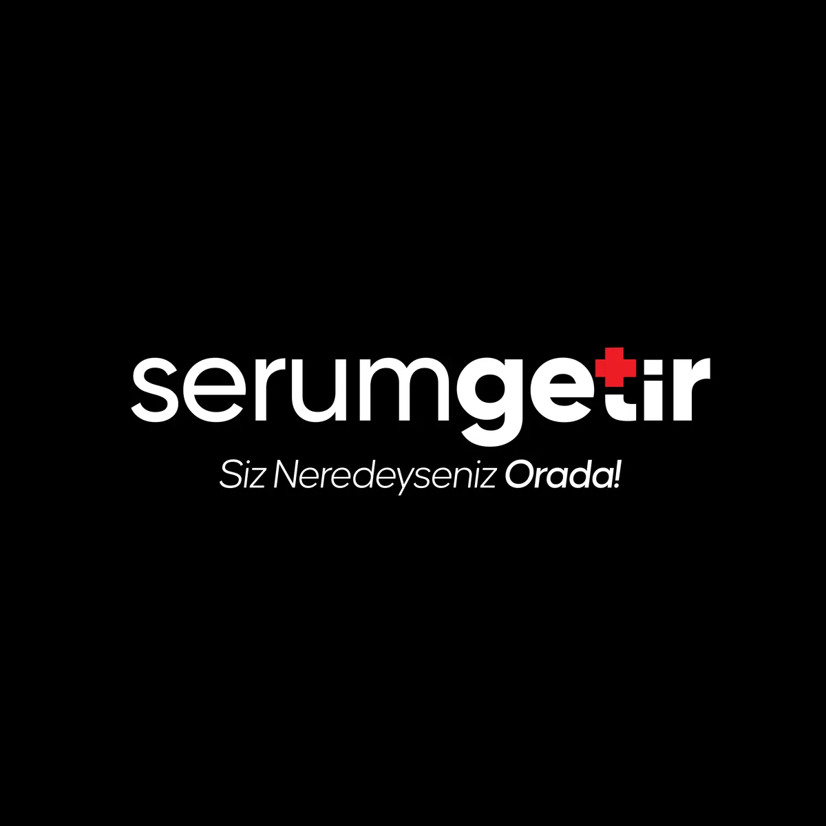
The logo has no separate emblem; the symbol lives inside the lettering. The top of the t in “getir” becomes a red cross. The rationale in the brand guide: “A very classic approach; a form born from using the traditional first-aid symbol as a complementary part of the typography.”
Construction
- Cross = t: The cross’s vertical arm continues the stem of the t, and its crossbar sits on the x-height. The cross is not added on top of the letter; it becomes the letter. The foot of the t stays black, so the letter still reads.
- Two weights: “serum” is set light and “getir” bold. The cross arm has exactly the stem weight of “getir”, so the emphasis falls on the word for the action.
- Lowercase: The warmth of a service that comes to your door, instead of the formality of an institutional healthcare brand.
- Colour and type: Only two colours: Serum Red and black. The corporate typeface is Gilroy. The slogan is Siz Neredeyseniz Orada! (“Wherever you are, we’re there!”).
Applications
The 36-page brand guide covers:
- logo and colour rules, correct and incorrect uses, placement over photography
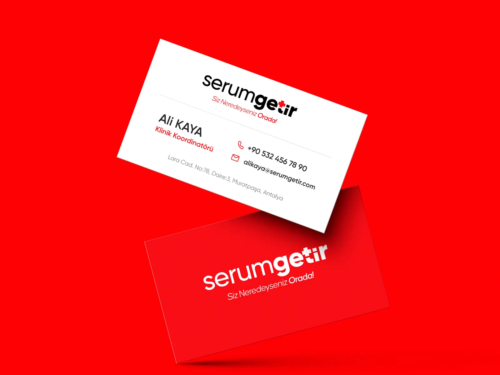
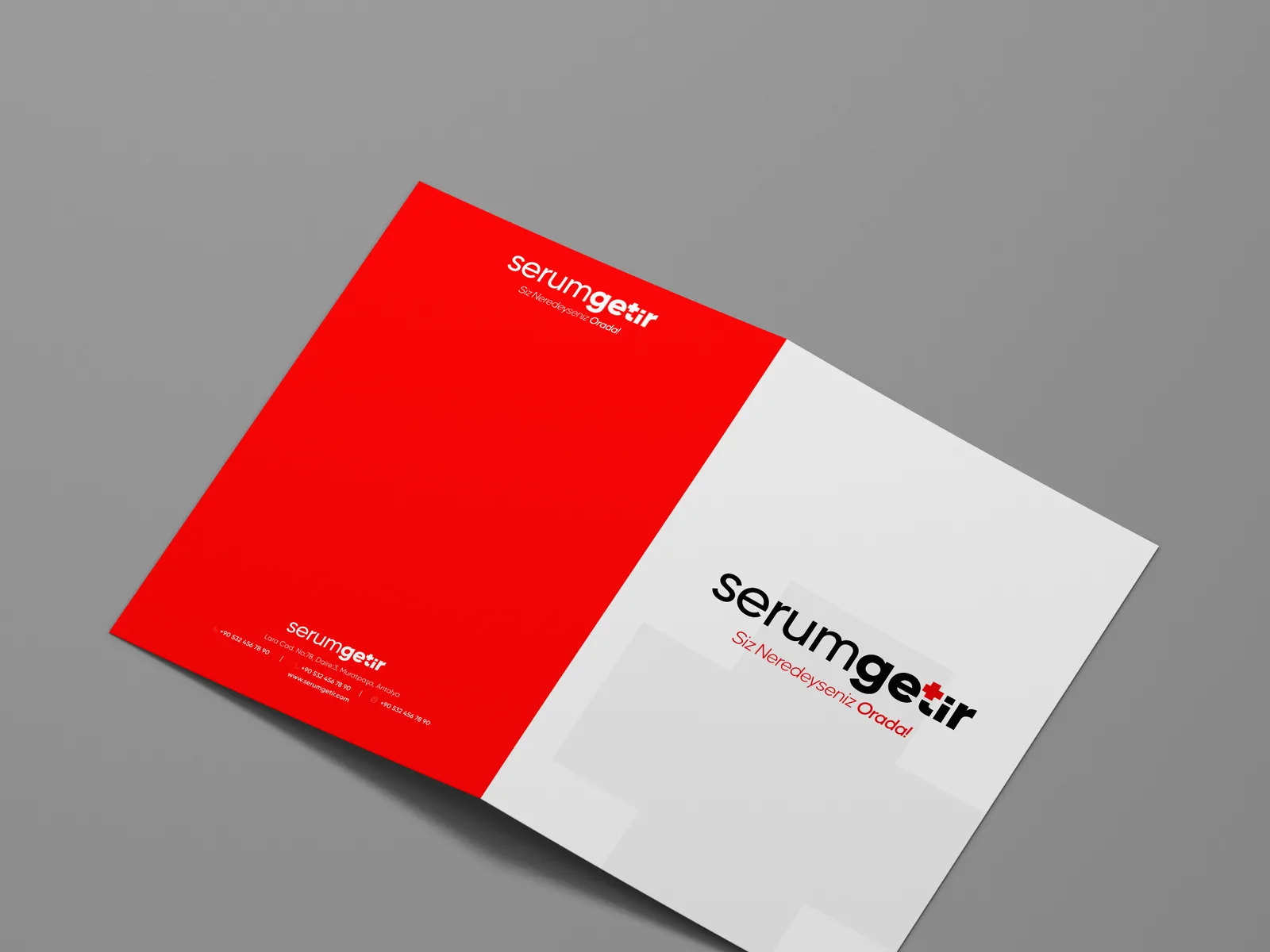
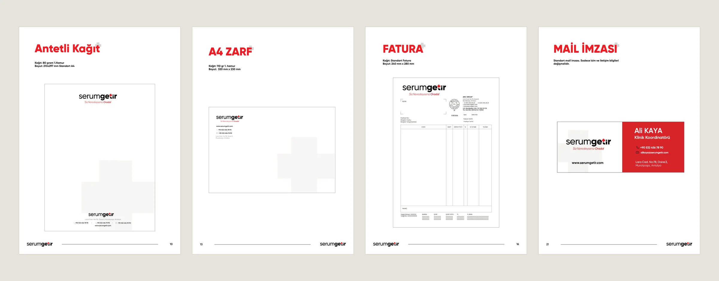
- stationery: business card, letterhead, A5 / A4 / A3 and DL envelopes, invoice, presentation folder, service card, email signature
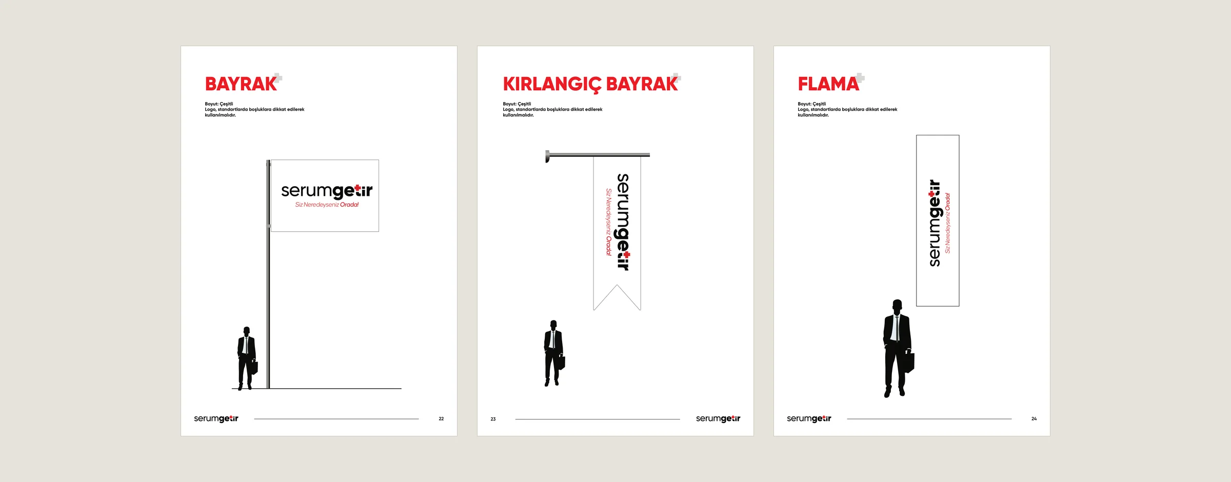
- on site: flag, swallowtail flag, vertical banner, watermark
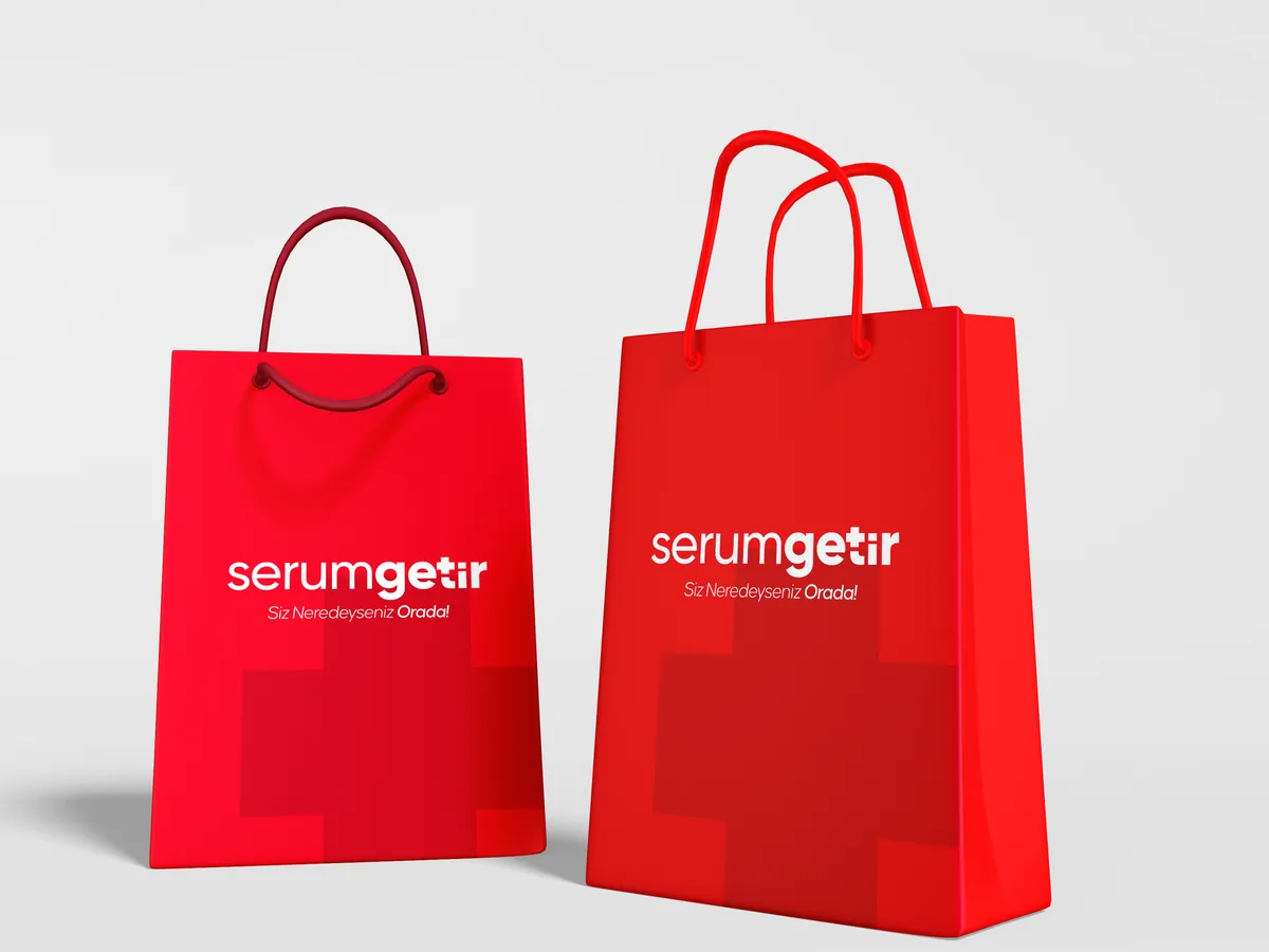
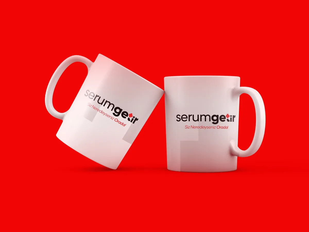
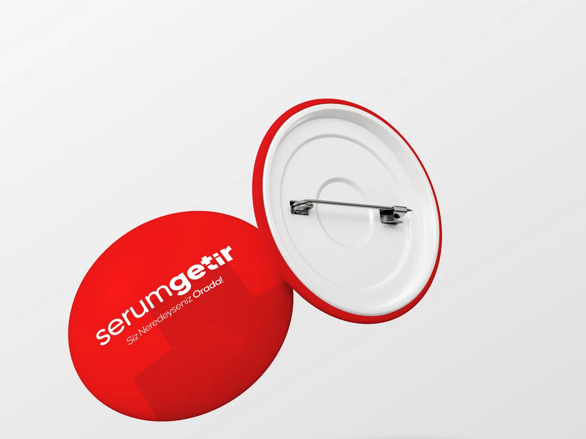
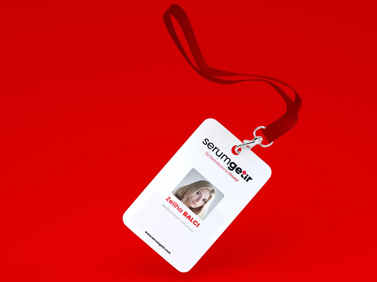
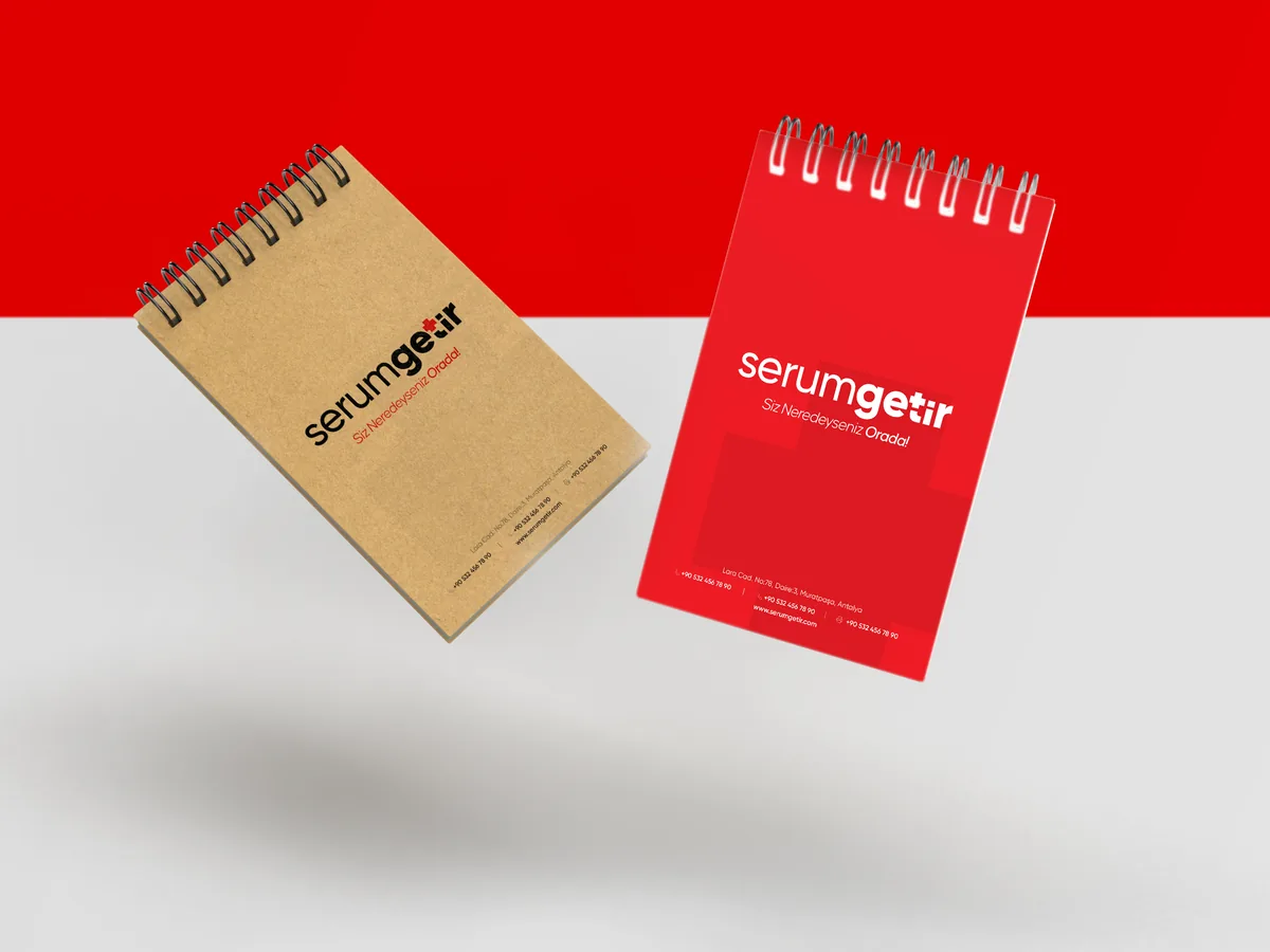
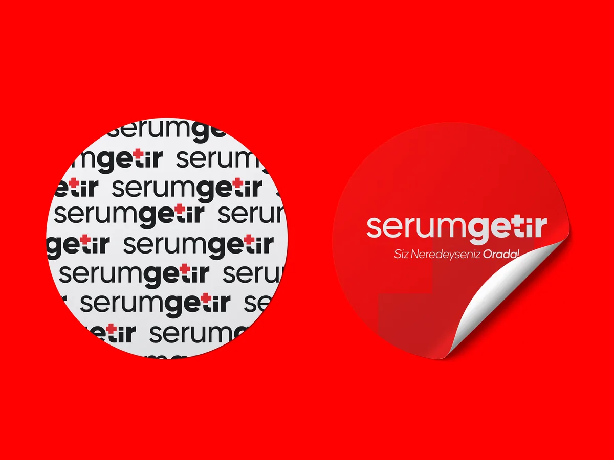
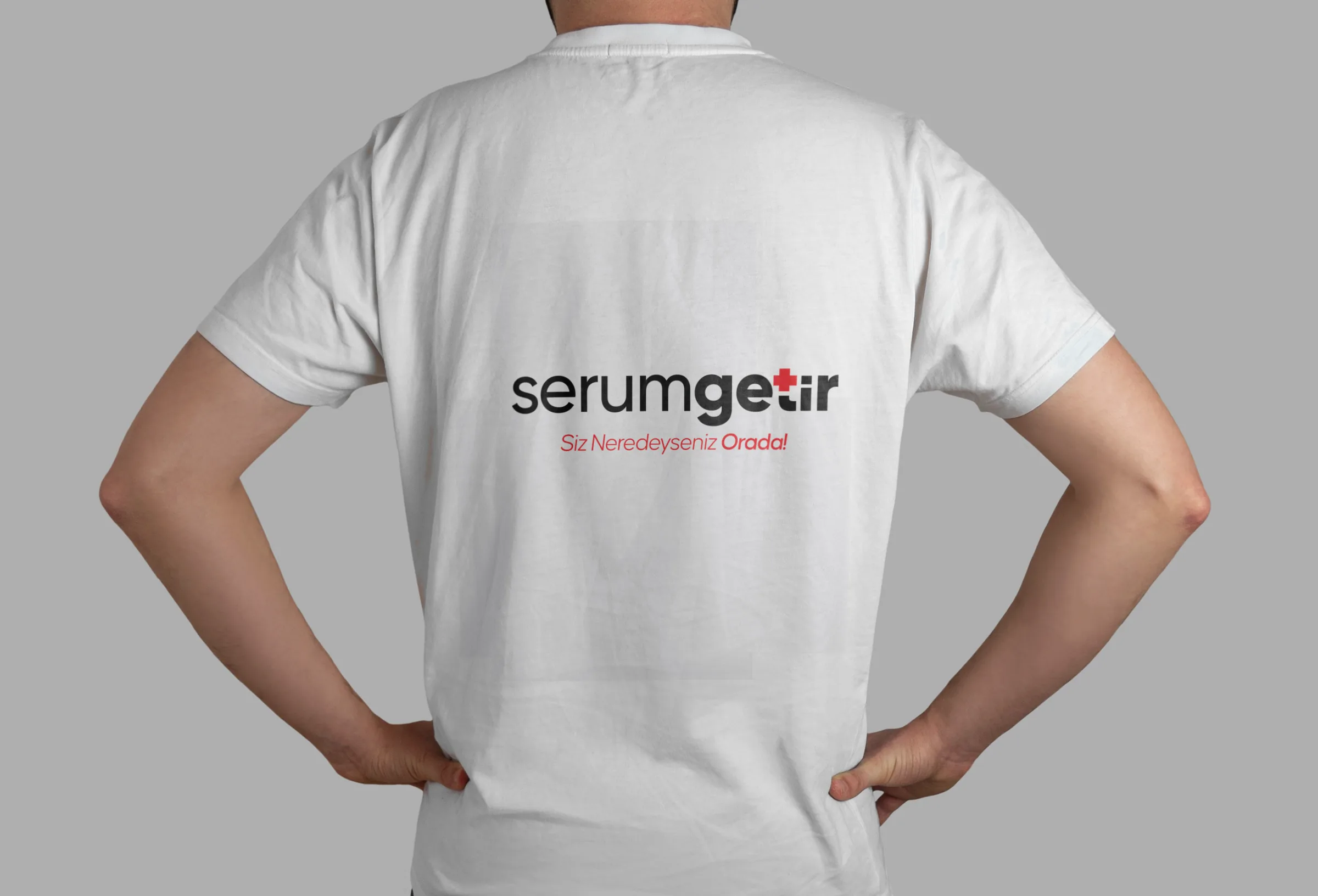
- promotional items: notepad, bag, mug, pin badge, sticker, T-shirt, ID card
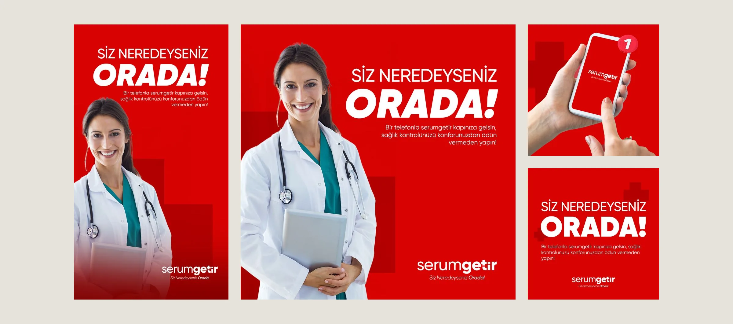
- social media: post and story templates
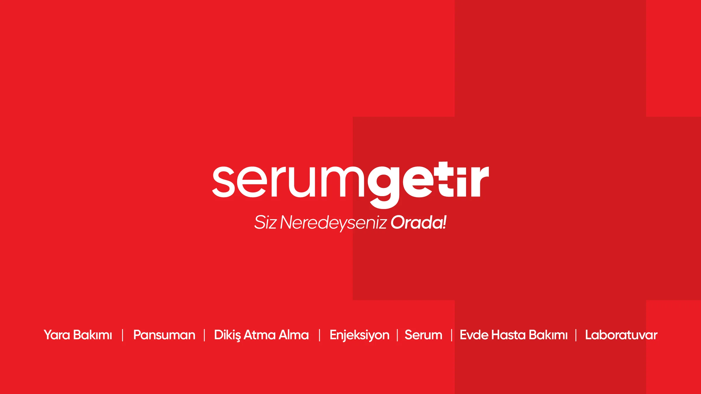
A large, faint cross motif repeats across the stationery. Highlights are shown below.
I ran the project freelance, from the logo to the brand guide.
Applications
19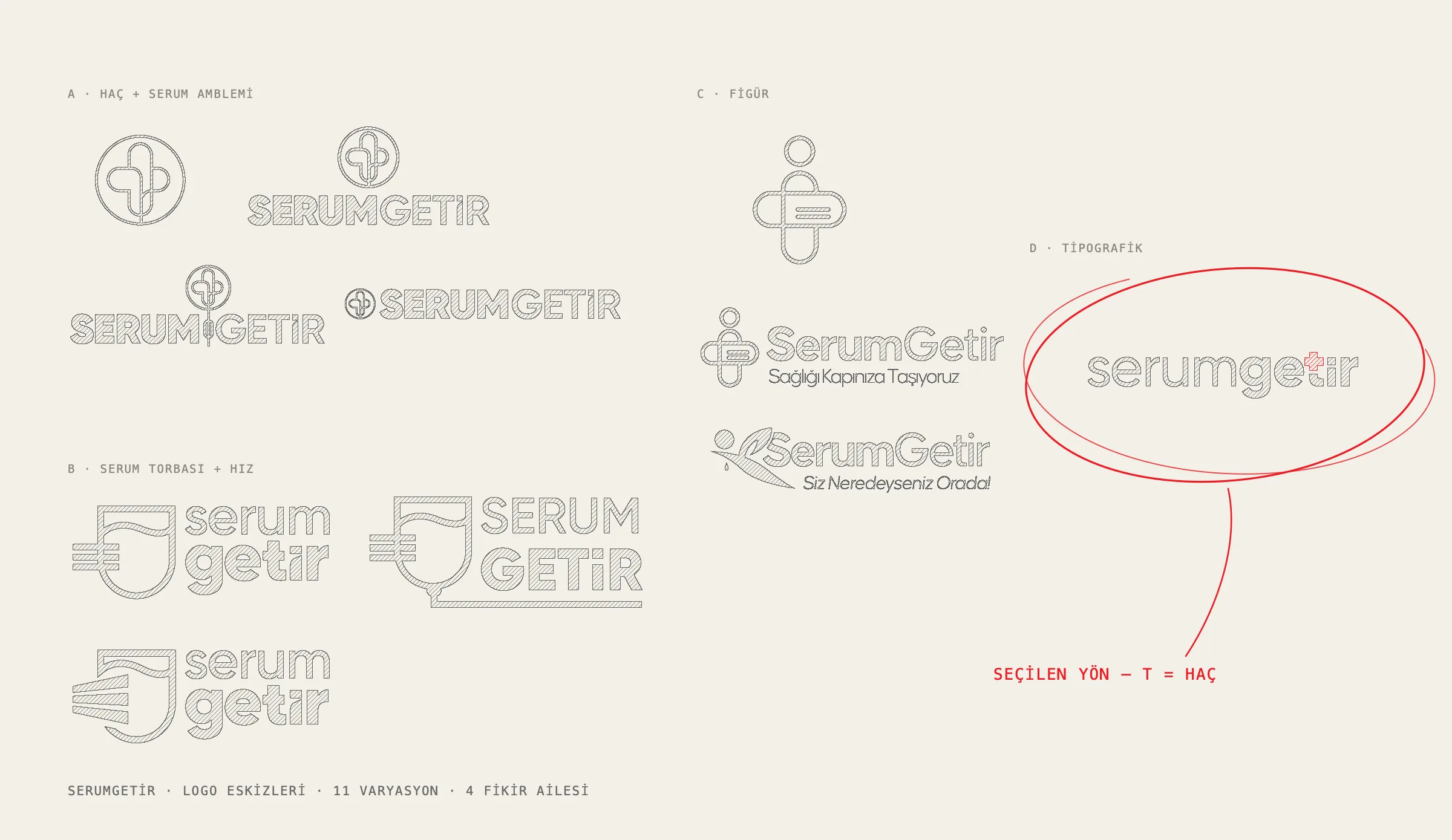
Colour palette
- Serum Red#ED1C24 · 48-16 C
- Plain Black#000000 · Process Black