Özel Tarım Corporate Identity
Corporate identity for Özel Tarım, a seed potato company — an Ö–T monogram logo, a colour system and applications that run from the field to the office.

Brief
Özel Tarım is an agricultural company focused on selected seed potatoes. The brief was an identity that speaks for both its field experience and its R&D approach, and reads with the same clarity everywhere — from a sack in the field to the company van and social media.
Approach
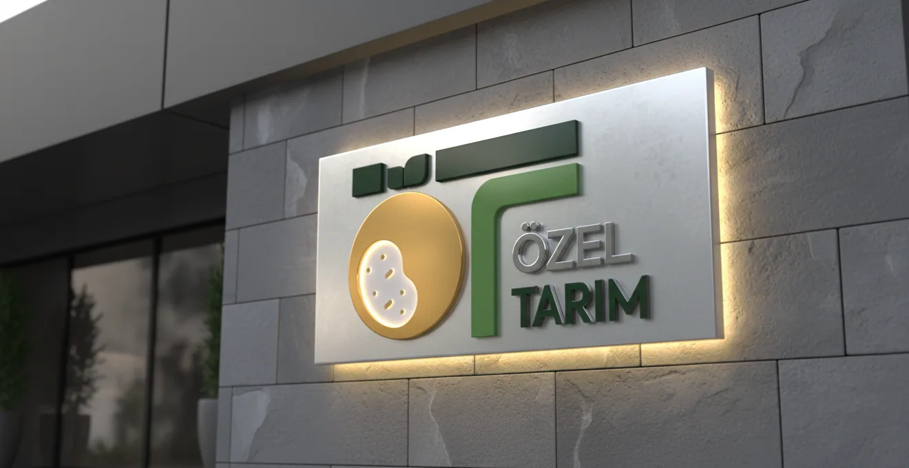
The logo is built on making the value beneath the soil visible: the golden seed potato.
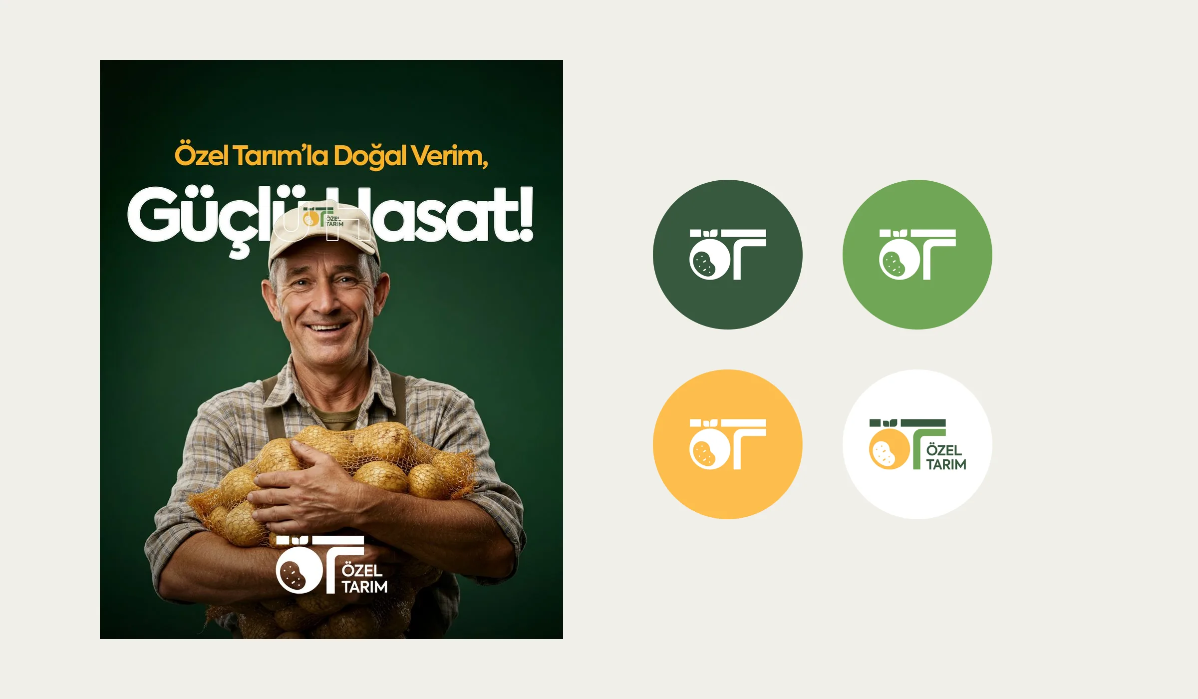
- Circle and seed: the round form on the left stands for the sun and abundance; the white seed inside marks the core of the company’s expertise.
- Ö–T monogram: the curve and corner on the right carry a sprout up to the surface while joining the two letters into one signature. The angular T speaks of trust and discipline, the soft Ö of approachability.
- Colour: Golden Potato Yellow refers to sun, energy and a “gold standard”; Grass Green and Green Soil to earth, vitality and sustainability.
- Typography: Axiforma, to carry the logo’s geometric balance into text; Black and Semibold for headlines, Regular for body copy.
The result is a clear geometry that brings nature’s organic flow together with engineering precision, and reads easily at any scale.
Applications
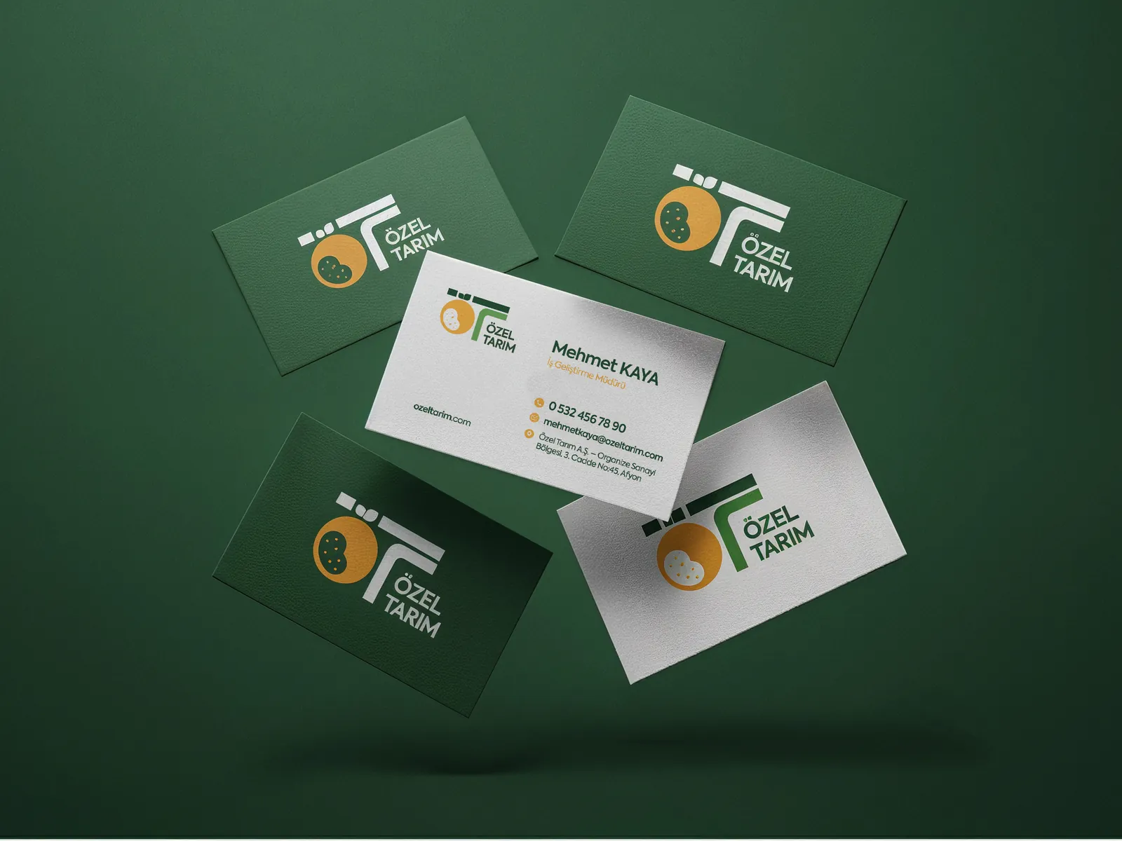
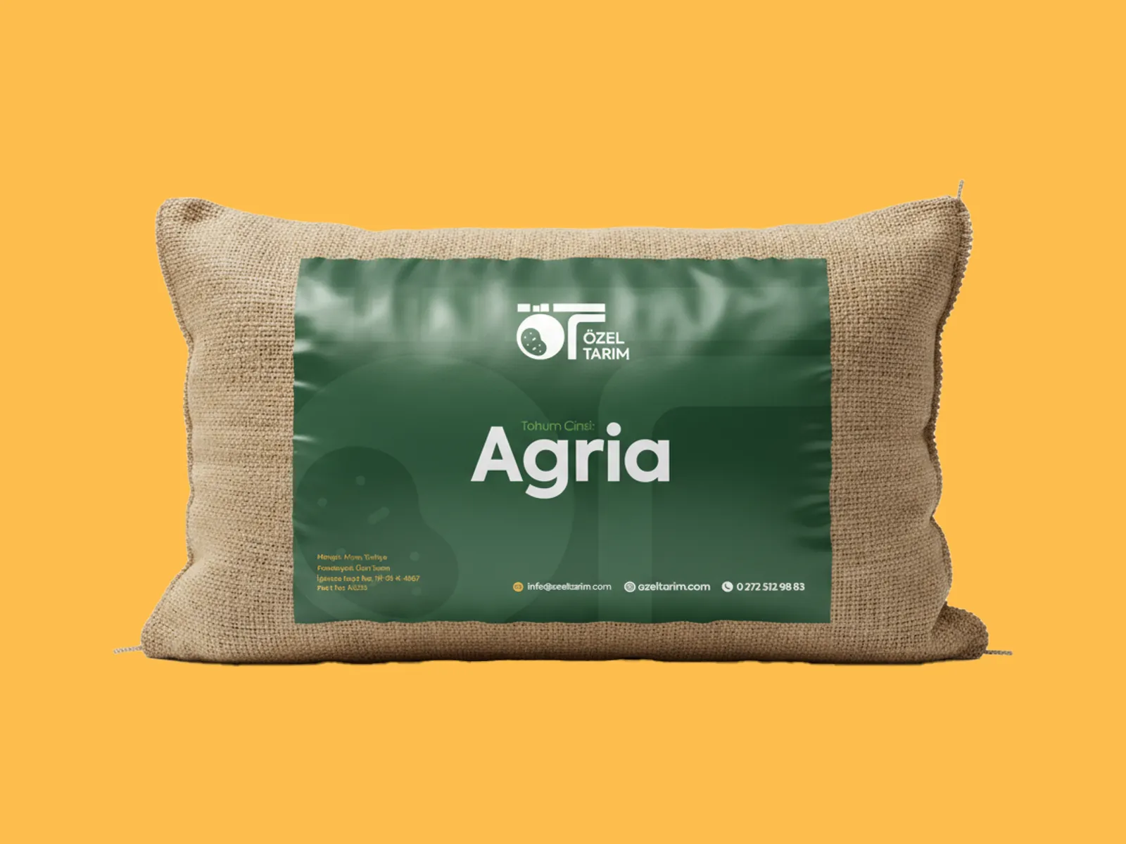
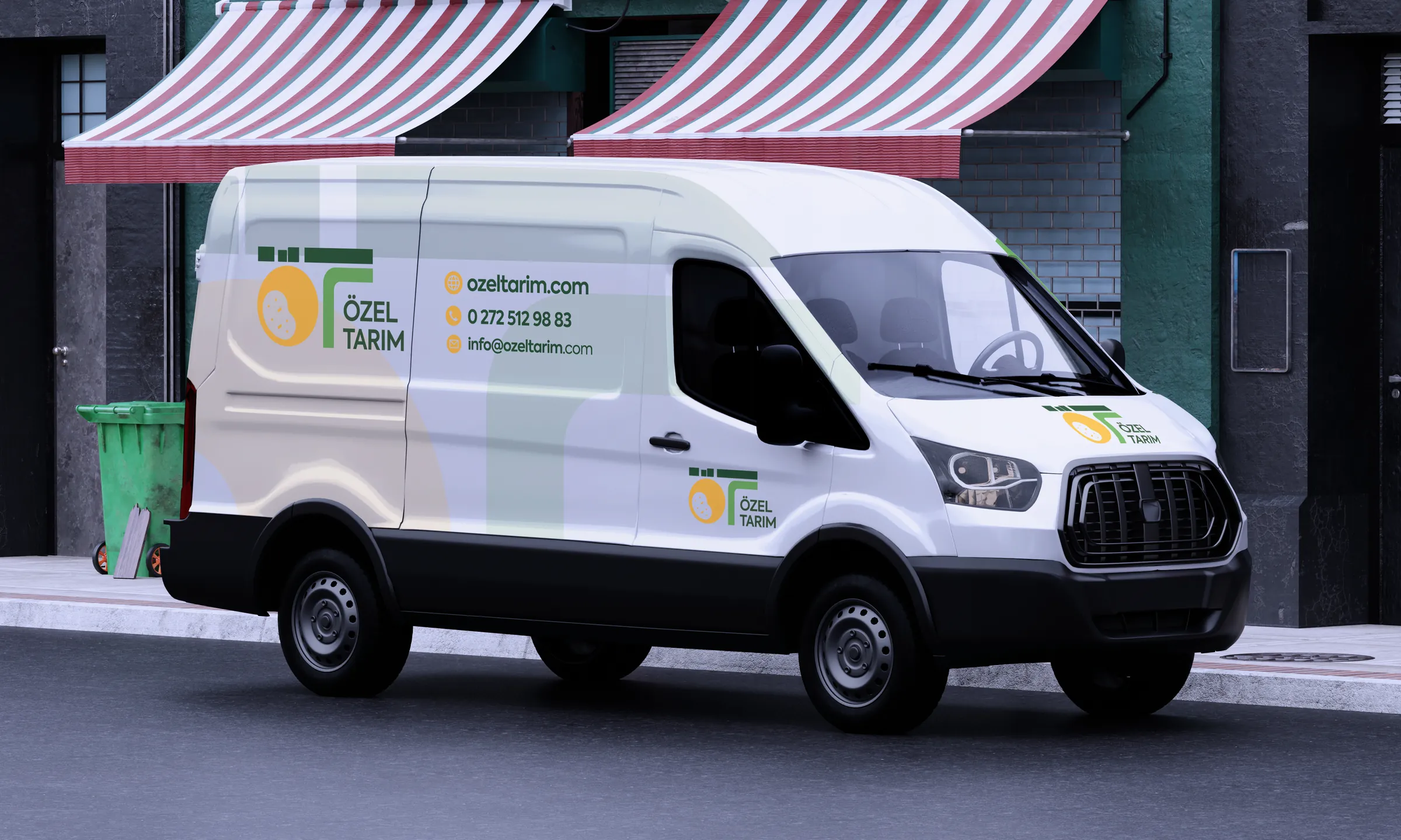
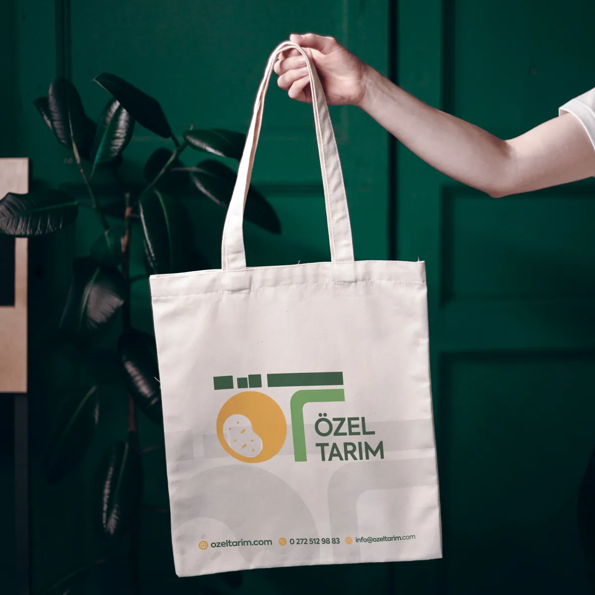
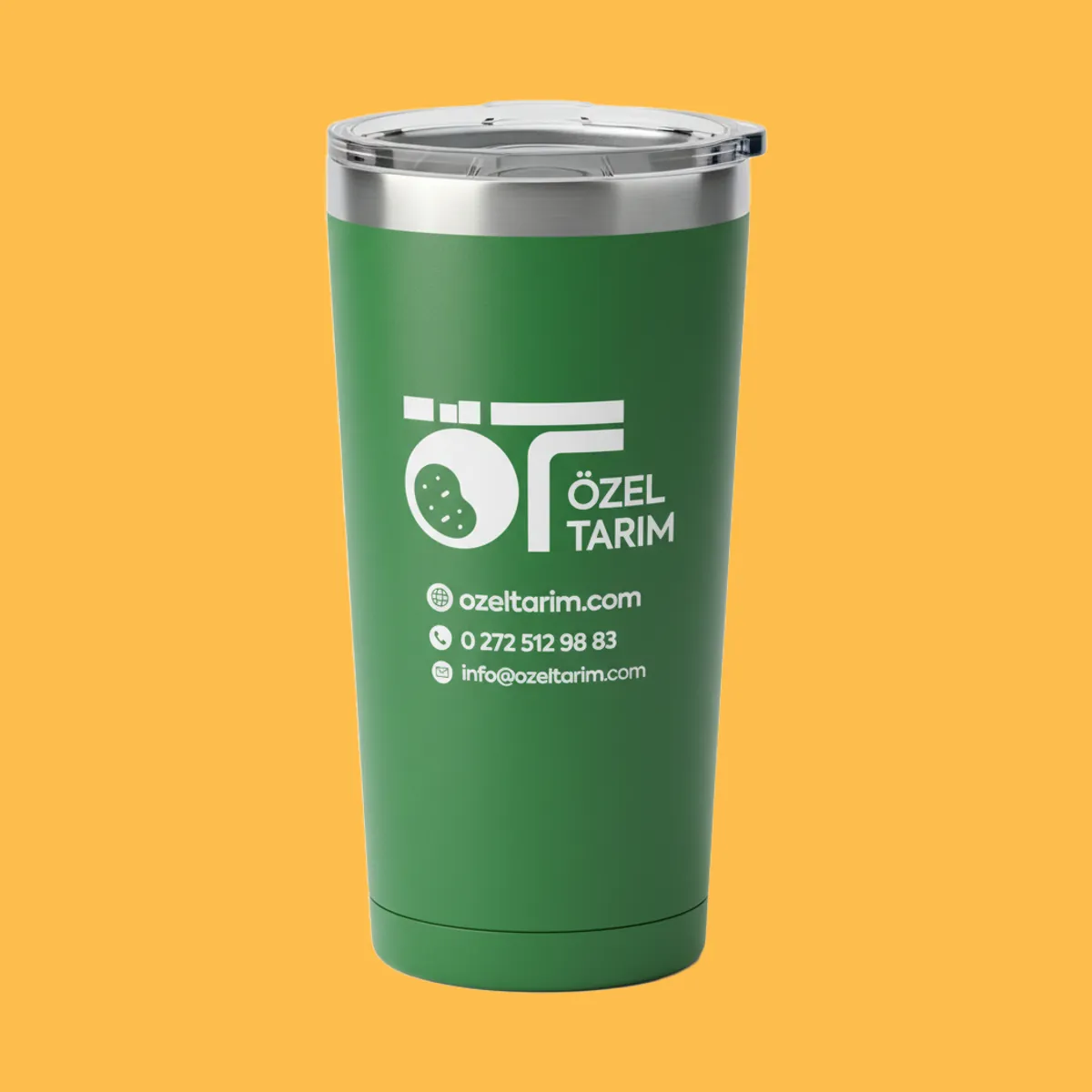
The guidelines define logo use, clear space and use on different grounds, and cover more than 20 applications — from stationery, lanyards, staff wear and merchandise to sack labels, vehicle livery, e-mail signatures and social media. The highlights are below.
I led the project as art director and graphic designer at Salus Medya.
Applications
11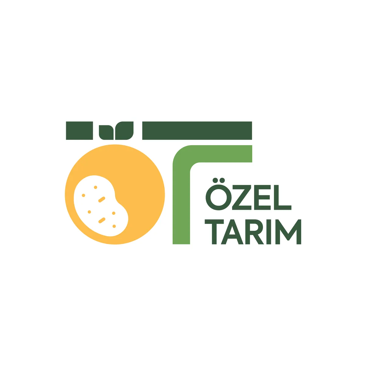

Colour palette
- Golden Potato Yellow#FDBD4C · Pantone 136 C
- Grass Green#6FA756 · Pantone 368 C
- Green Soil#38593E