RentWeCar Corporate Identity
Corporate identity for car rental brand RentWeCar — the logo process from sketch to final, the WE emblem, an orange and navy colour system and identity applications.
Brief
RentWeCar is a car rental brand. The brief was an identity that turns renting a car from a cold, individual transaction into a partnership built on mutual trust. The brand’s line: “we” are at the centre of the journey.
Process
The logo came out of a wide search, not a single idea.
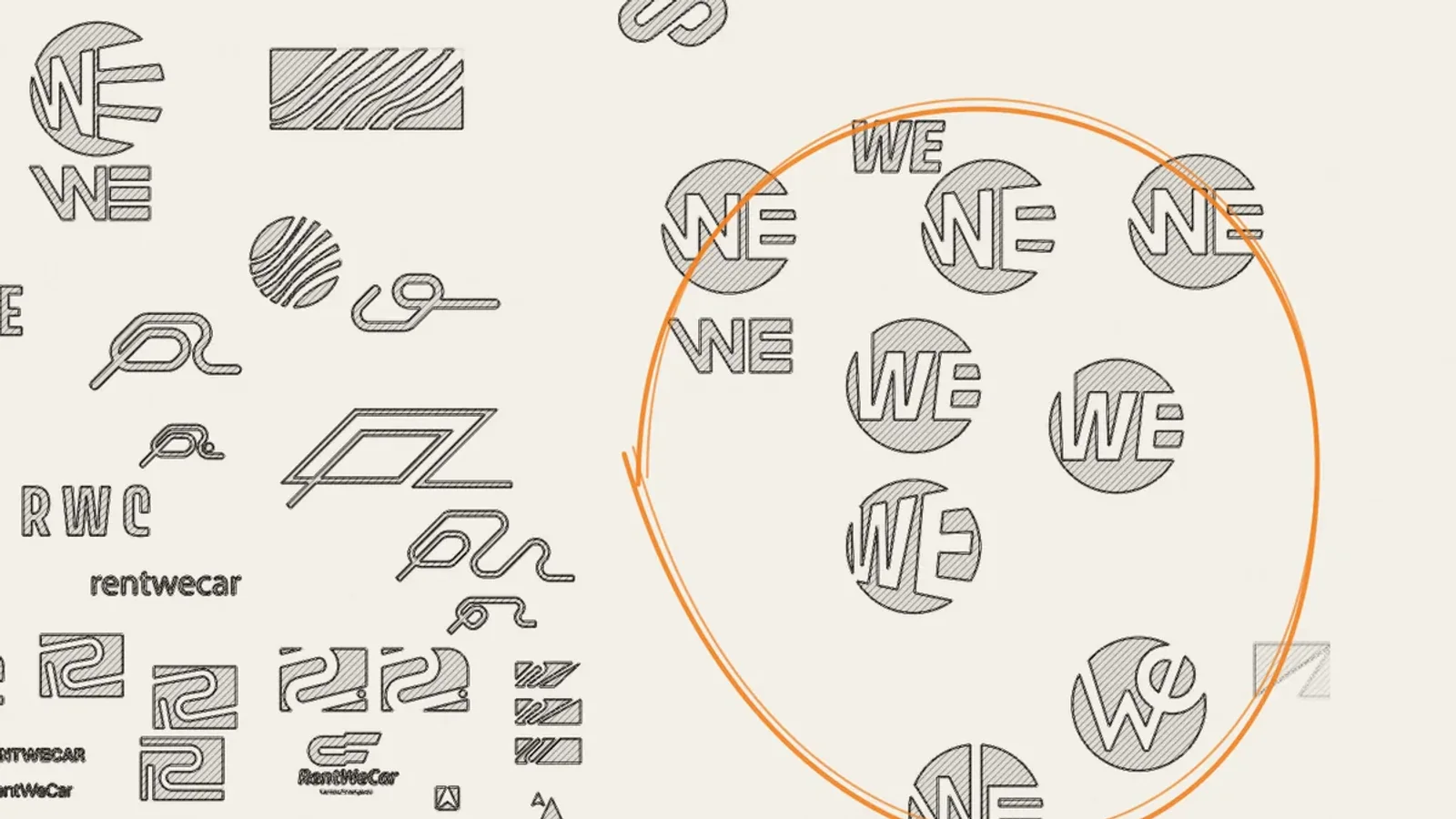
- Sketches: more than 60 variations, from road, speed and key ideas to R monograms, wave lines and W marks.
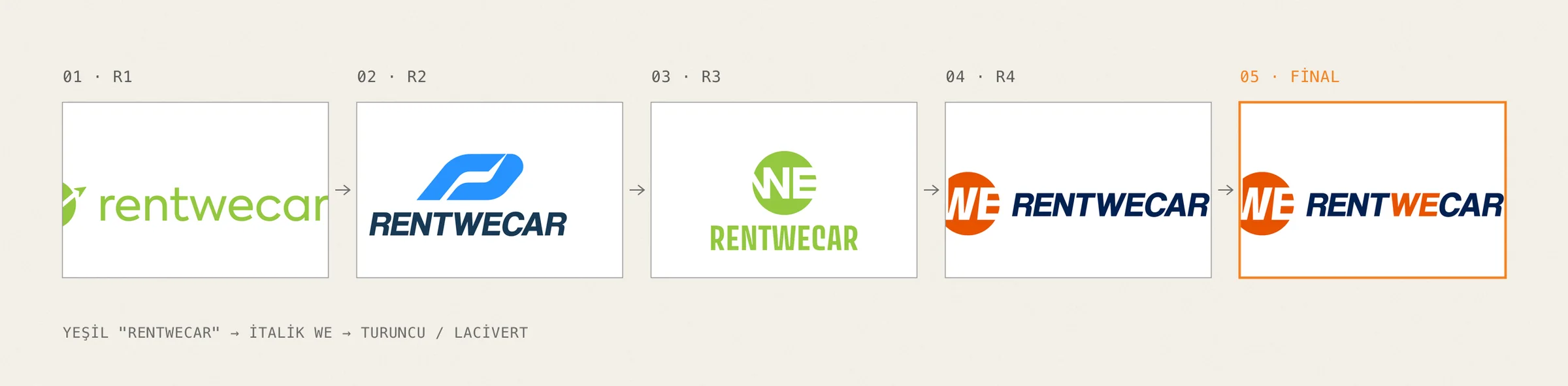
- Presentation rounds: first green, lowercase “rentwecar” directions, then R and WE monograms. Each round dropped one direction and strengthened another.
- Chosen direction: WE, already sitting in the middle of the brand name, moved to the centre of both the emblem and the story. The colour shifted from green to orange and navy.
Construction
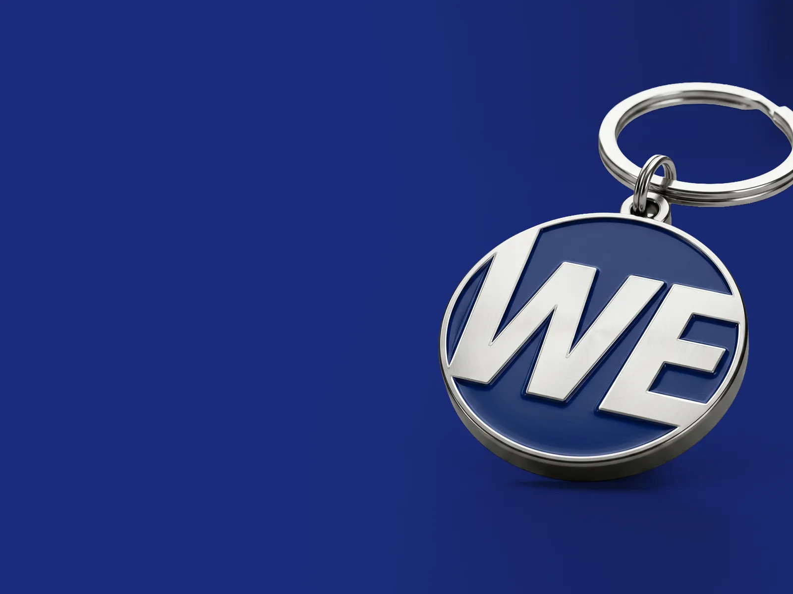
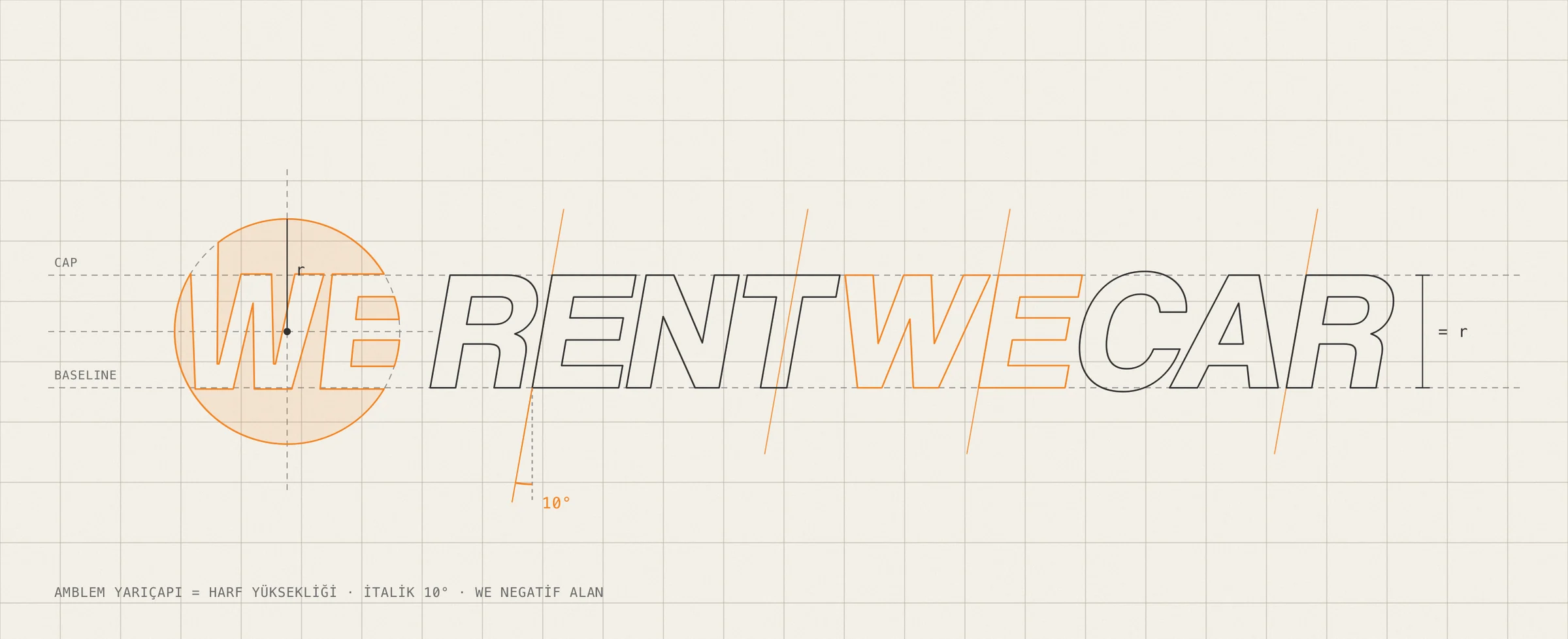
- Emblem: the orange circle stands for the wheel, an uninterrupted journey, and for wholeness. The WE cut out of it in negative space shows the togetherness at the heart of the brand.
- Proportion: the emblem’s radius is exactly the cap height of the lettering, so circle and type come from the same module.
- Italic: bold letters slanted 10° to the right reject standing still and speak of forward motion. The orange WE, bridging RENT and CAR, says the real link between service and car is people.
- Colour and type: orange for energy and warmth, navy for trust and stability. The corporate typeface is Coolvetica.
Applications
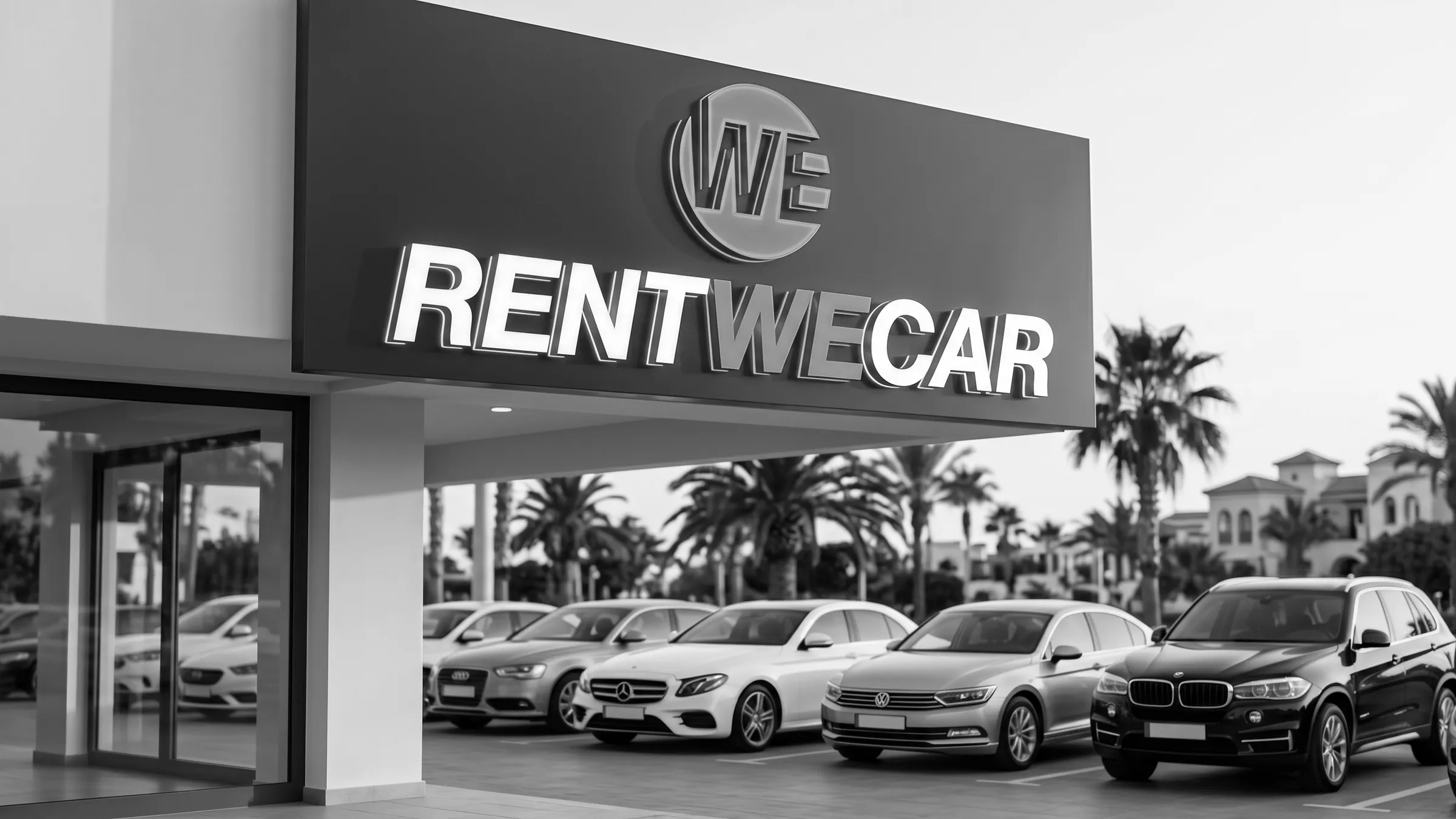
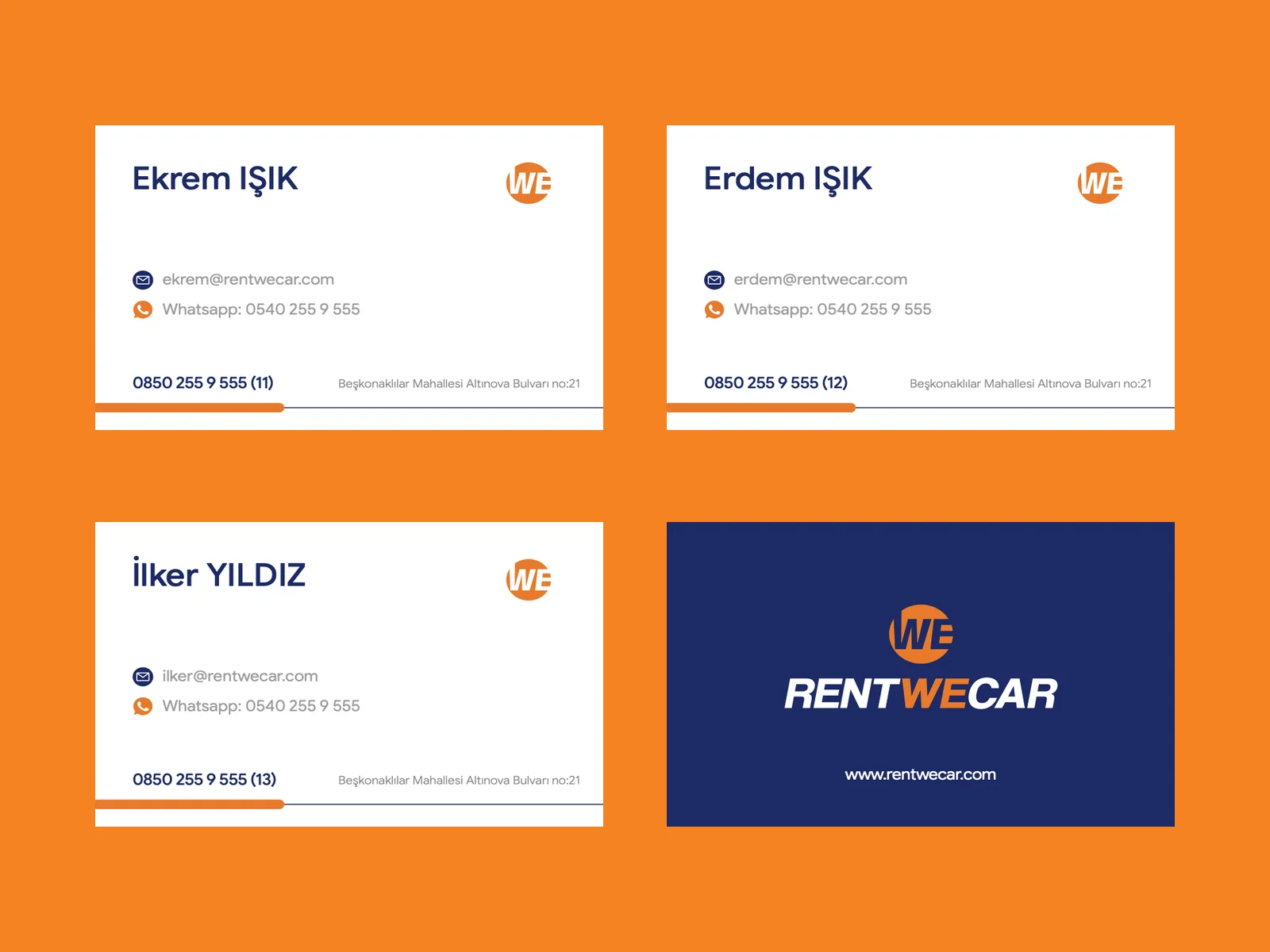
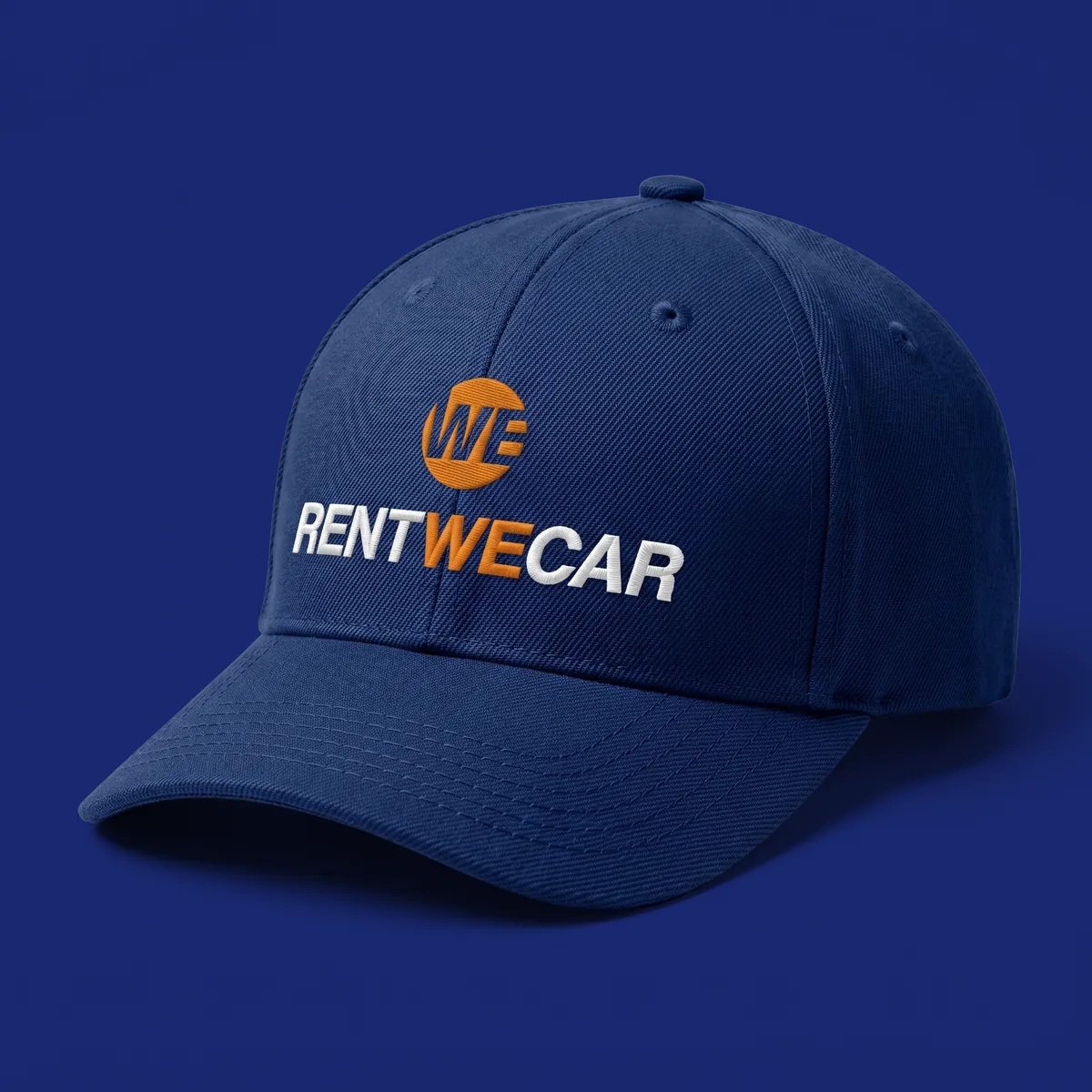
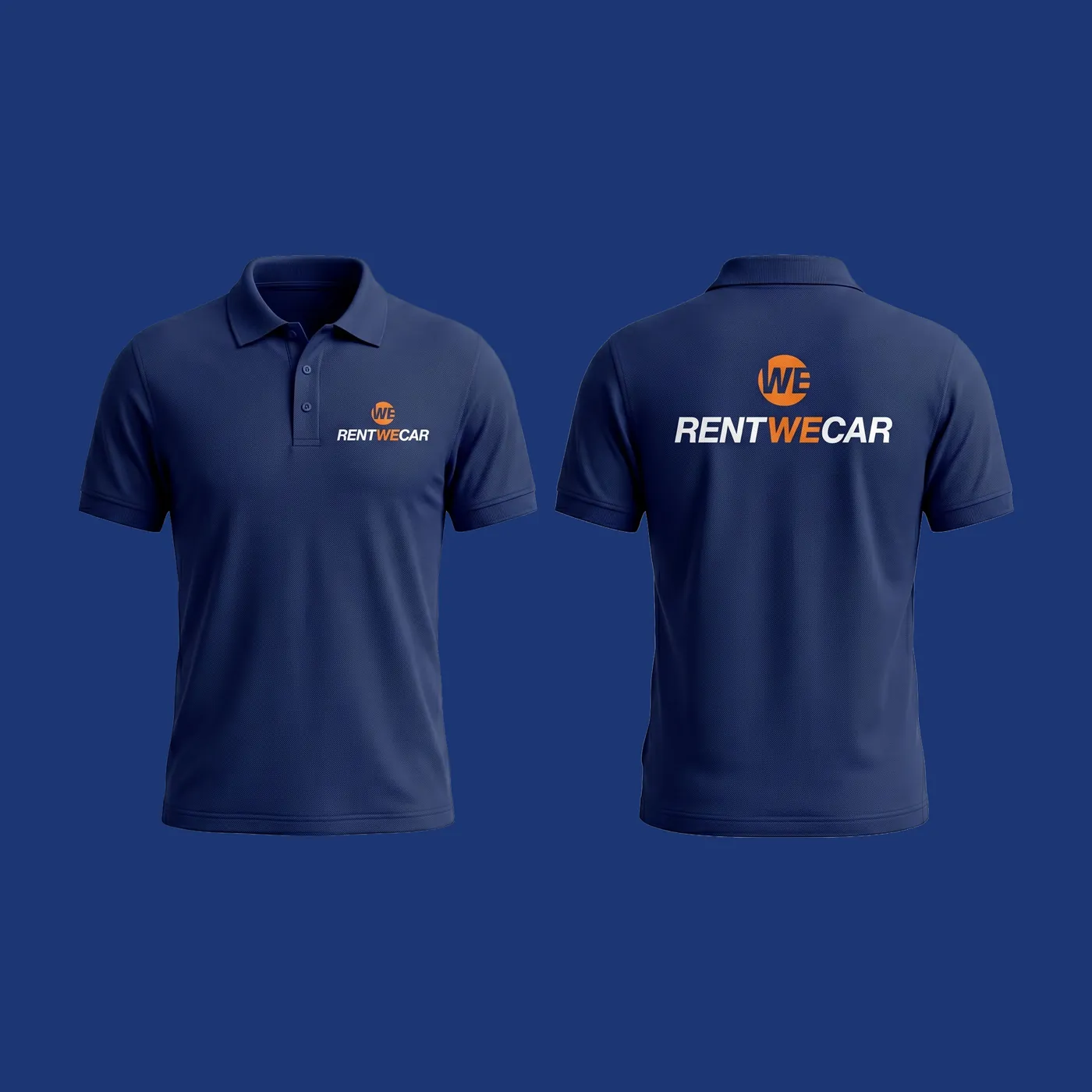
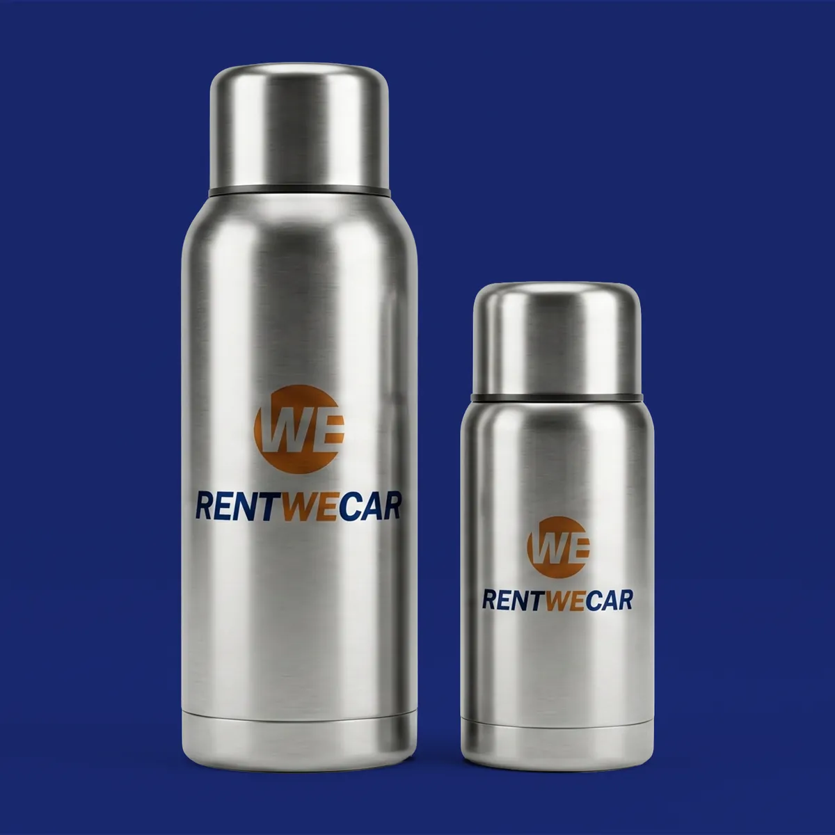
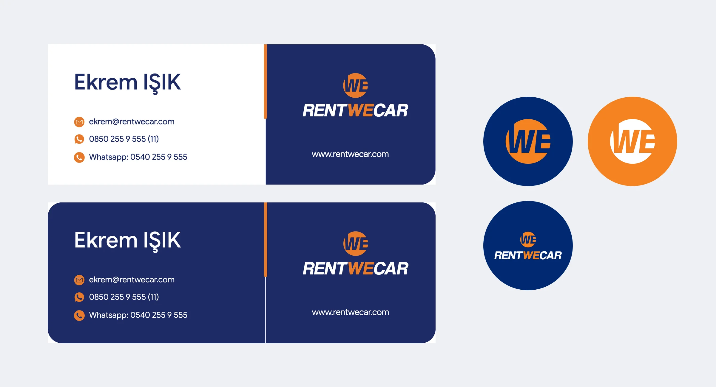
The guidelines cover stationery, number plate frames, ID badges and lanyards, staff wear, merchandise, e-mail signatures and social media profiles. The highlights are below.
I led the project as art director and graphic designer at Salus Medya.
Applications
13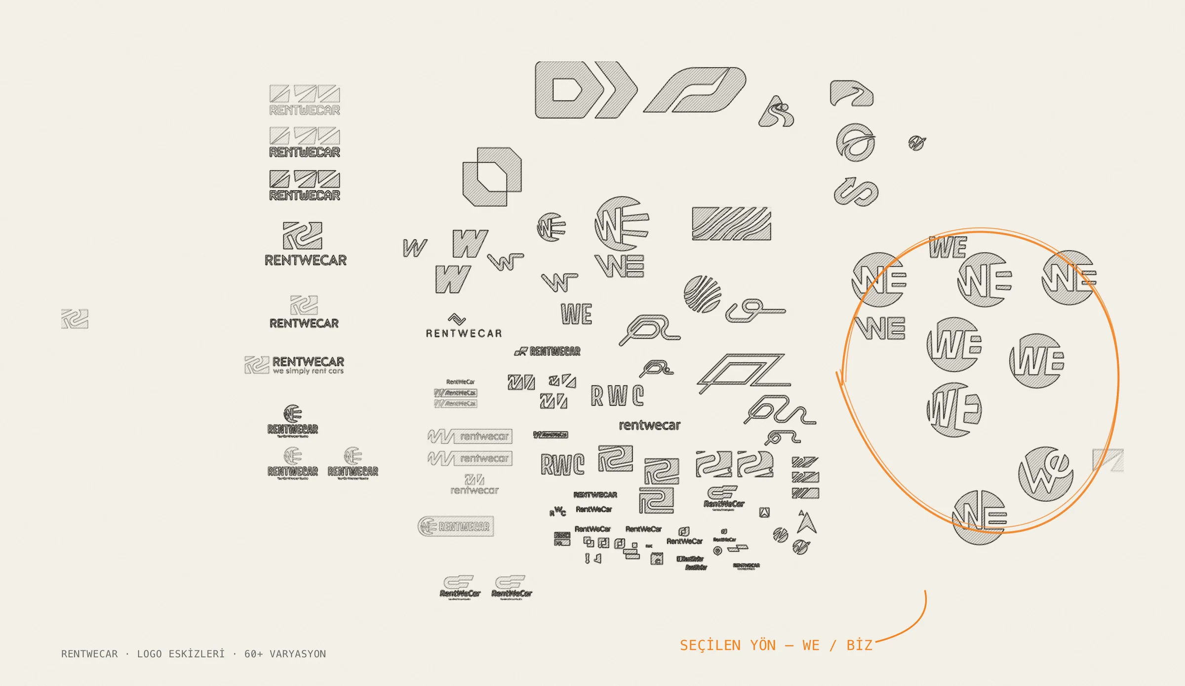

Colour palette
- We Orange#F58220 · Orange 021 C
- Support Orange#EB8D2D · 144 C
- Support Orange 2#F5B827 · 130 C
- Deep Blue#002972 · 2748 C
- Support Blue#1C3673 · 2746 C
- Support Blue 2#0E4787 · 286 C