RAMS Türkiye Web Interface
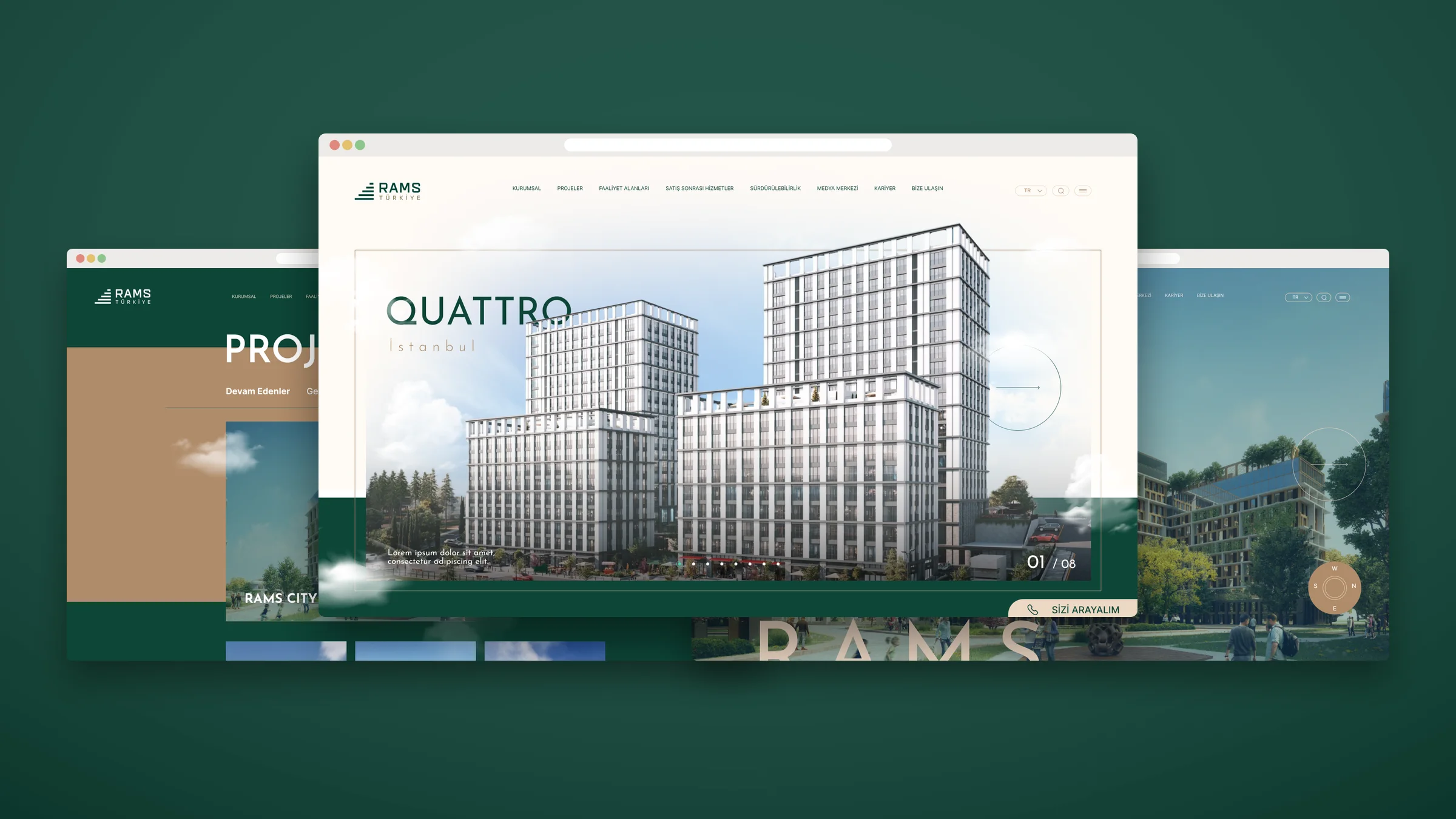
A corporate website interface for the real-estate developer RAMS Türkiye: home, projects and project detail pages, in forest green and earth tones, with a lively visual language drawn from nature.
Brief
RAMS Türkiye is the Turkish real-estate developer of the international RAMS Global group, with projects in Türkiye, Thailand and Kazakhstan across sectors from housing and offices to health, tourism and food. For the new corporate website I designed the interface of the three main pages: home, projects and project detail.
The site had two jobs: show the scale of the group and the range of its sectors at a glance, and lead a buyer smoothly from project to project, then to floor plans and contact.
Visual language
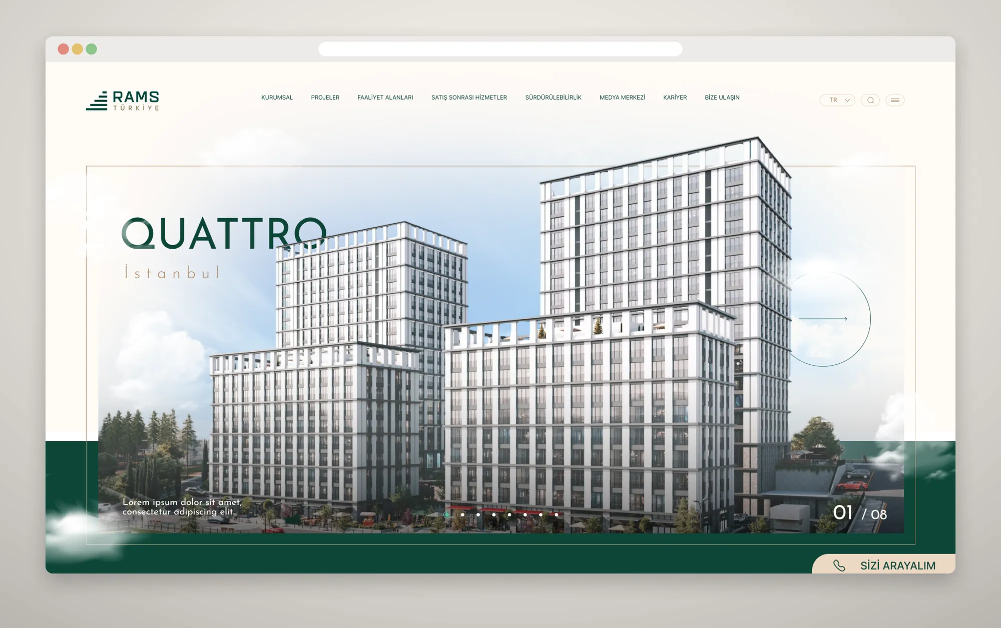
- A palette from nature: a deep forest green as the main ground, earth tones for accents, cream for light sections. The colours belong to the same family as the green façades and trees in the architectural renders, so the site feels like a continuation of the projects’ landscaping.
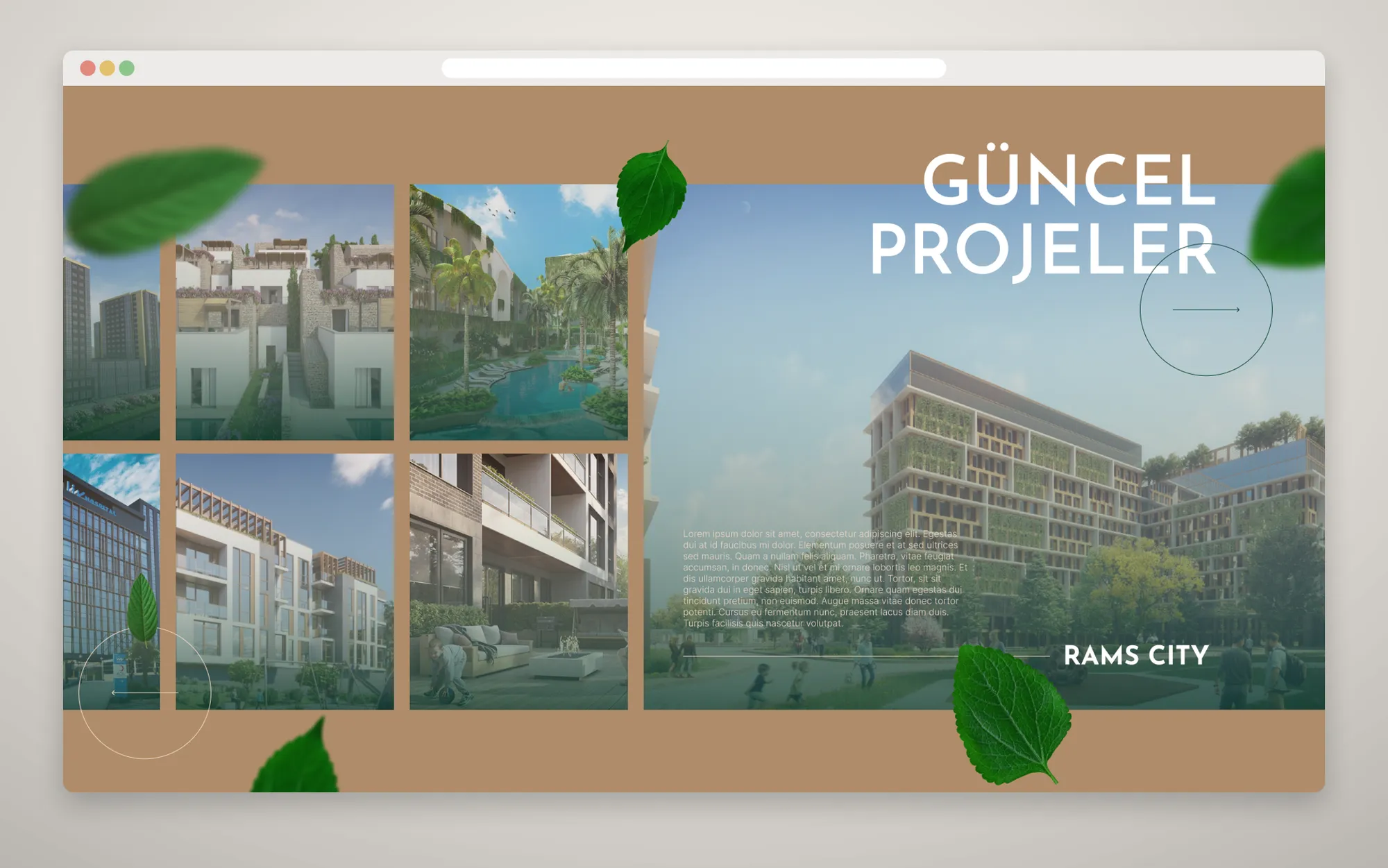
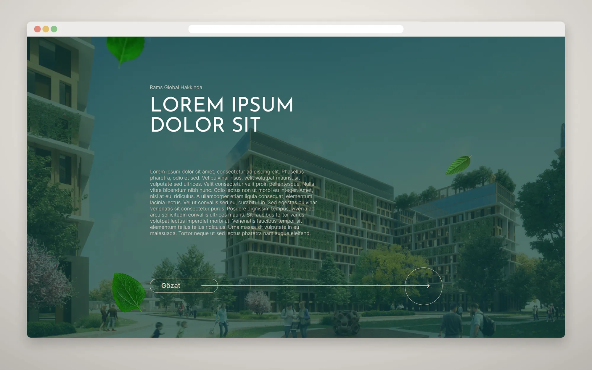
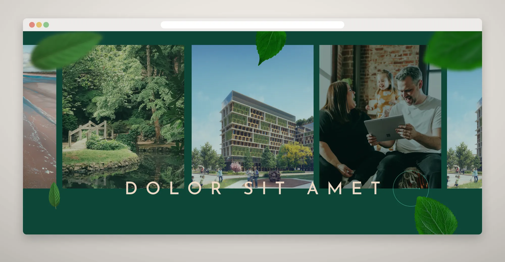
- Clouds and leaves: clouds and drifting leaves float between layers at section transitions. Images break out of their frames and headings overlap photographs, so the page reads as a scene with depth rather than flat blocks.
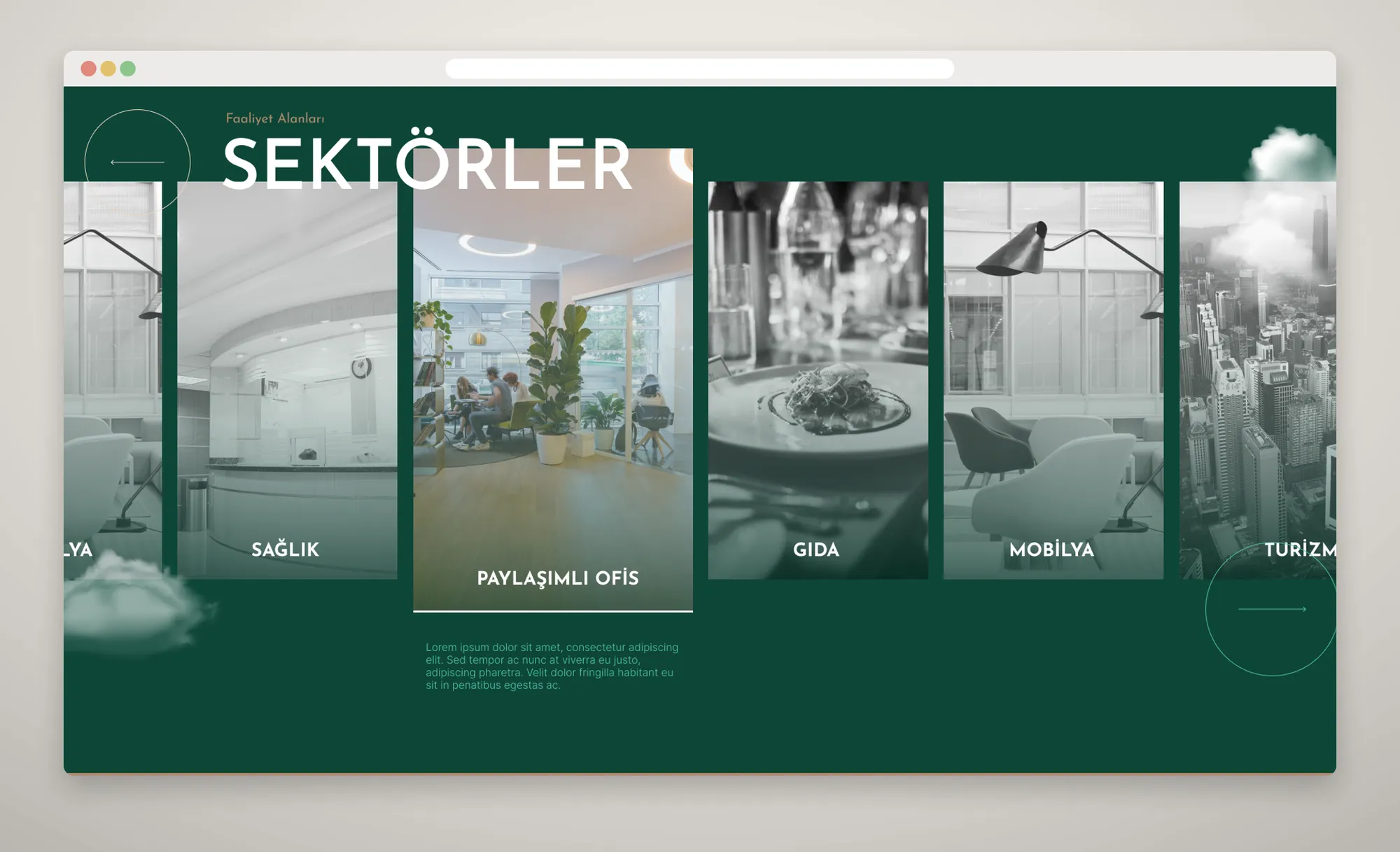
- Typography: a geometric, all-caps display face for headings (SEKTÖRLER, GÜNCEL PROJELER, RAMS CITY) and widely spaced secondary lines (İstanbul, City). Body and interface text in a plain grotesque.
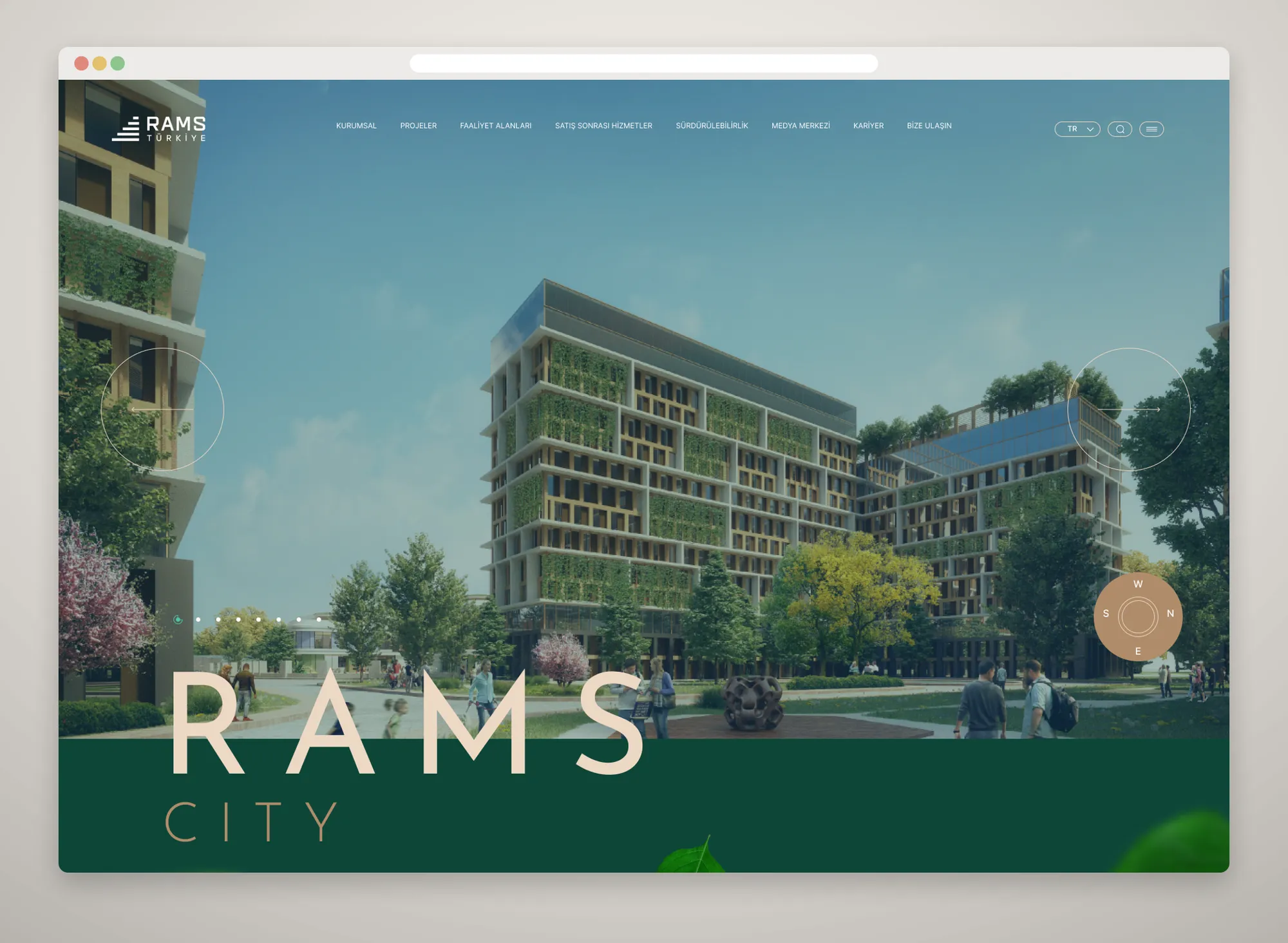
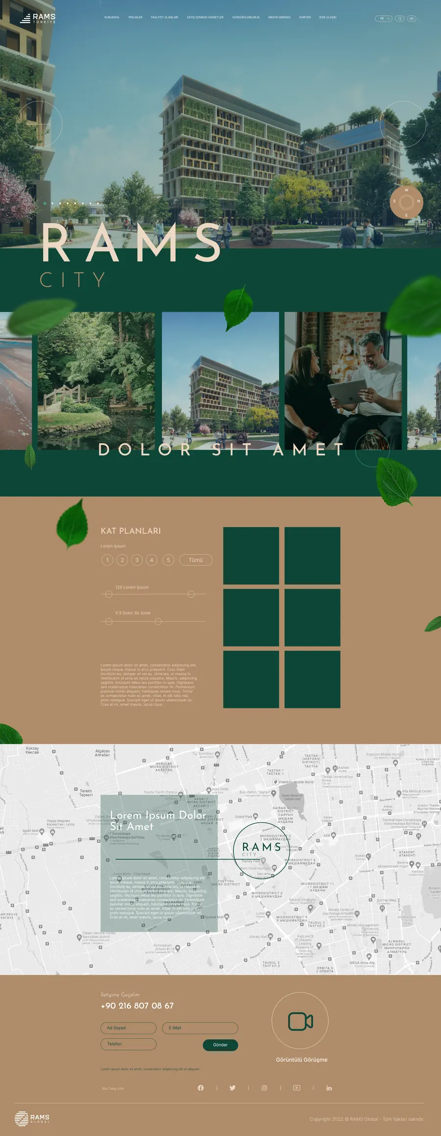
- Circle and pill: navigation arrows sit in large thin-lined circles; buttons and form fields are rounded pills. The same shape language carries into the compass button and the video-call icon.
Three pages
Home. The page opens with a slider that moves between projects: a framed project image, the project name and city, a 01/08 counter and a “call me back” button that is always within reach. Sector cards scroll horizontally; the active card takes on full colour and grows while the others stay back in green. A current-projects mosaic and the about section lead to the contact area.
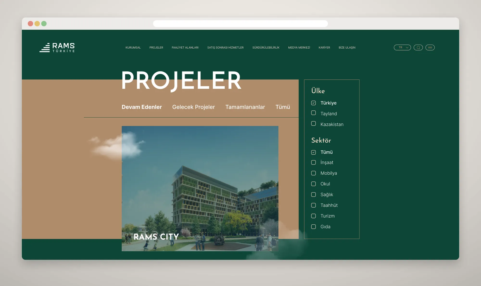
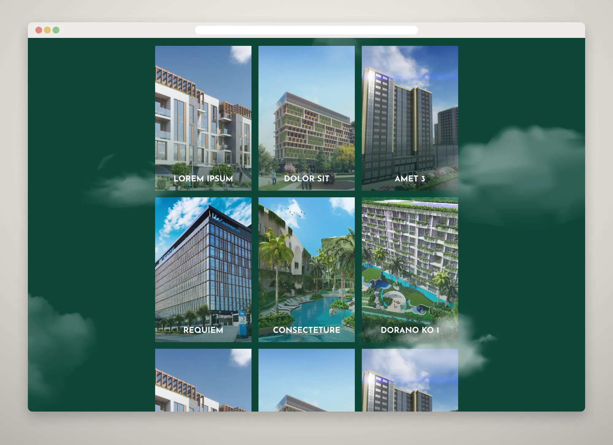
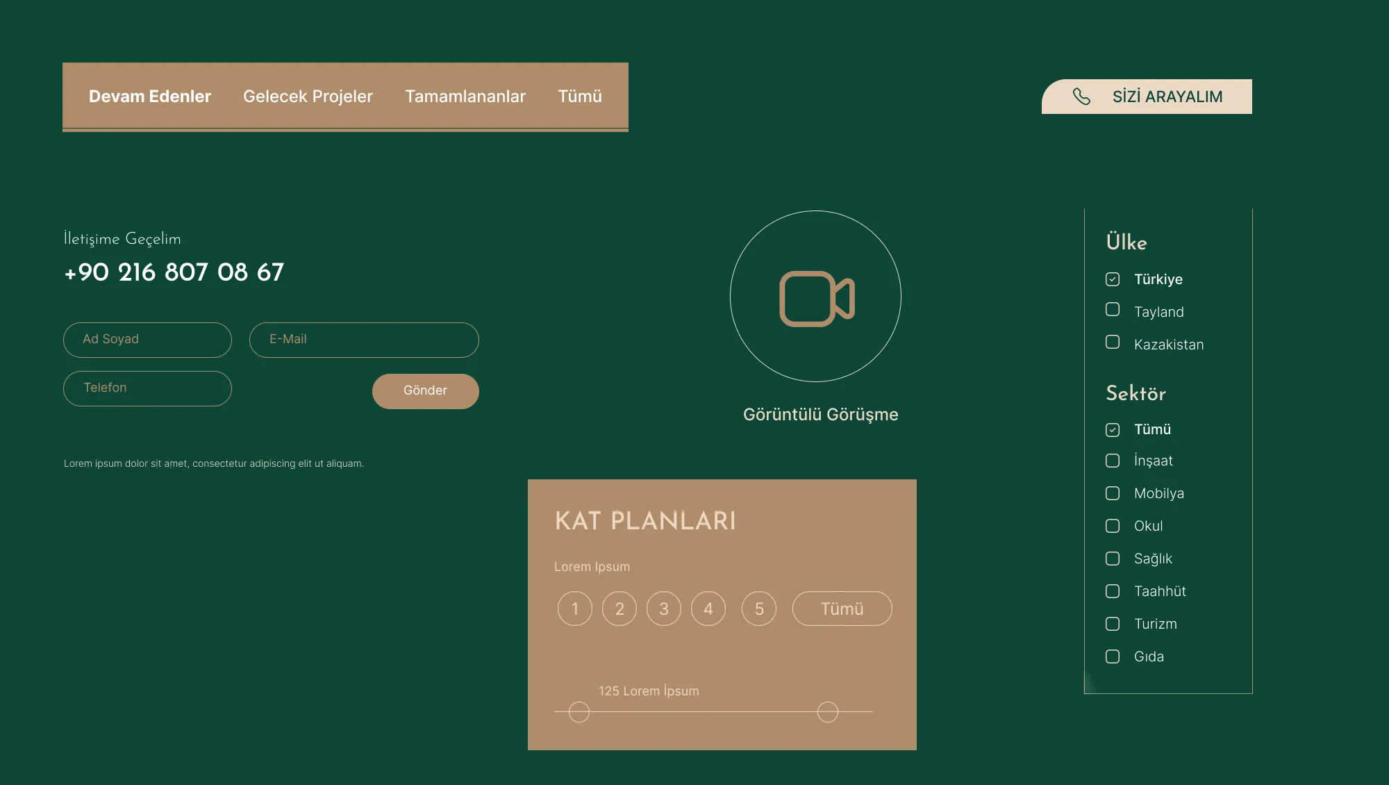
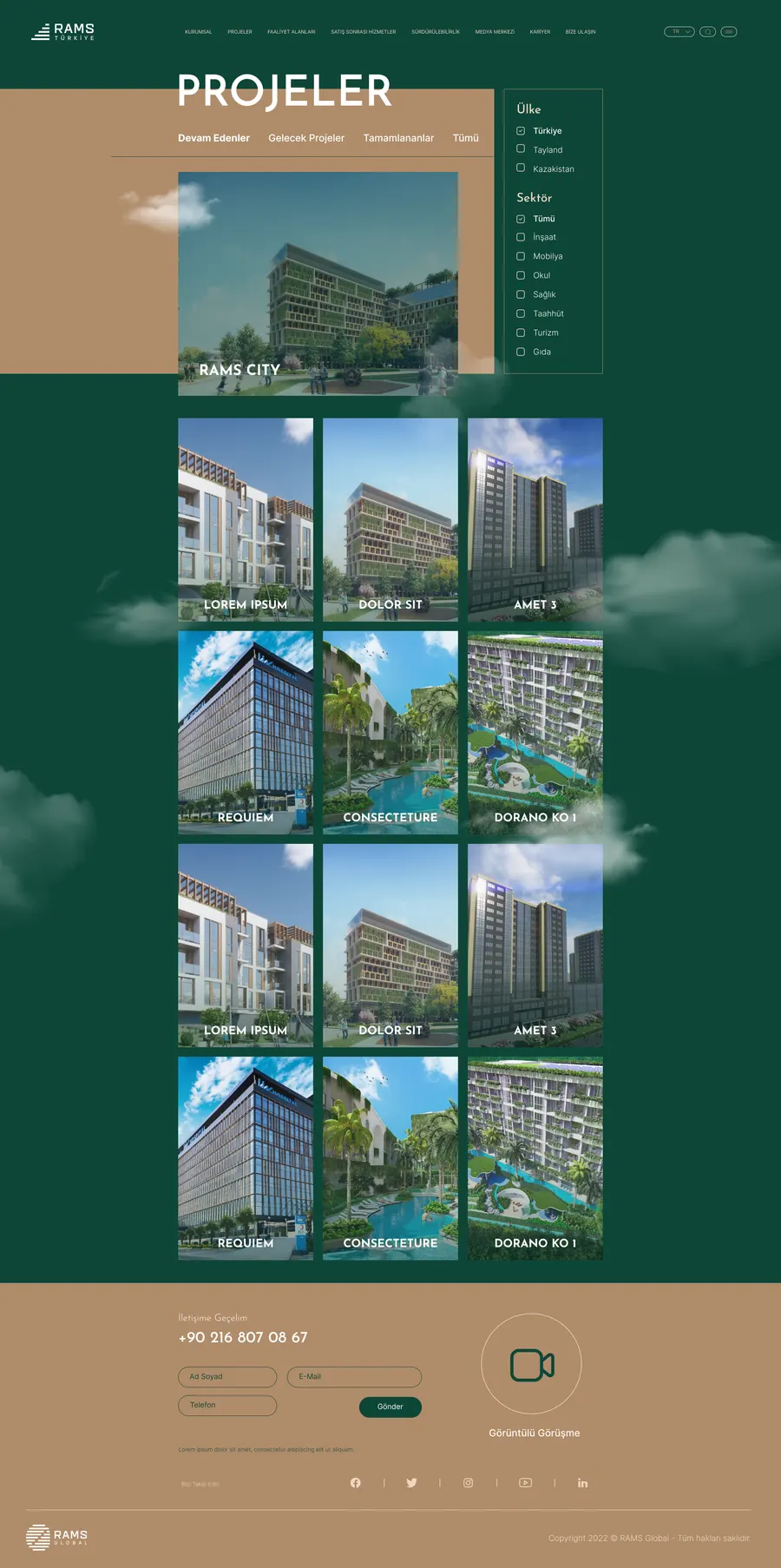
Projects. Projects are split into tabs by status: ongoing, upcoming, completed and all. A panel on the right filters by country and sector. A large featured card leads, followed by a three-column grid.
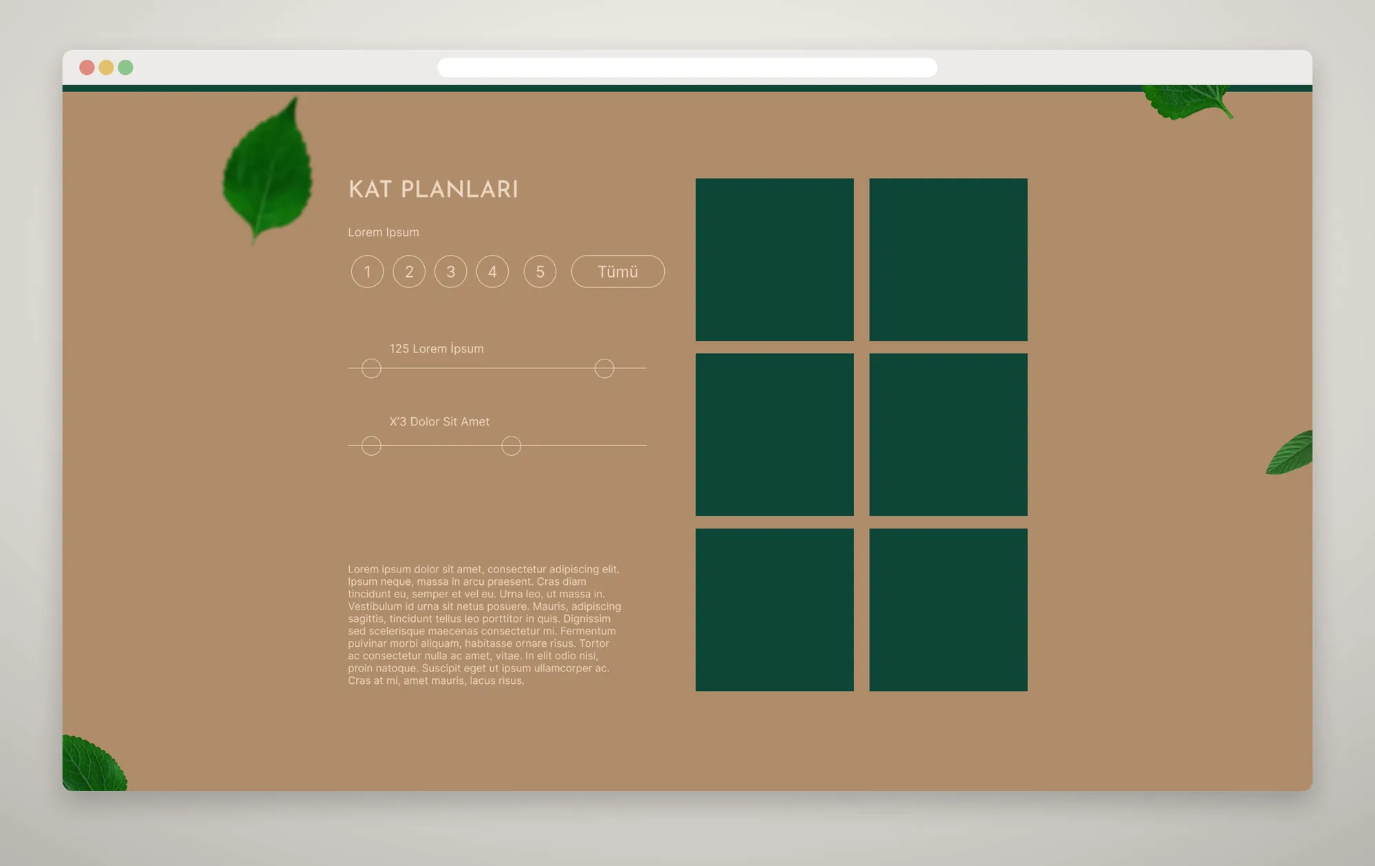
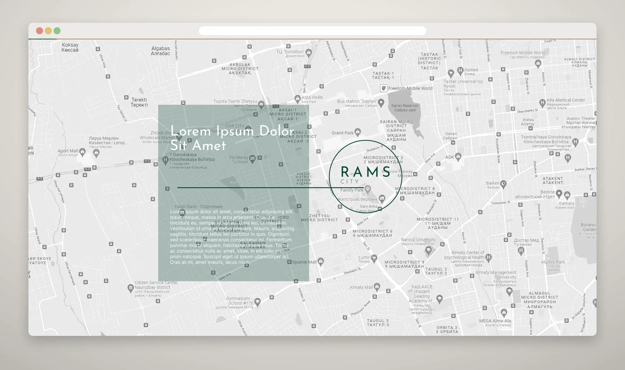
Project detail. It opens with a full-screen project image and a compass button designed for showing the image from different directions. A lifestyle gallery presents the project with its surroundings and everyday life. The floor plans section filters by floor number and floor-area range. The page ends with a map that places the project in the city.
Components
Status tabs, the filter panel, the floor-plan selector, the contact form, the video-call button and the circular navigation arrows all come from one system across the pages. The contact area repeats in green or earth tone depending on the page ground.
I designed the interface as a freelance project in 2022.
Applications
14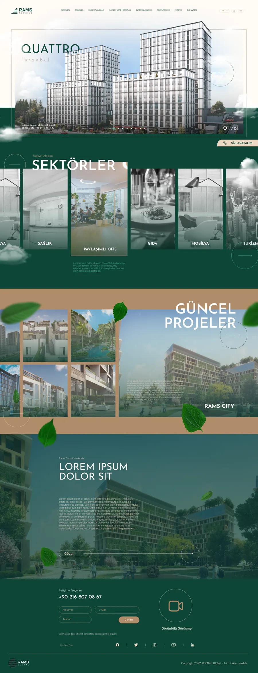
Colour palette
- Forest green — main ground#0E4638
- Earth — accent and secondary ground#B08C6A
- Cream — light ground#FFFDFA