ARC Group Corporate Identity
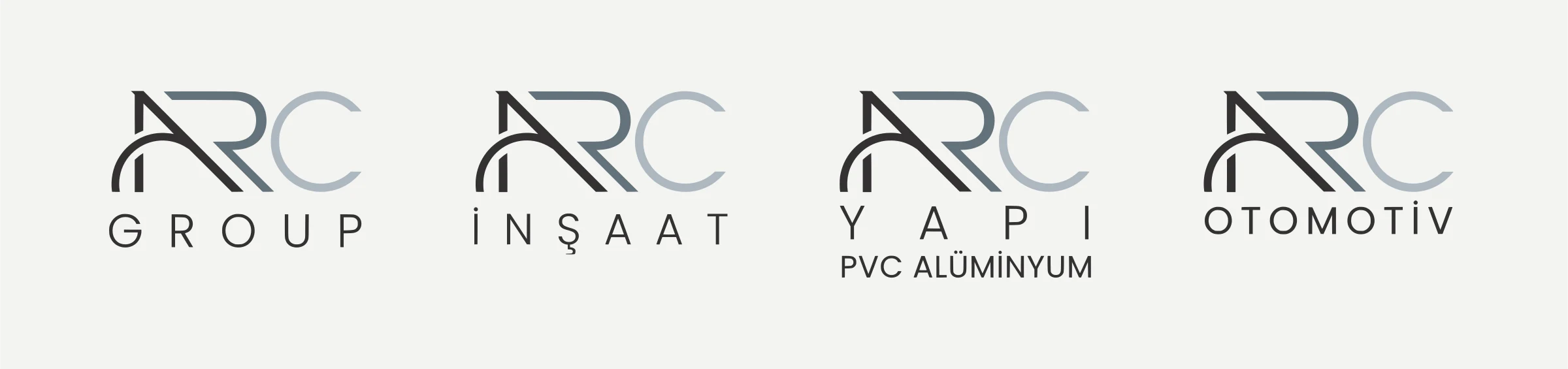
Logo, brand architecture and a 48-page identity guide for ARC Group, which brings companies from construction to PVC and aluminium under one roof. The mark stays fixed; the company line changes with every new company.
Brief
ARC Group brings companies working in different sectors under one roof: ARC İnşaat (construction), ARC Yapı PVC Alüminyum and the ones still to come. The need went beyond a logo. When a new company joins the group, the identity had to grow correctly on its own, without going back to the designer. It needed a system.
I’ve split this page into chapters, like the guide itself. In the lab below, the logo works live, together with the guide’s rules.
01 · The mark
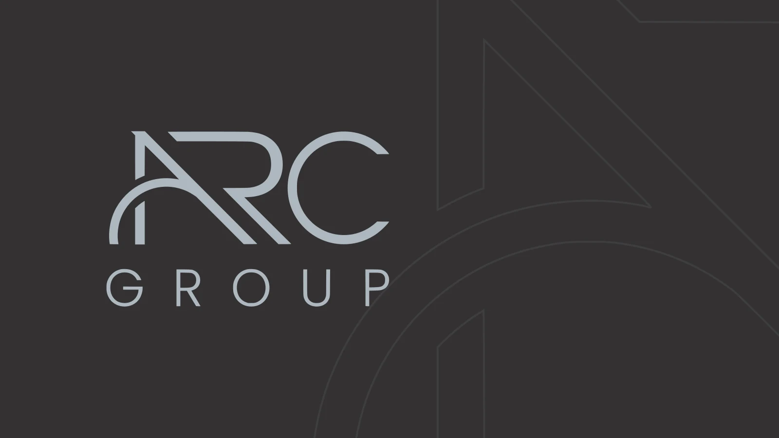
The mark isn’t set in a typeface; it’s a drawn typographic arrangement. An arc cuts through the left leg of the A, like the name itself: an arc. The three letters move from dark to light, left to right: the A in B Dark, the R in dark A Gray, the C in light A Gray. The sense of motion comes from the colour itself.
Every size hangs on one variable, the logo’s height A. The mark is 2.5A wide; its minimum width is 20 mm.
Logo lab
Interactive · built on the guide’s rules02 · The system
The group companies share the same mark; only the company line changes. The rule is simple and repeatable:
- The company line is A/3 tall and exactly as wide as the mark (2.5A).
- Letter spacing isn’t fixed; the line opens up until it fills the width of the mark.
- A new company gets the same formula. The guide’s example is ARC Otomotiv (automotive).
I measured this on the logos I traced from the guide into vector form. The GROUP and OTOMOTİV lines are 0.33A tall, and every company line is as wide as the mark. The group’s full logo family, including ARC Gıda (food) and the residential project brand Sultan Konakları, also appears on the Logofolio page.
03 · Colour and type
Greys were chosen to strengthen the sense of a group and to signal a corporate character; the complementary colour is a mix of blue and grey. Supporting text is always set in 95 Black.
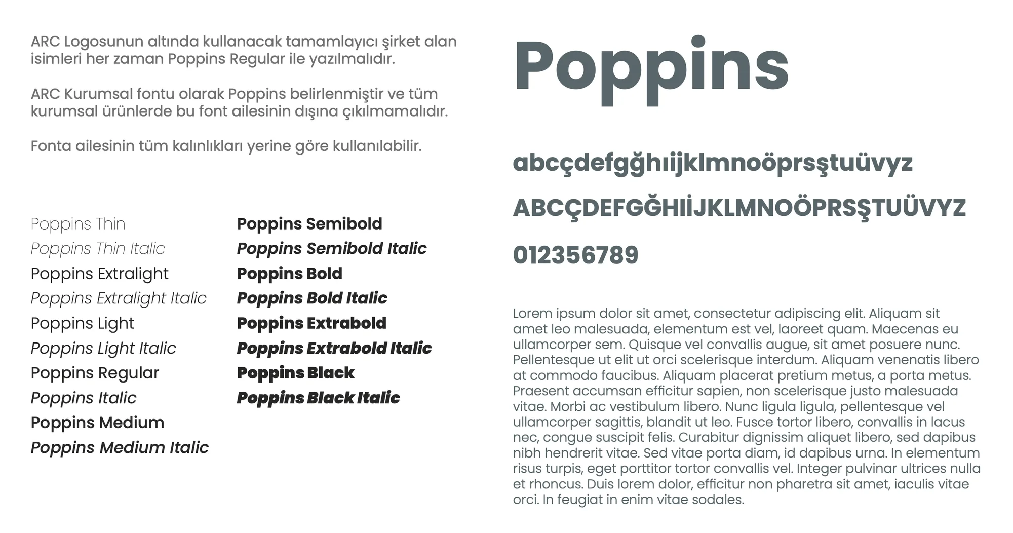
The corporate typeface is Poppins. Company names are always Poppins Regular; the family’s other weights are used where they fit. The slogan: İlhamımız Gelecekten, Gücümüz Sizden (“our inspiration comes from the future, our strength from you”).
04 · Rules
- Clear space: every element around the logo stays at least A/4 away.
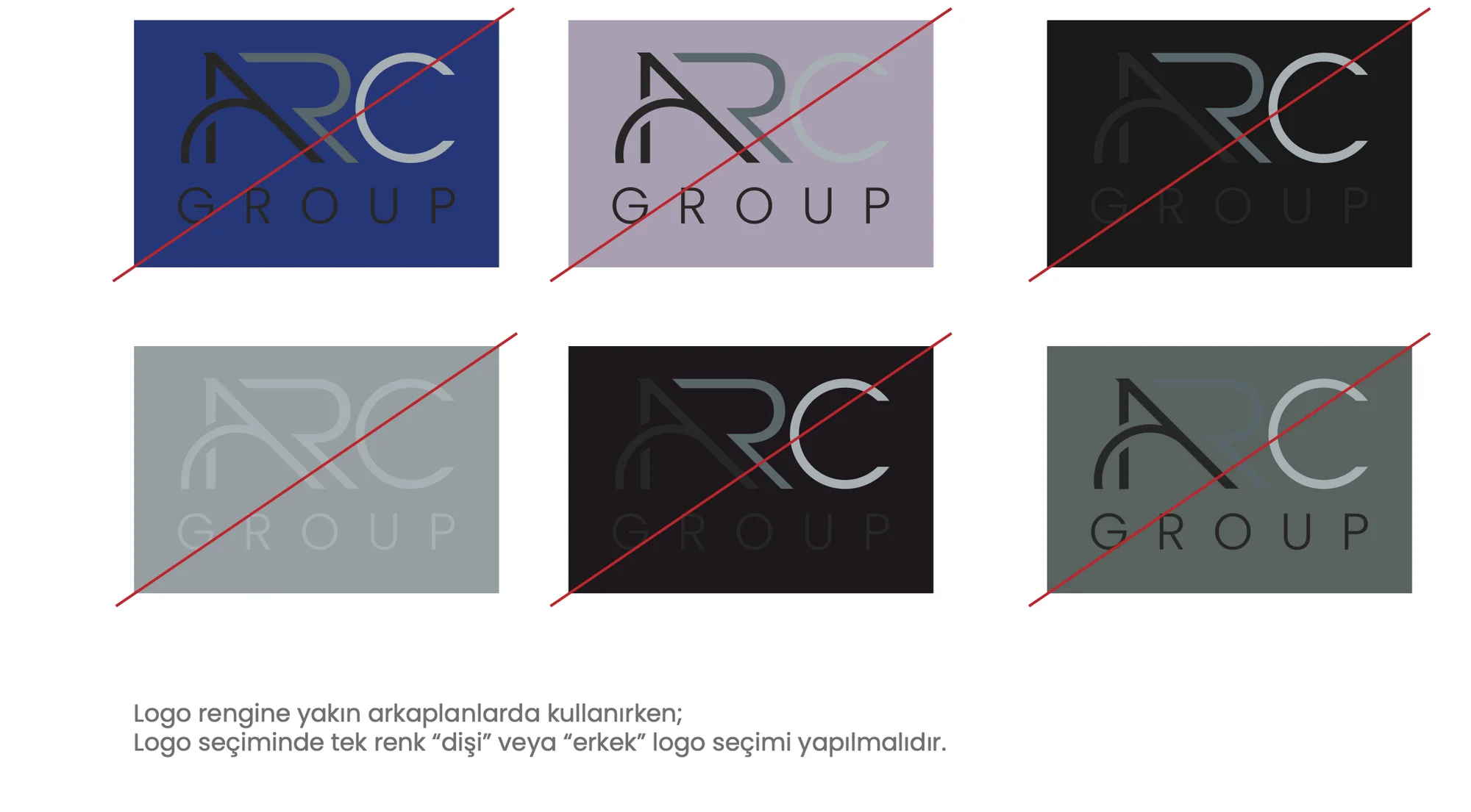
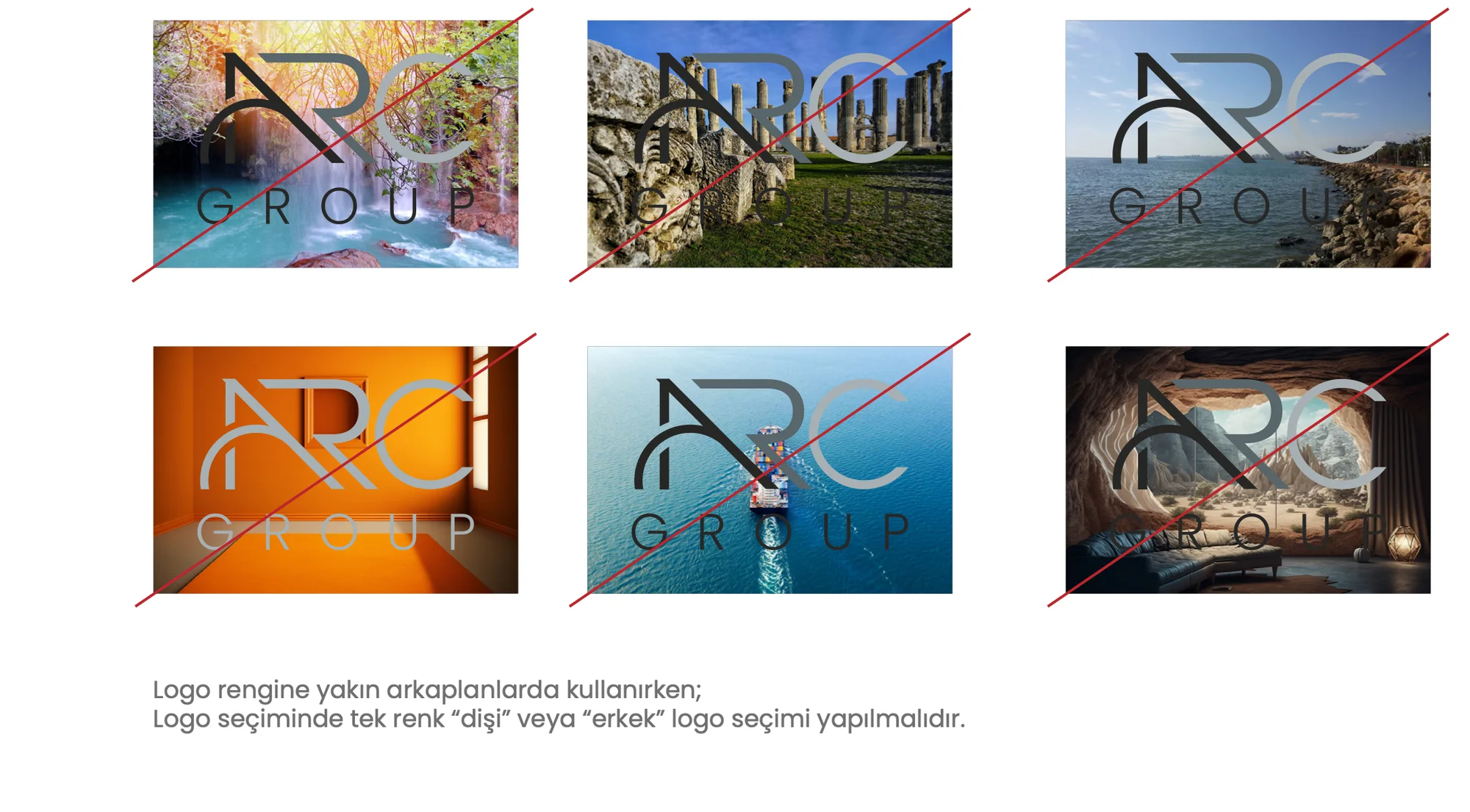
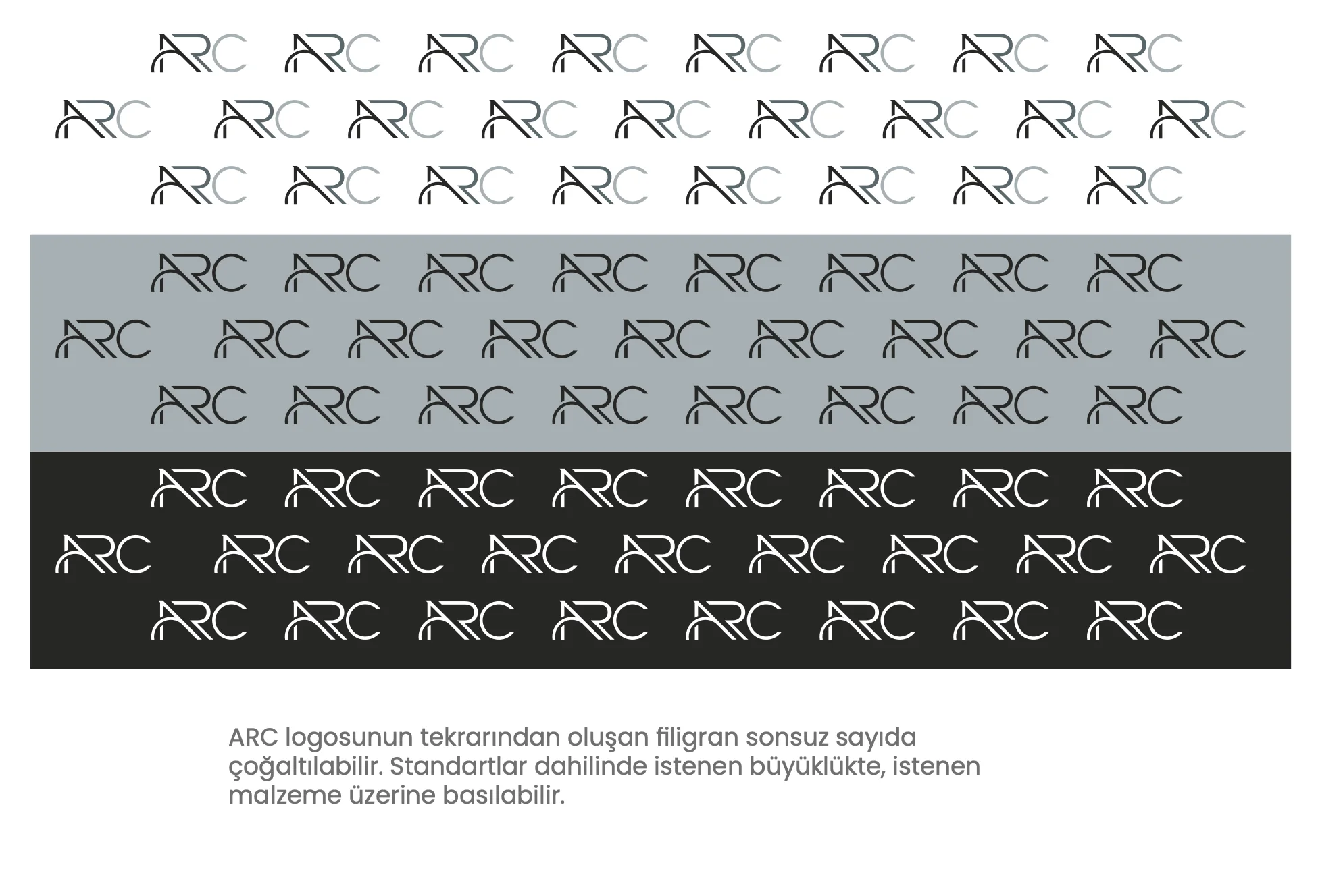
- Grounds: on light grounds, single-colour B Dark, the guide’s “male logo”. On dark grounds, single-colour A Gray, the “female logo”. The three-colour logo is never used on grounds close to its own colours or over photographs.
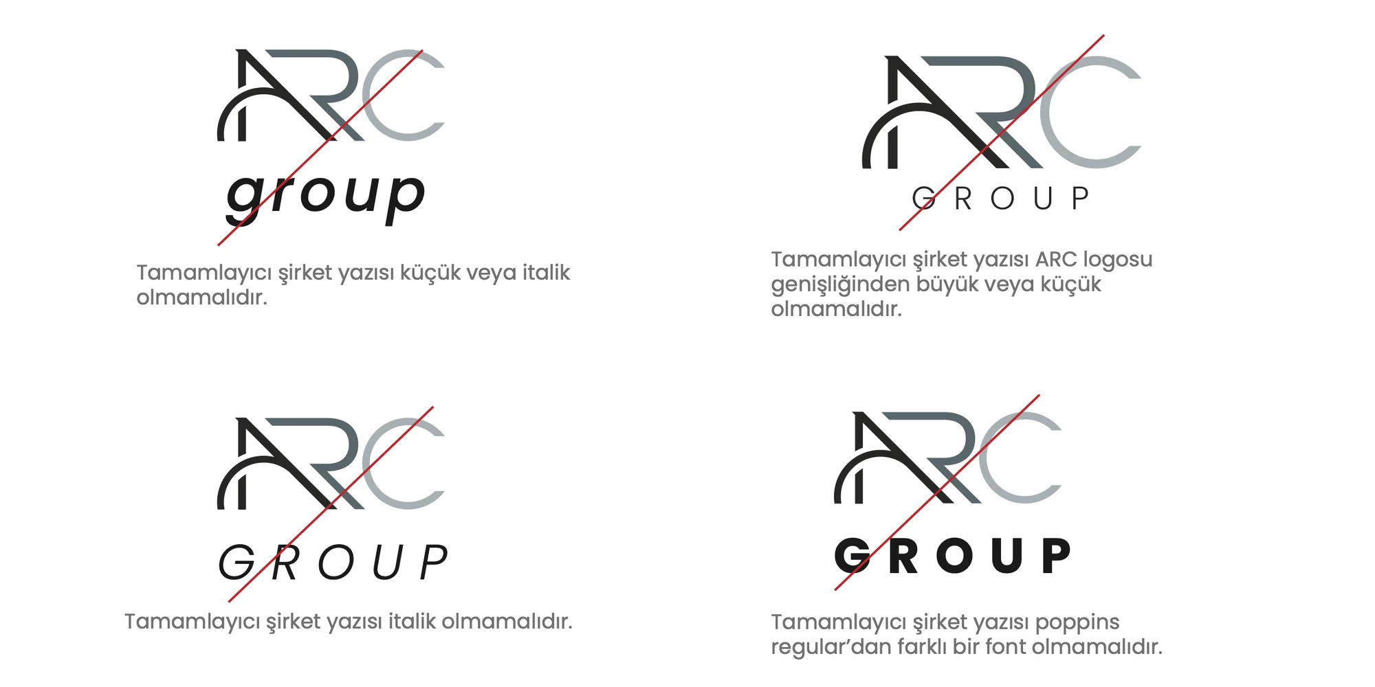
- Company line: no lowercase, no italics, no typeface other than Poppins Regular, and never wider or narrower than the mark.
05 · Applications
The 48-page guide carries the system into everyday use:
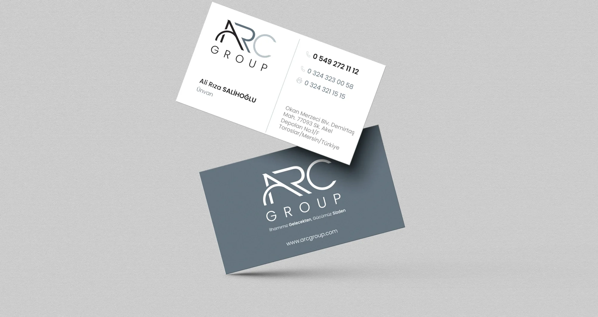
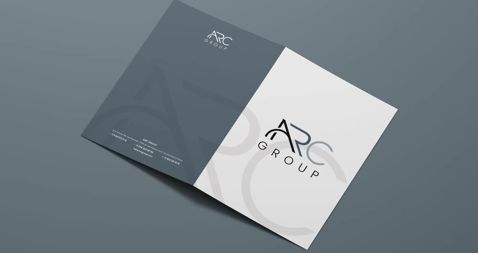
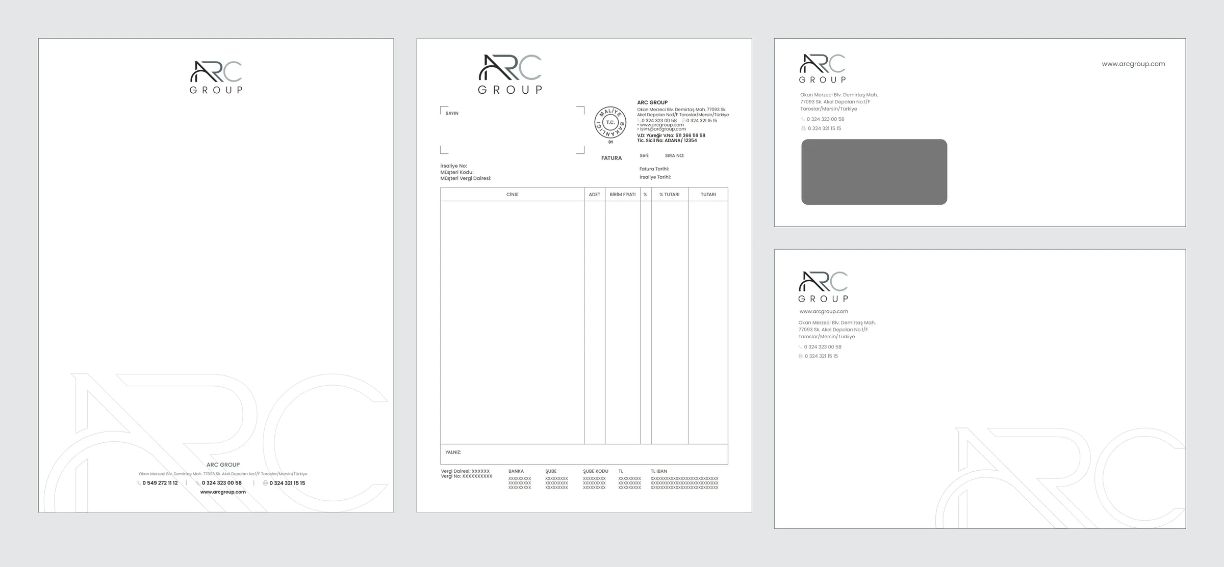
- Stationery: business card, letterhead and continuation sheet, windowed and plain DL envelopes, A5 / A4 / A3 envelopes, invoice, folder, pocket folder, compliments card, email signature
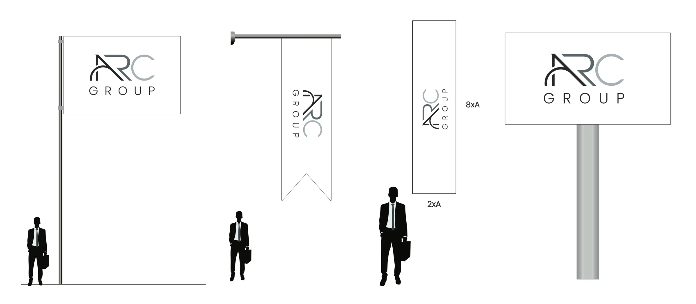
- On site: flag, swallow-tail flag, banner, totem, watermark
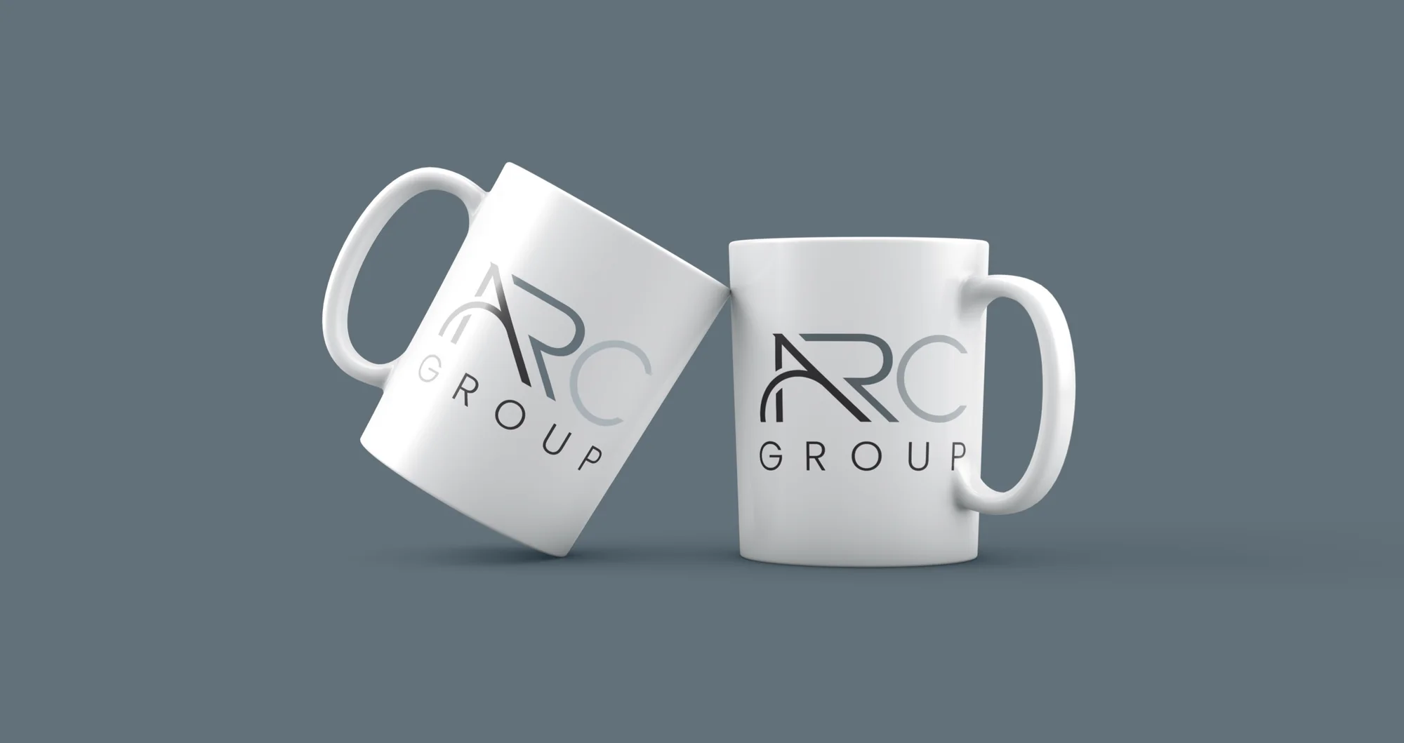
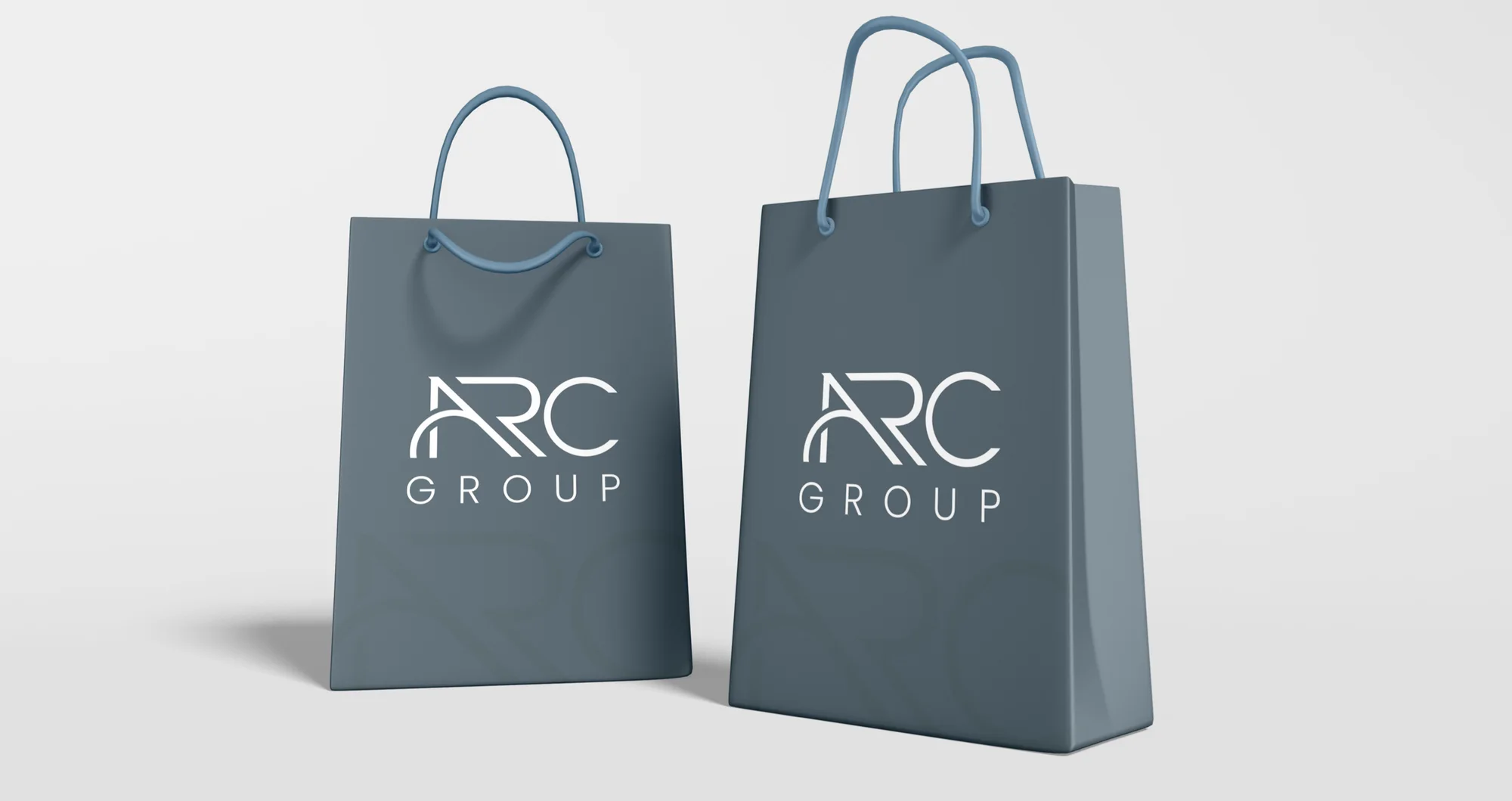
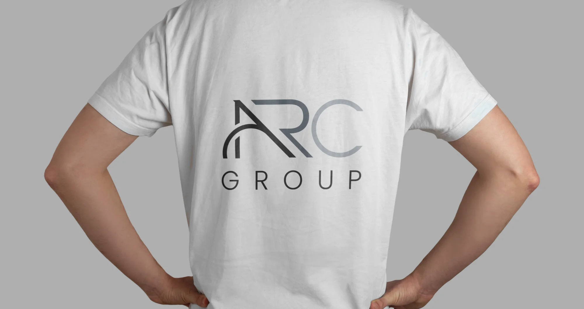
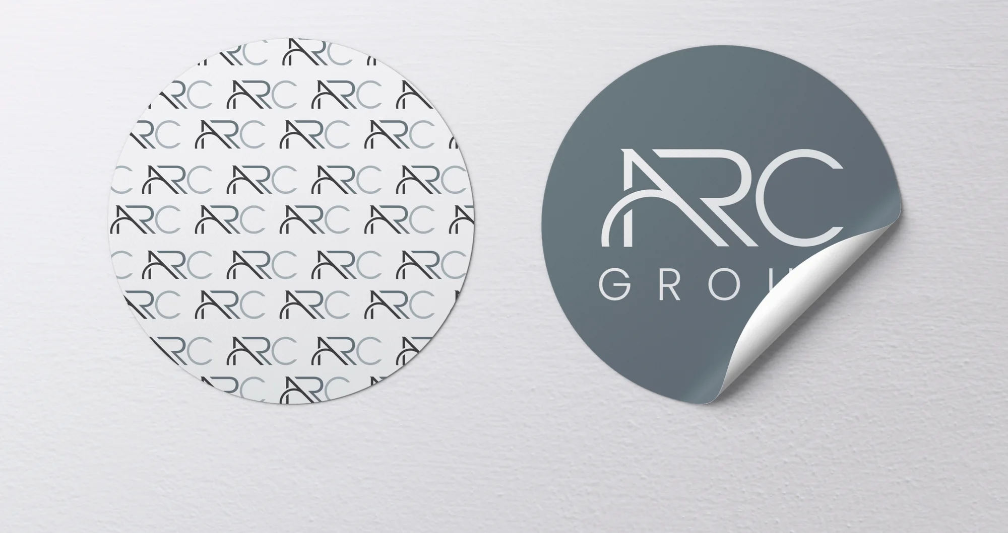
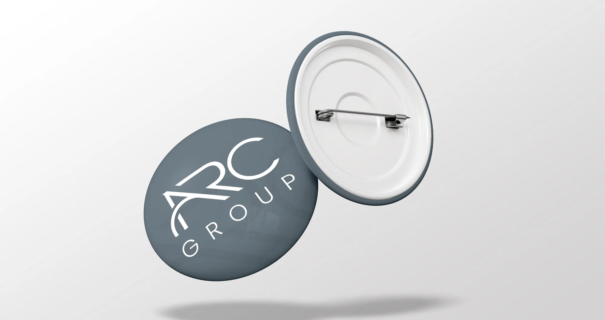
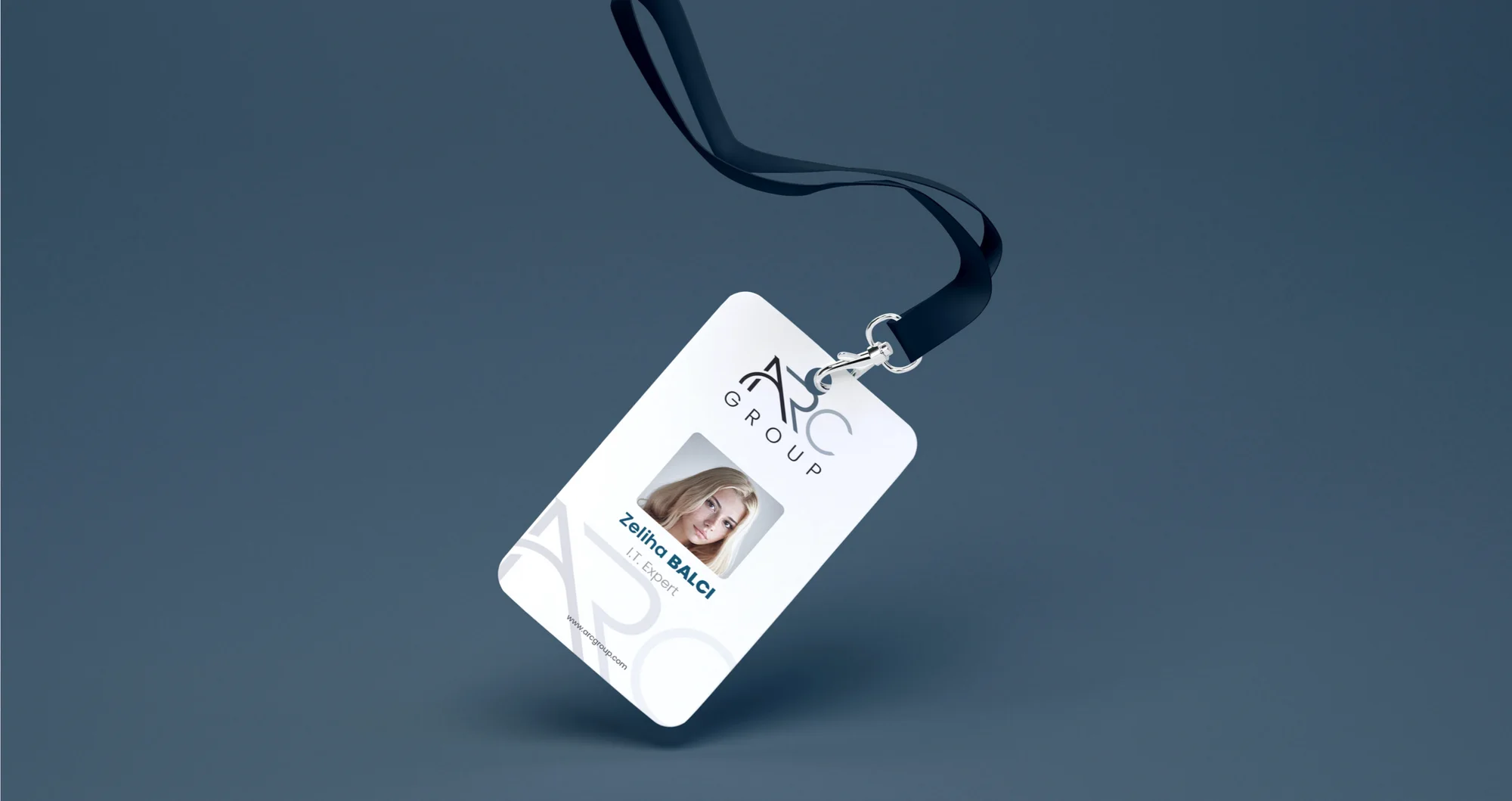
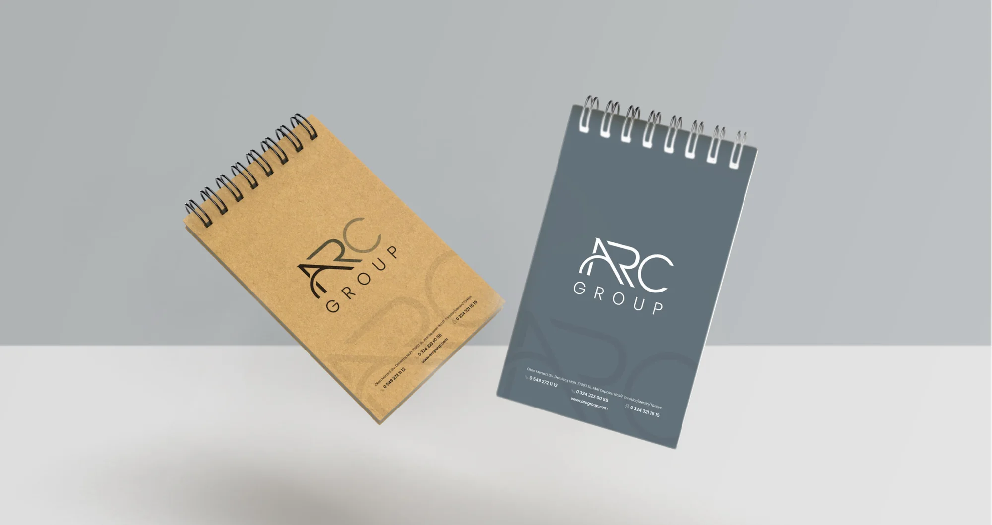
- Promotional: mug, bag, stickers, T-shirt, badge, staff ID card, notepad
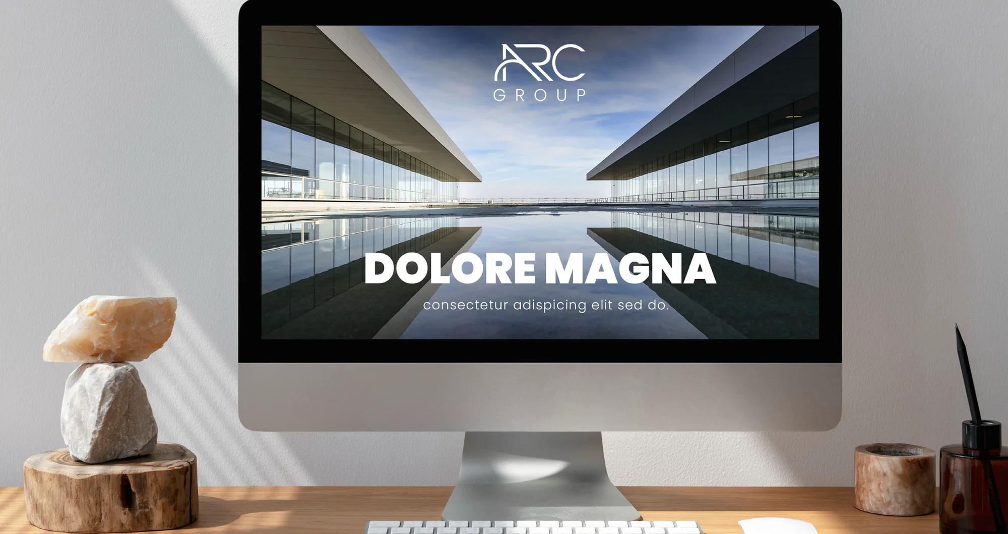
- Digital: post, banner and web banner templates
Across the stationery, a cropped, enlarged ARC outline runs as a faint watermark, and the same mark repeats into an endless pattern. Highlights follow below.
I ran the project freelance, from the logo to the guide.
Applications
19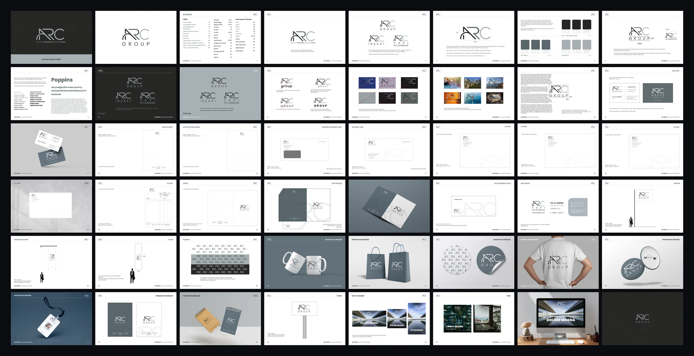
Colour palette
- B Dark — primary, complementaryCMYK 0 0 0 95 · RGB 51 49 50 · P 179-15 C
- A Gray — darkCMYK 15 0 0 65 · RGB 99 114 122 · P 174-10 C
- A Gray — lightCMYK 7 0 0 30 · RGB 173 184 191 · P 174-1 C