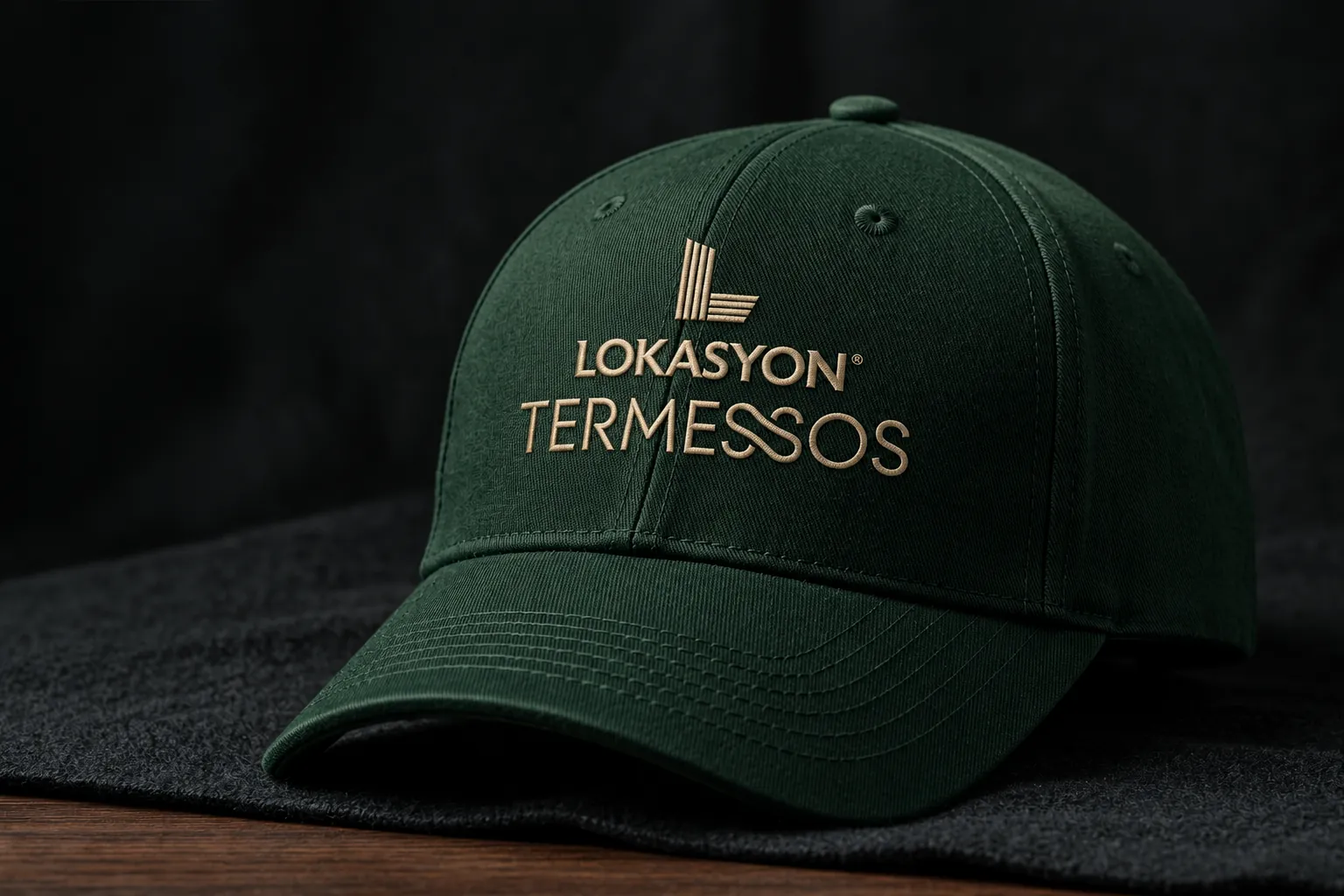
Lokasyon Termessos Corporate Identity
Corporate identity for the Lokasyon Termessos residential project in Antalya — logo, colour, typography and applications from print to digital.
Brief
Lokasyon Termessos is a residential project of two blocks, Luna and Sole, on Termessos Boulevard in Antalya. The task was a corporate identity that joins the Lokasyon parent brand and the project in a single signature, and keeps the same refined tone at every touchpoint — from the sales office to digital channels.
Approach
The project takes its name both from the boulevard it stands on and from Termessos, one of Antalya’s most powerful ancient cities. I built the identity on that double meaning, with an architectural discipline.
- Symbol: the L of Lokasyon. Repeated vertical and horizontal lines speak of façade rhythm, stacked floors and a sense of rising — the letter becomes an architectural signature.
- Typographic balance: LOKASYON carries the parent brand in a strong, decisive cut, while the fine, flowing letters of TERMESSOS stand for the project’s own distinction.
- Colour: Termessos Green refers to the region’s mountainous landscape, Sandstone Gold to ancient stone and sunlight — luxury expressed through a warm, timeless tone rather than display.
- Typeface: the corporate family is Google Sans Flex; Medium and SemiBold for headlines, Regular for text.
Applications
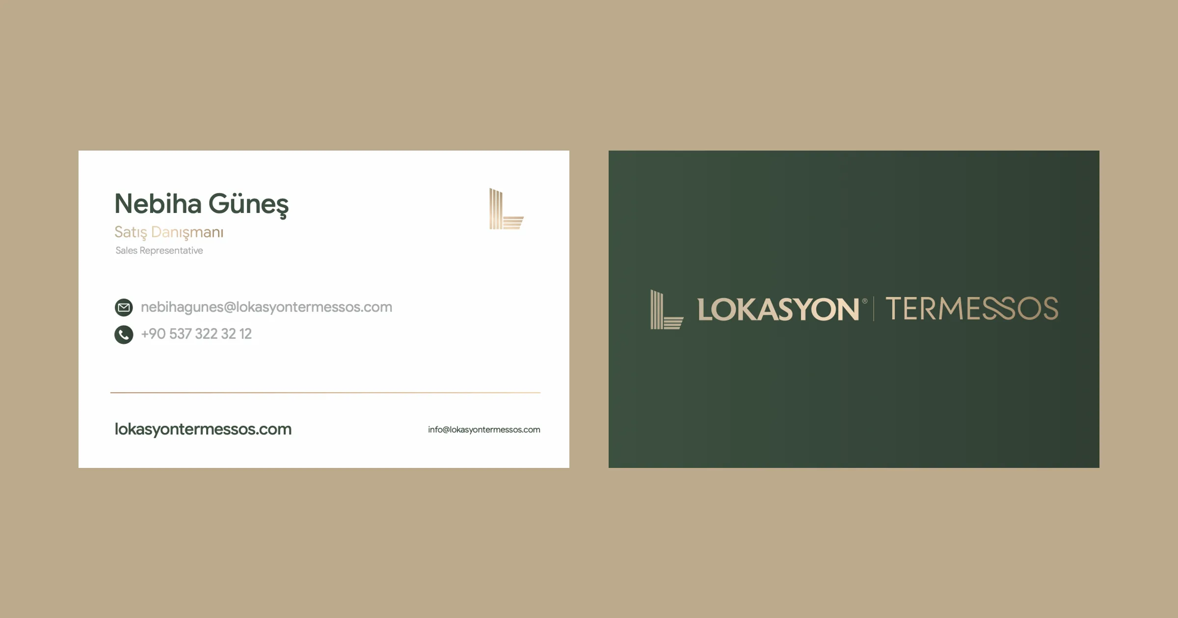
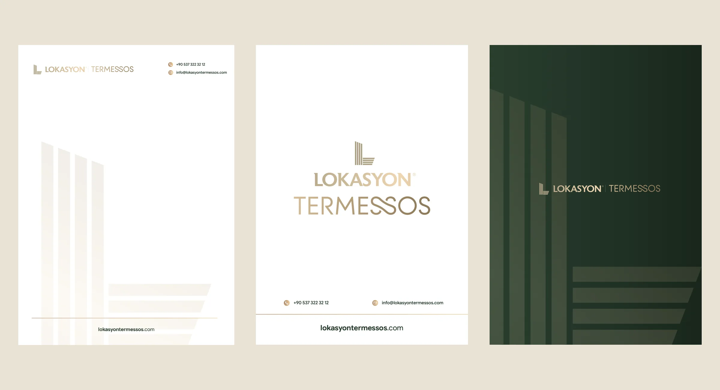
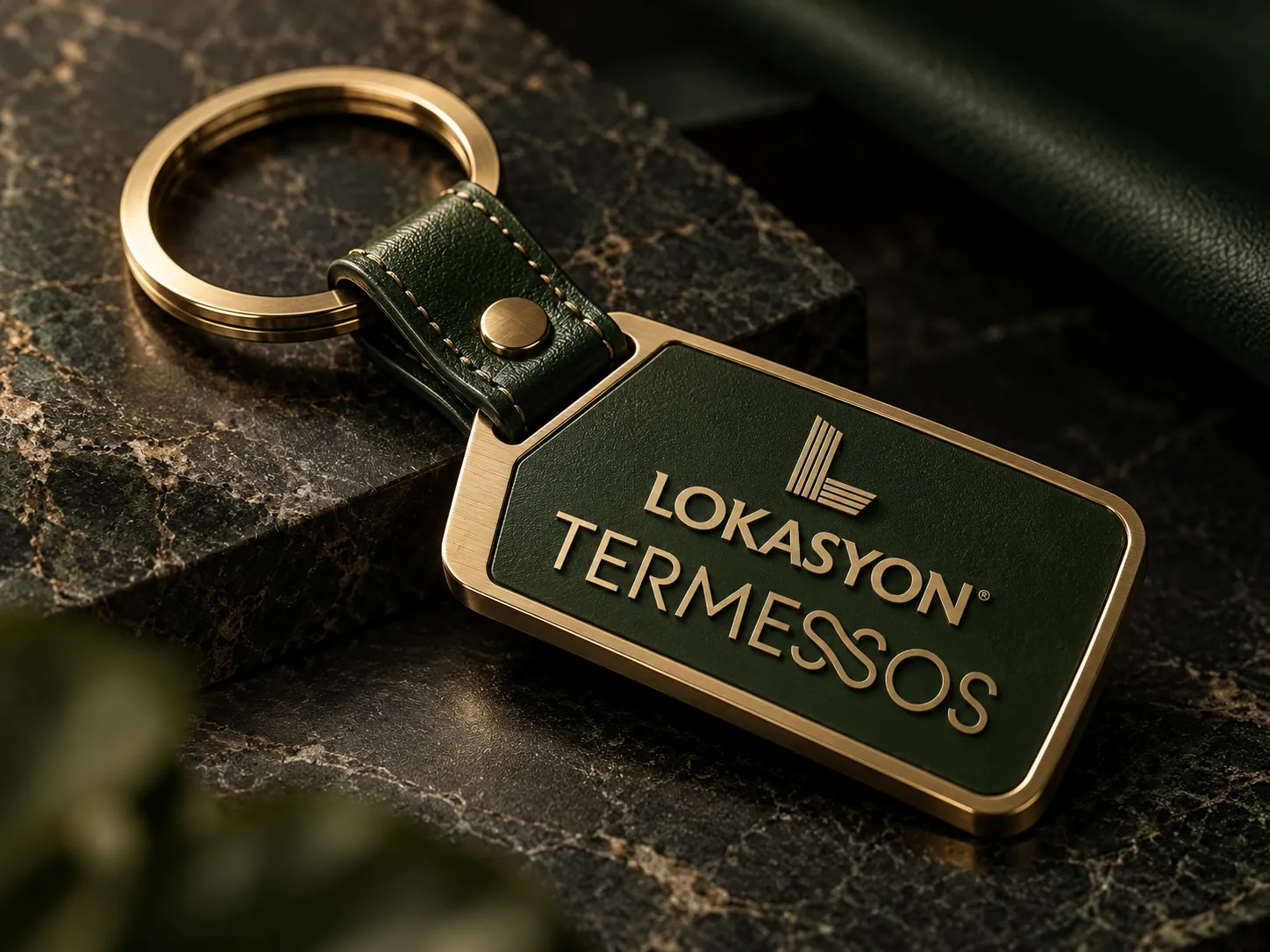
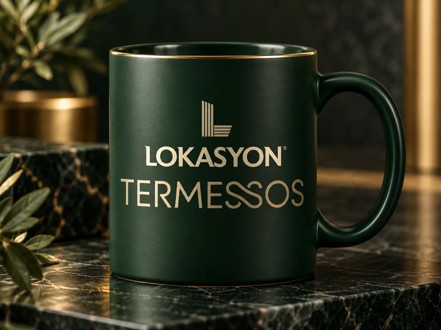
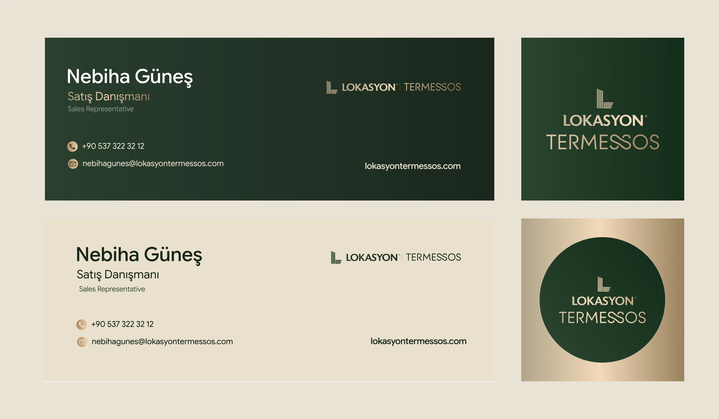
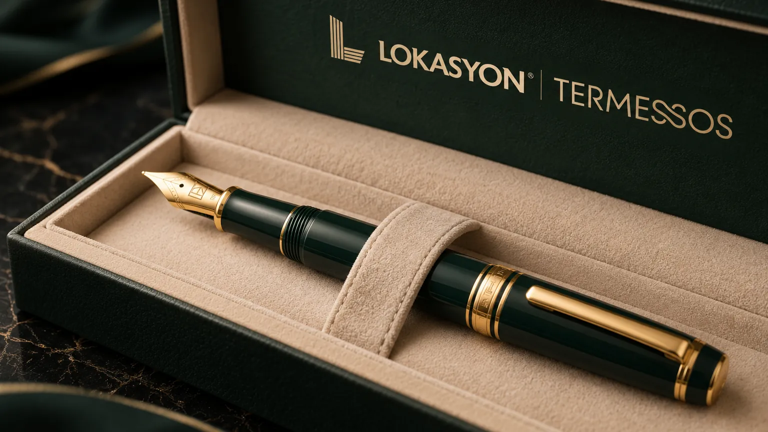
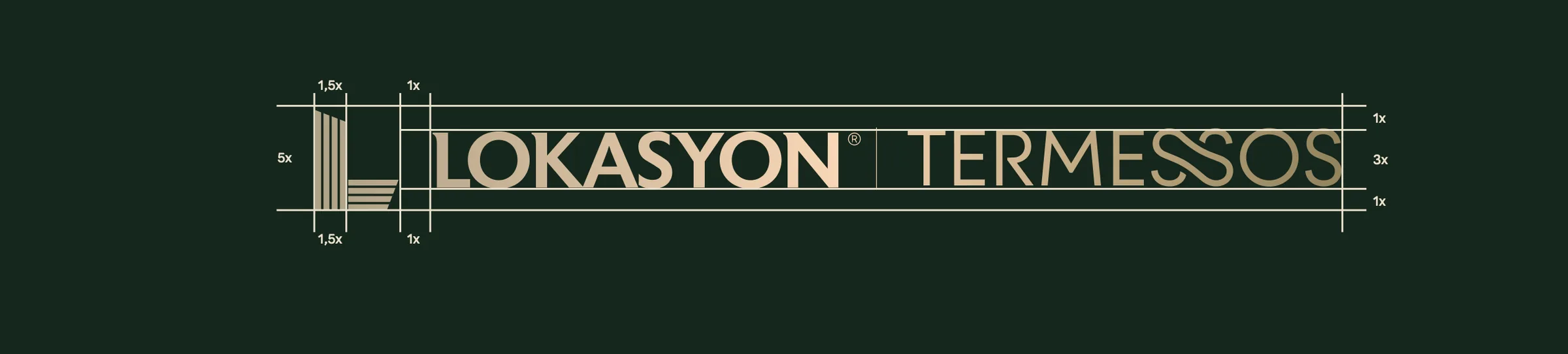
The guidelines define the logo’s anatomy, clear space and minimum sizes, and correct and incorrect use, and cover 15 applications — business cards, letterhead, envelopes and folders, ID badges, staff wear and merchandise, through to e-mail signatures and social media avatars. The highlights are below.
I led the project as art director and graphic designer at Salus Medya.
Applications
08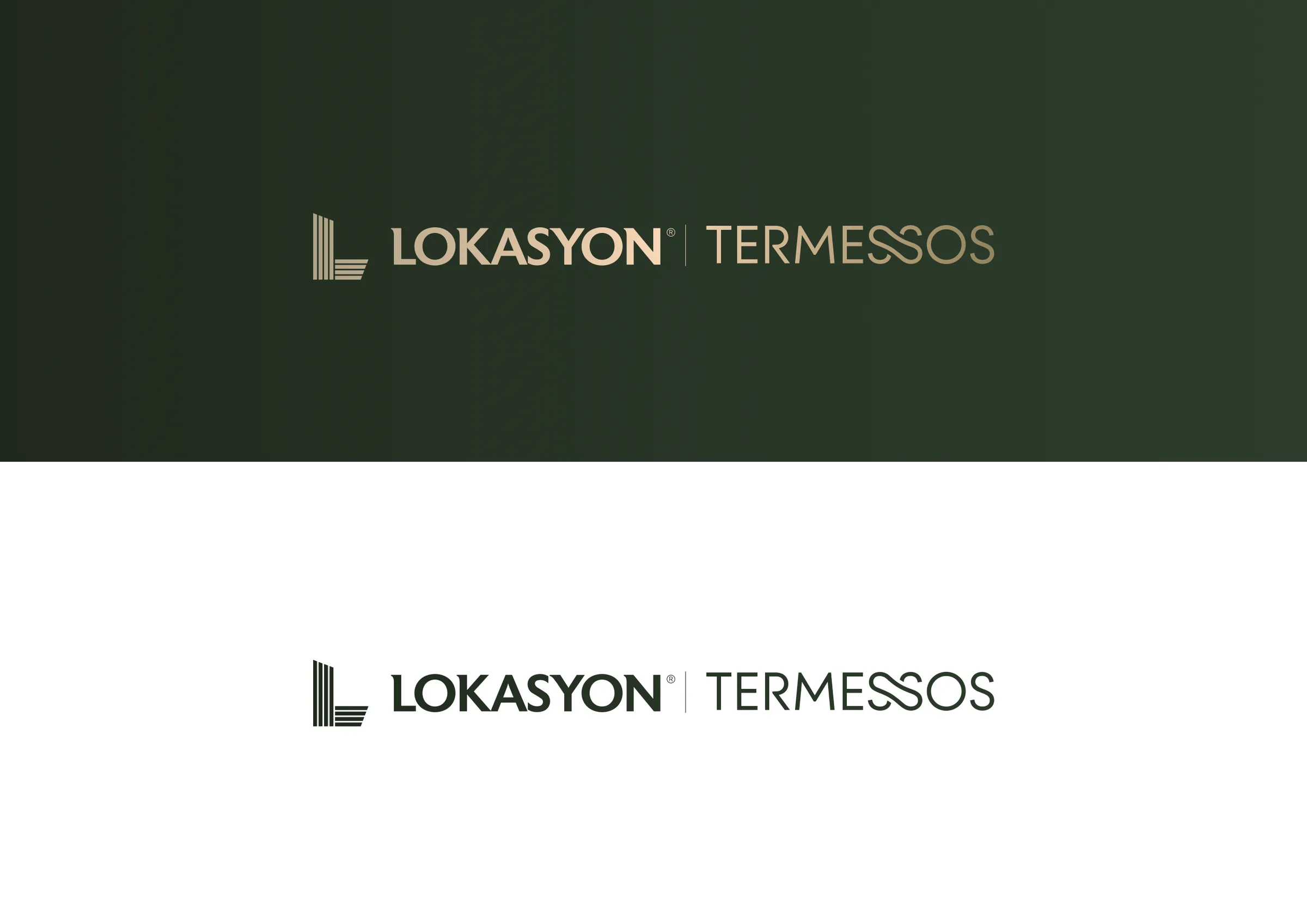
Colour palette
- Termessos GreenGradient
- Middle Green#2B4530
- Architectural Green#162D1C
- Sandstone GoldGradient
- Bronze Stone#BCAA8C
- Travertine#EAE2D4