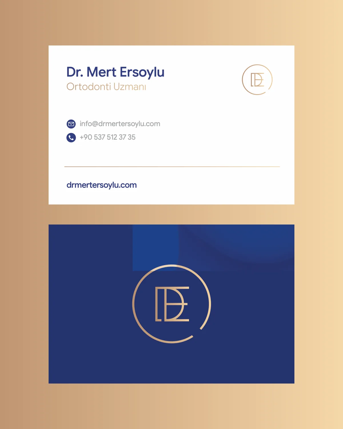
Dr. Mert Ersoylu Corporate Identity
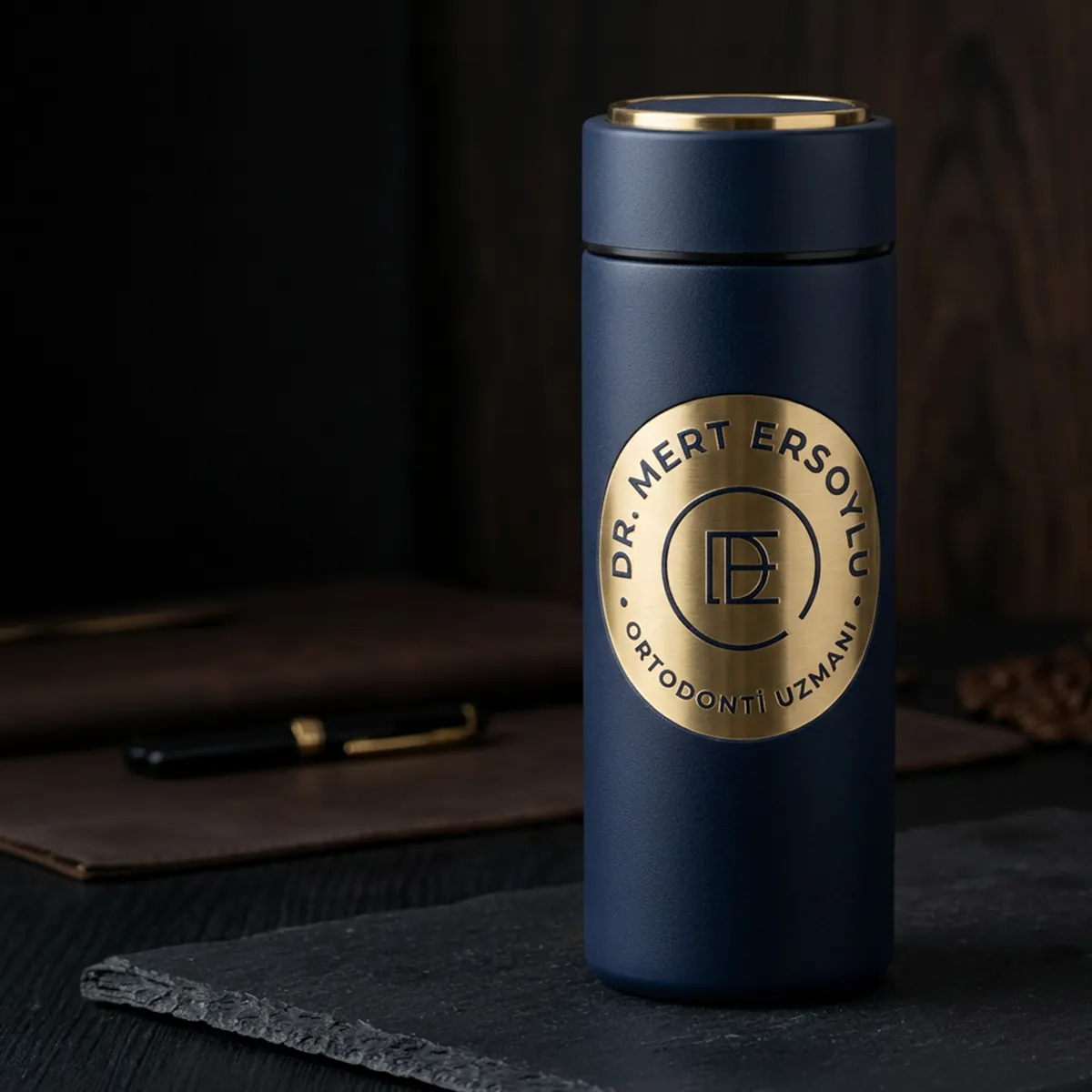
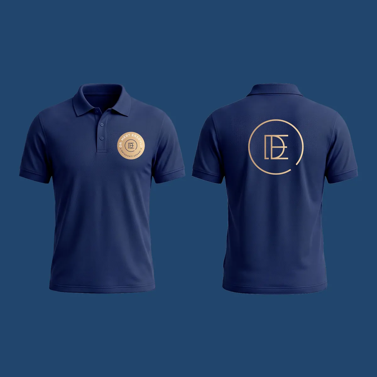
Corporate identity for orthodontist Dr. Mert Ersoylu — an ME monogram logo, a navy and gold colour system, and the clinic's print, uniform and digital applications.
Brief
Dr. Mert Ersoylu is an orthodontist. The brief was an identity that brings the engineering precision of orthodontics and the personal care given to each patient together in a single signature, and builds trust from the first moment of contact with the clinic.
Approach
The identity starts from one sentence: a balanced ME at the centre of the smile.
- Open ring: the logo’s circular form stands for the completeness of a treatment and the ideal proportion in facial aesthetics. Its deliberately open end is the motif that recurs across the rest of the identity.
- ME monogram: the initials join in a single mark that stands for uninterrupted communication between specialist and patient, and for the balance between dental function and facial anatomy.
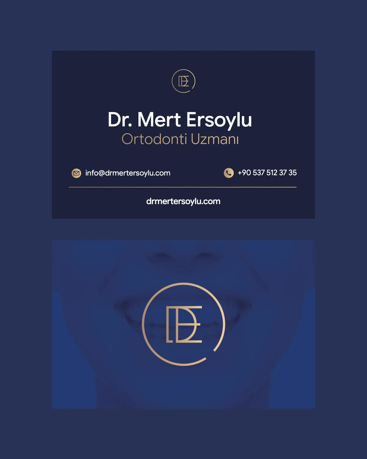
- Colour: navy speaks of trust, expertise and the calm a patient should feel in the chair; the warm gold of quality, care and a friendly patient experience.
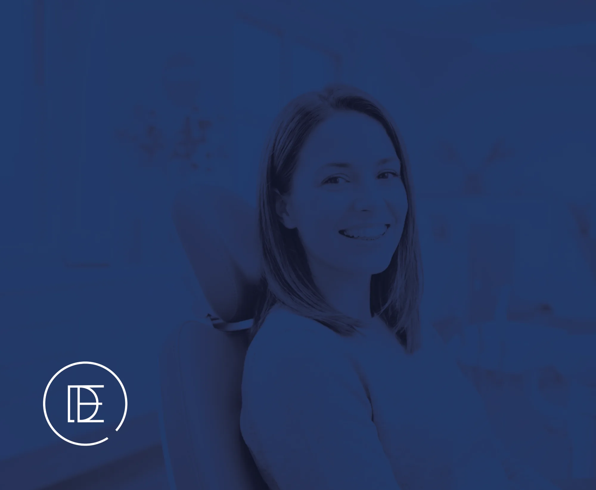
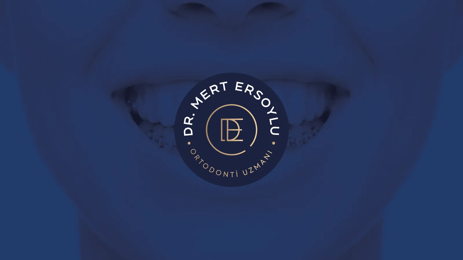
- Photography: smile photographs are turned into navy duotones and sit behind the logo, with the seal right at the centre of the smile.
- Typography: the Conneqt family, which reflects the precision of alignment, in Heavy, Regular and Book.
Applications
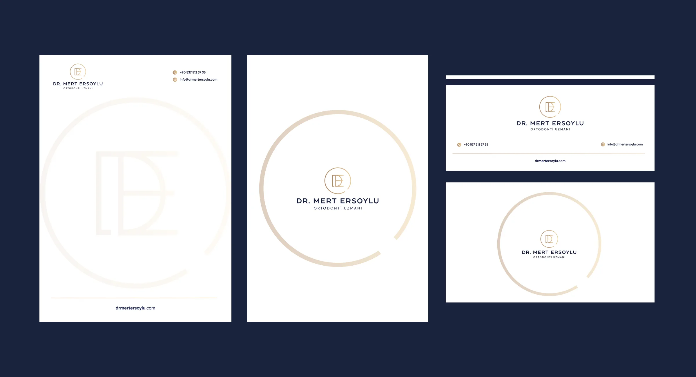
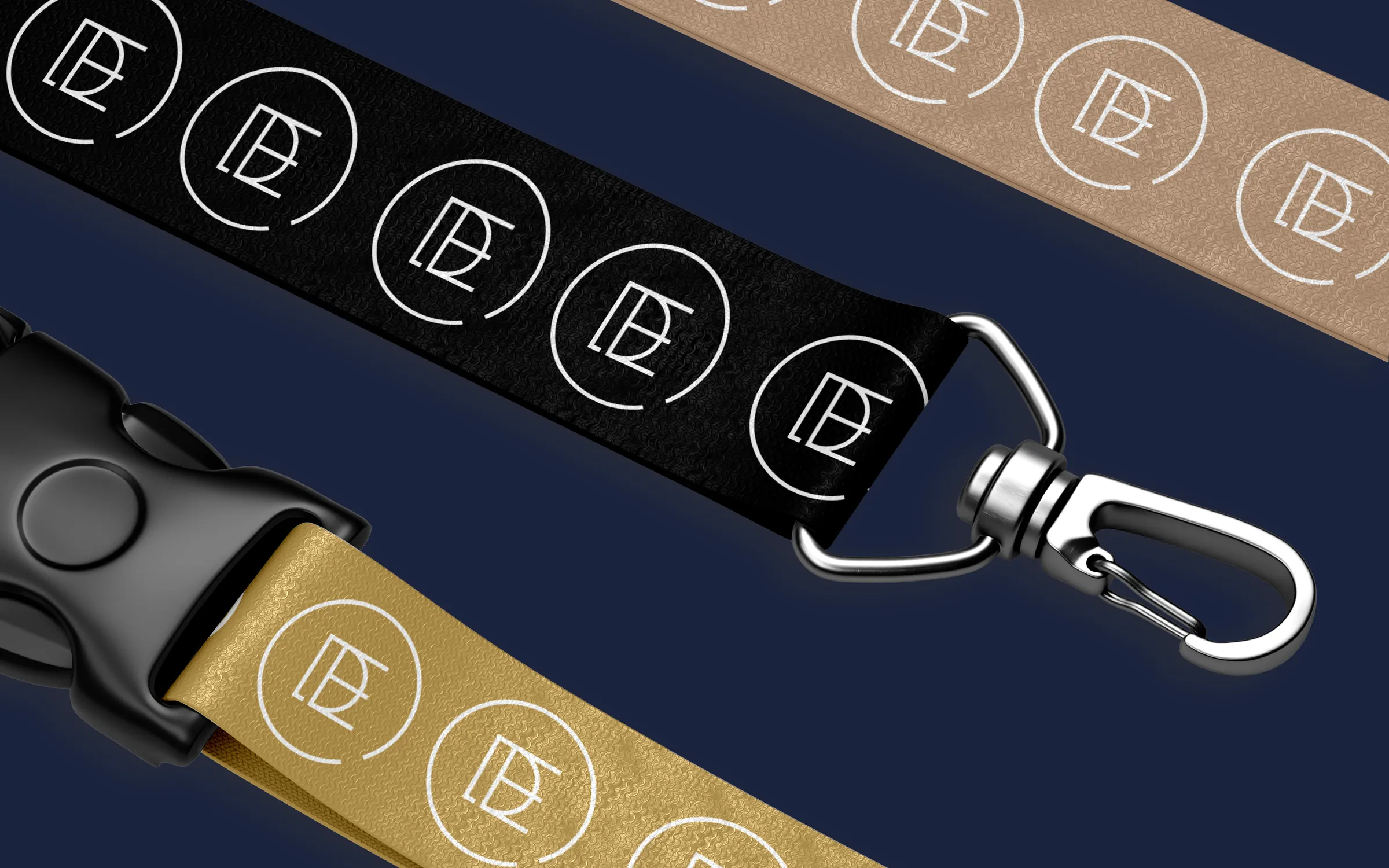
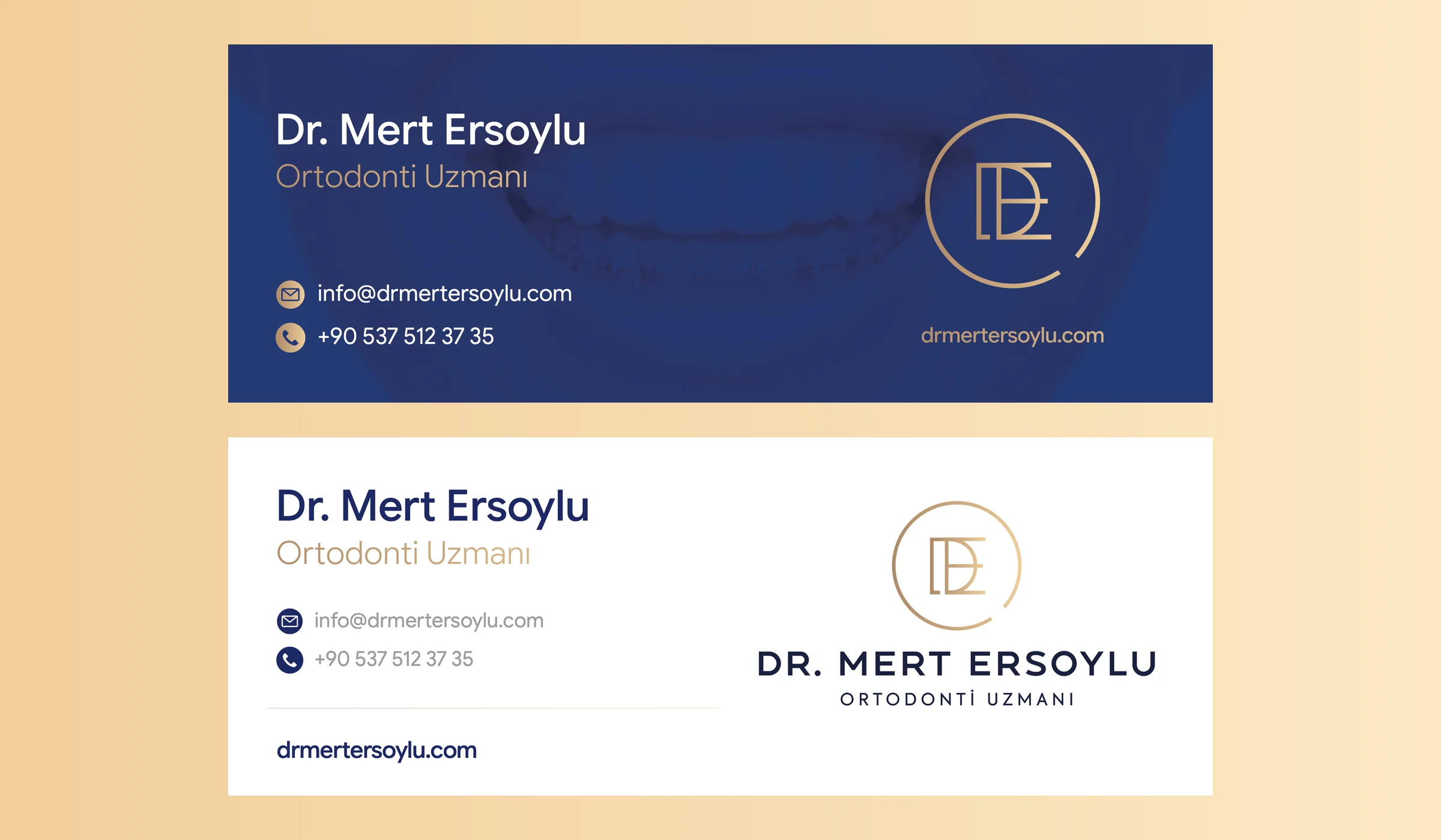
The guidelines define logo use, clear space, use on different grounds and over photography, and cover more than 15 applications, including stationery, ID badges and lanyards, clinic wear, merchandise, e-mail signatures and social media profiles. The highlights are below.
I led the project as art director and graphic designer at Salus Medya.
Applications
09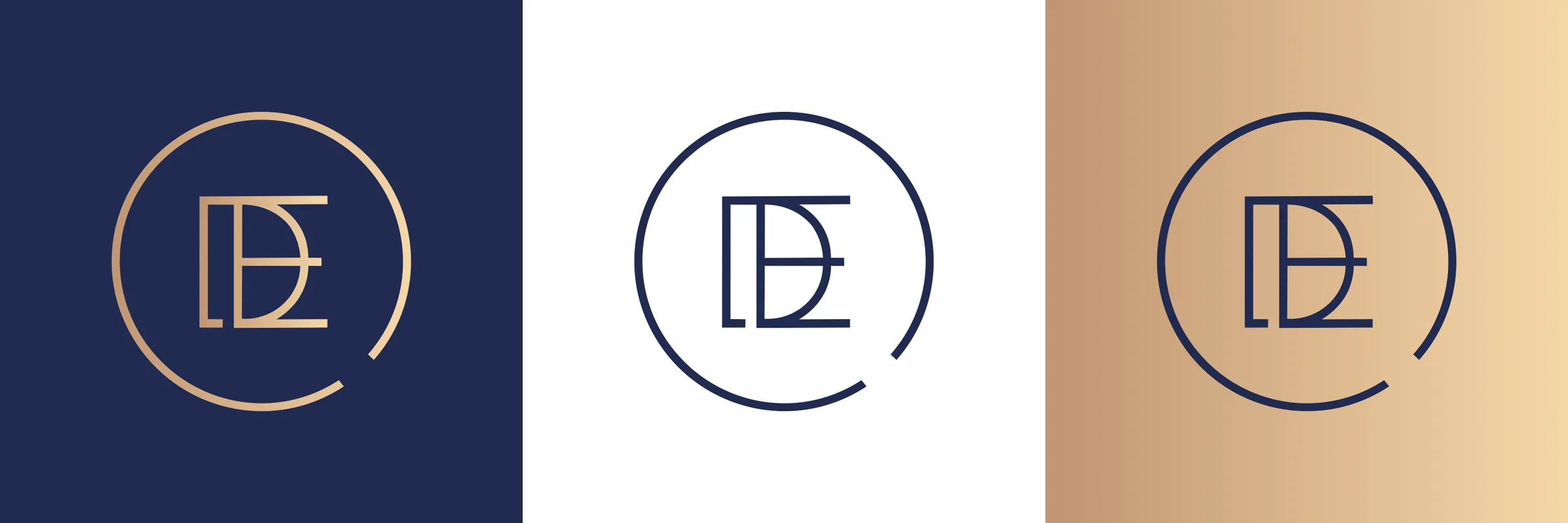
Colour palette
- Darkened Blue#1A233E · Pantone 276 C
- Middle Blue#283254 · Pantone 275 C
- Open Blue#21456D · Pantone 2746 C
- Beige Gradient#C09672 → #F5D7A8
- Open Beige#F2CE9C → #FBE8C3