Logofolio 2022–2025
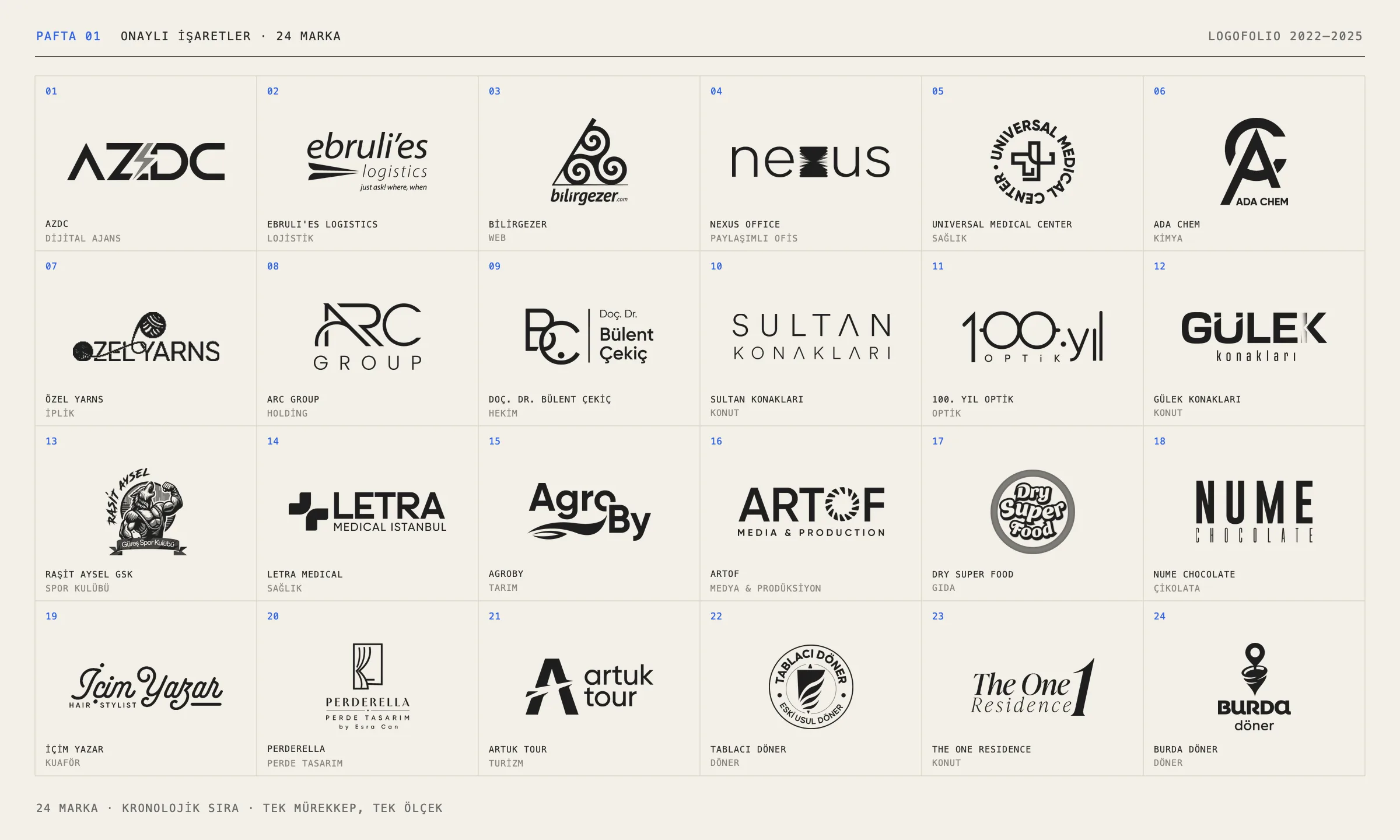
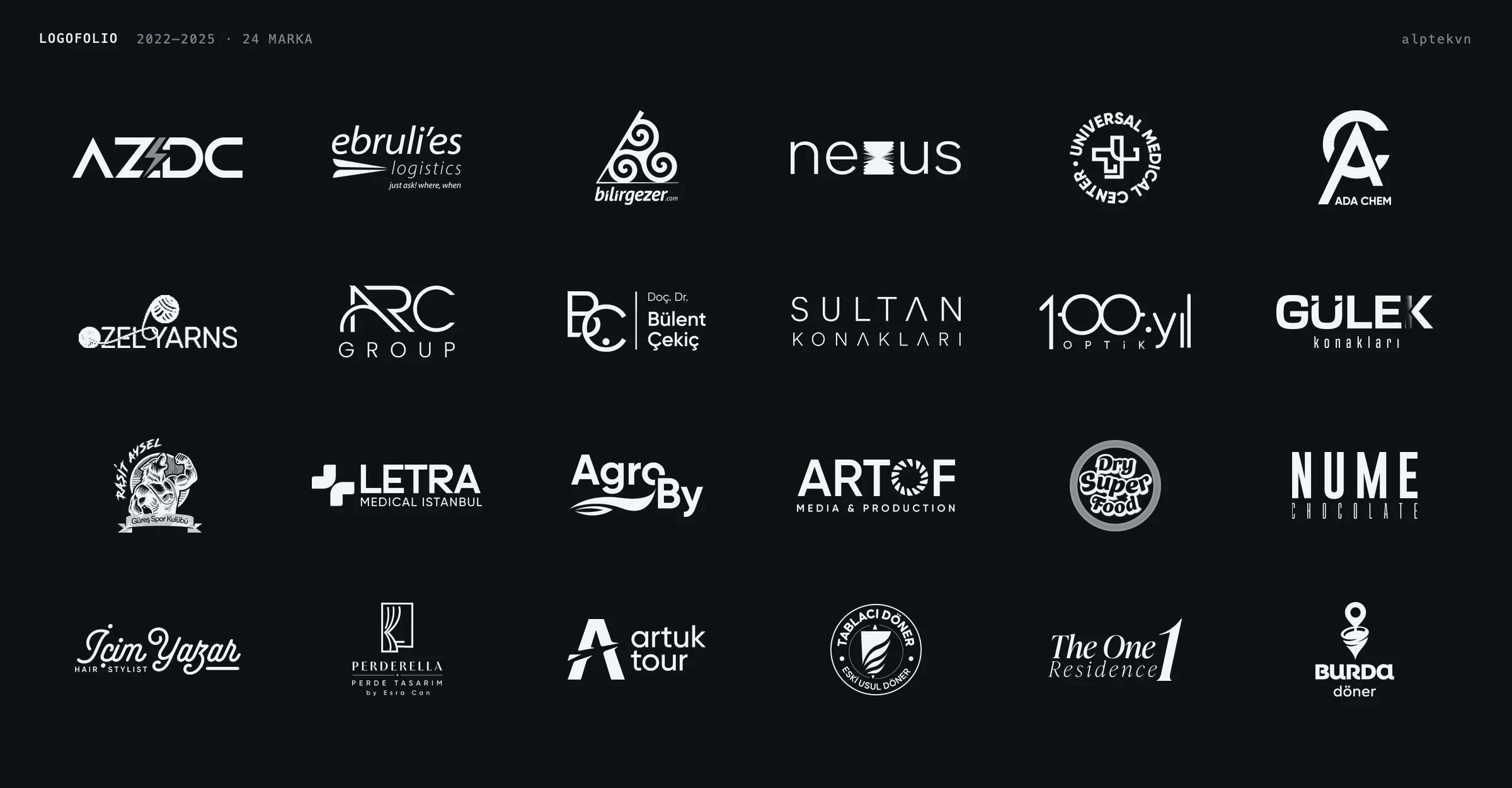
24 logos I designed between 2022 and 2025, laid out as sheets in a drawing set: sketches, presented directions, a brand family, ground tests, details and the final marks.
Brief
A selection of logos I designed between 2022 and 2025: 24 brands, from optics to chemicals, healthcare to agriculture, residential projects to döner restaurants. Some were drawn in-house at agencies, others freelance.
The page shows more than the finished logos; it also follows the path a logo takes. The images are numbered sheets, as in a drawing set: first every mark, then sketch, search, system, detail and delivery.
Stages
01 · Sheet
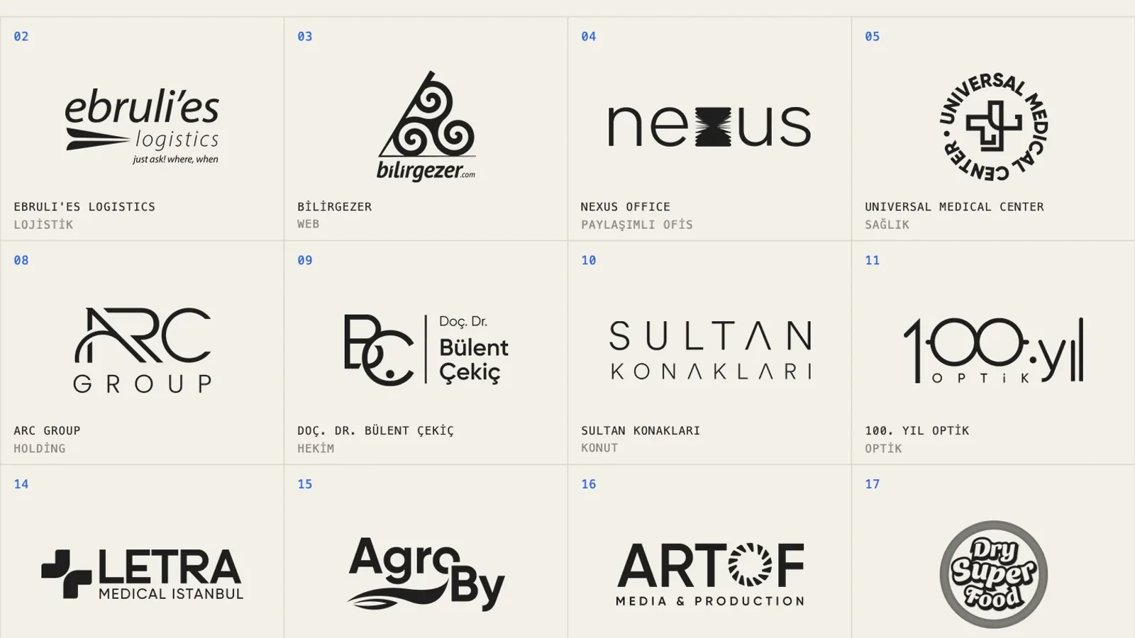
Form first, colour later. All 24 marks sit side by side in the same ink and at the same visual weight. Wide wordmarks and compact emblems are scaled by the area they cover, so none of them overpowers the rest. The order is chronological, by the date of the source files.
02 · Sketch
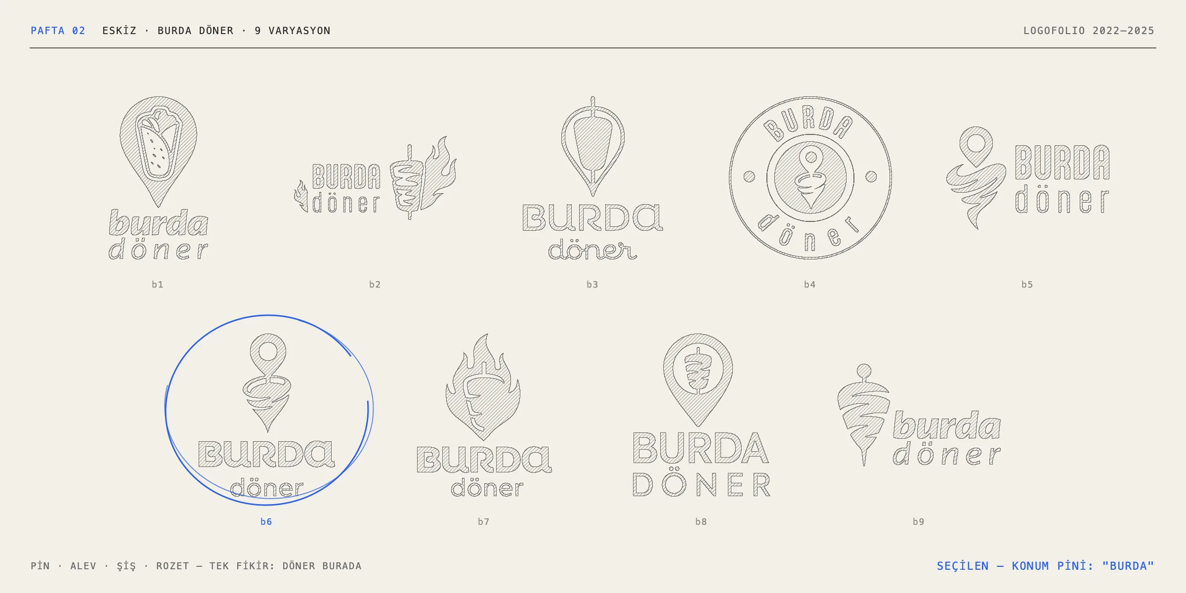
For Burda Döner I drew nine variations: a location pin, flames, a döner skewer and a round badge. All of them circle one idea: the döner is here. In Turkish, “burda” means “here”, and the chosen location pin turns the brand’s name directly into a mark.
03 · Search
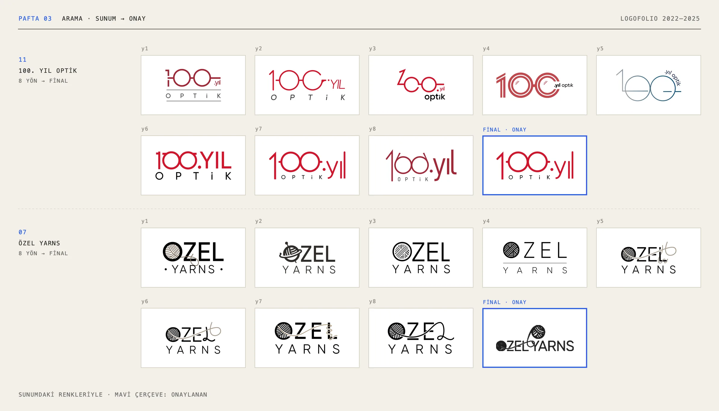
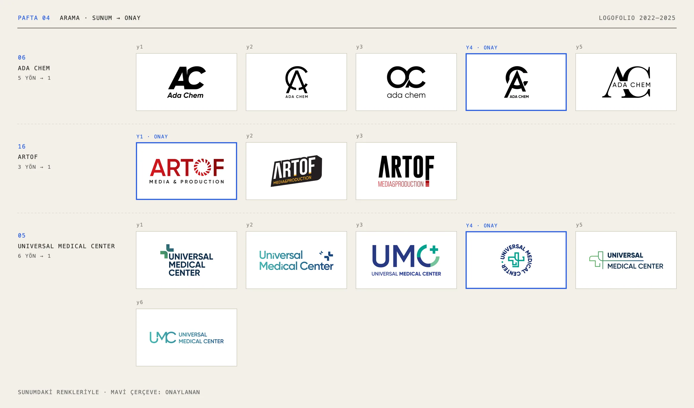
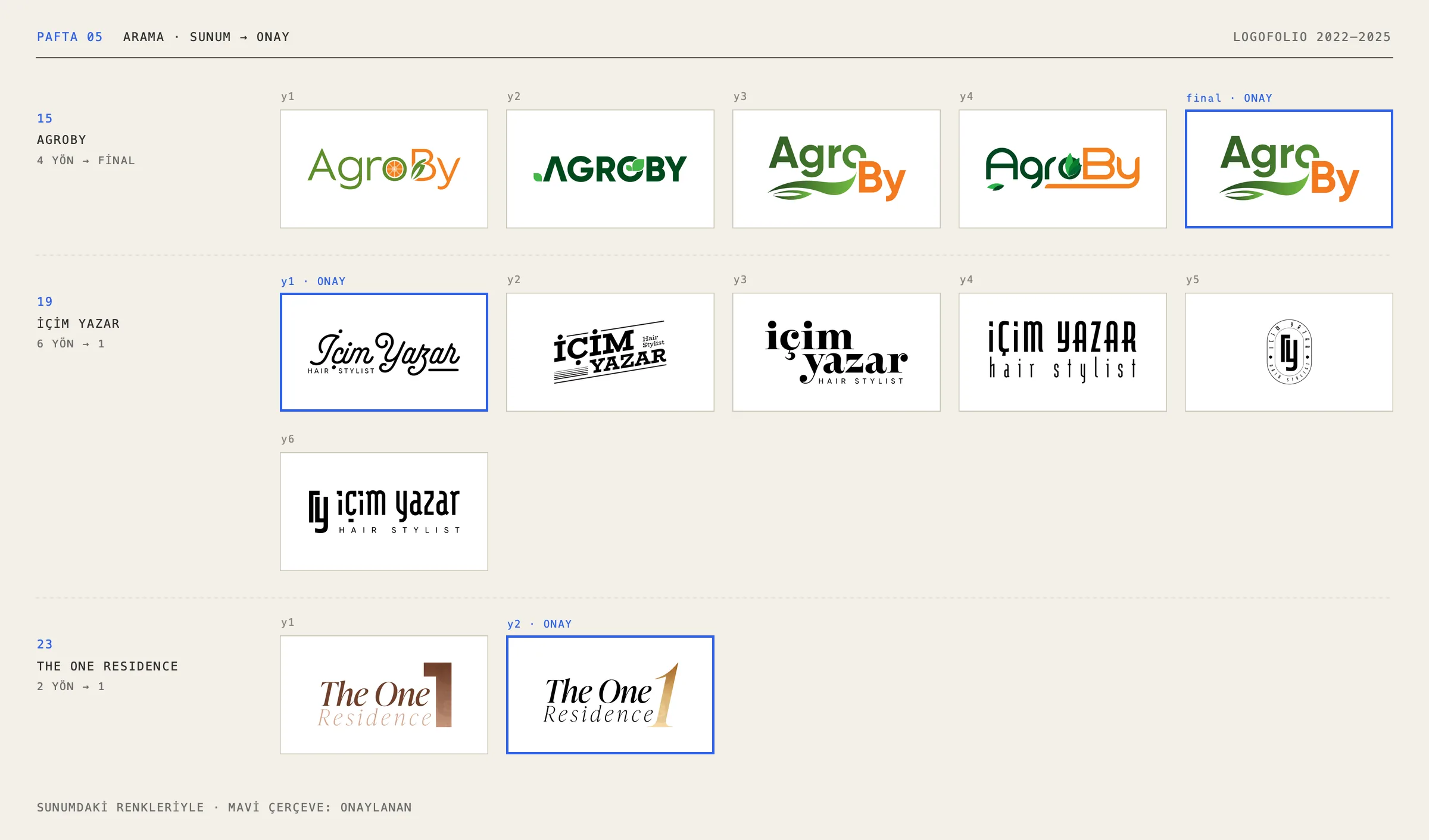
42 directions from the presentations of eight brands, in the colours they were shown to the client. A blue frame marks the approved one. For some brands the approved direction kept developing after the presentation; for 100. Yıl Optik, Özel Yarns and AgroBy, the last card shows the final.
04 · System
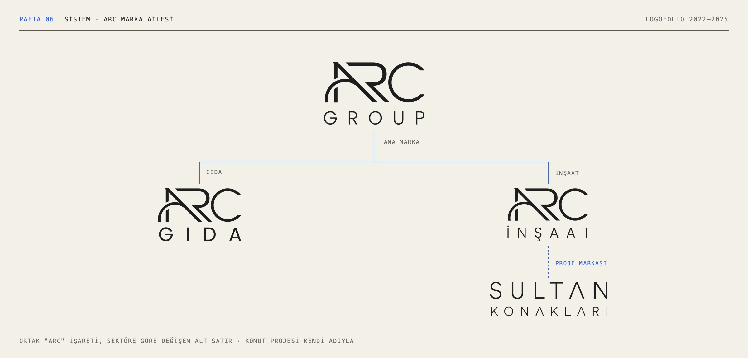
Sometimes a logo works not on its own but as part of a family. At ARC the shared mark stays fixed while the line beneath changes with the sector: Group, Gıda (food), İnşaat (construction). The residential project Sultan Konakları carries its own name and is used alongside the construction brand.
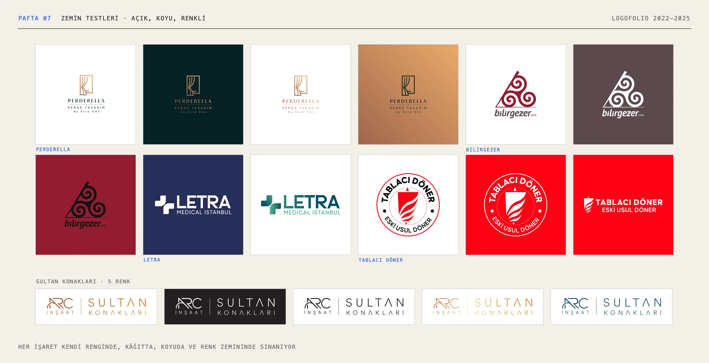
In the ground tests each mark is tried on white, on dark and in its own colour: Perderella, Bilirgezer, Letra, Tablacı Döner, and five colour versions of Sultan Konakları.
05 · Detail
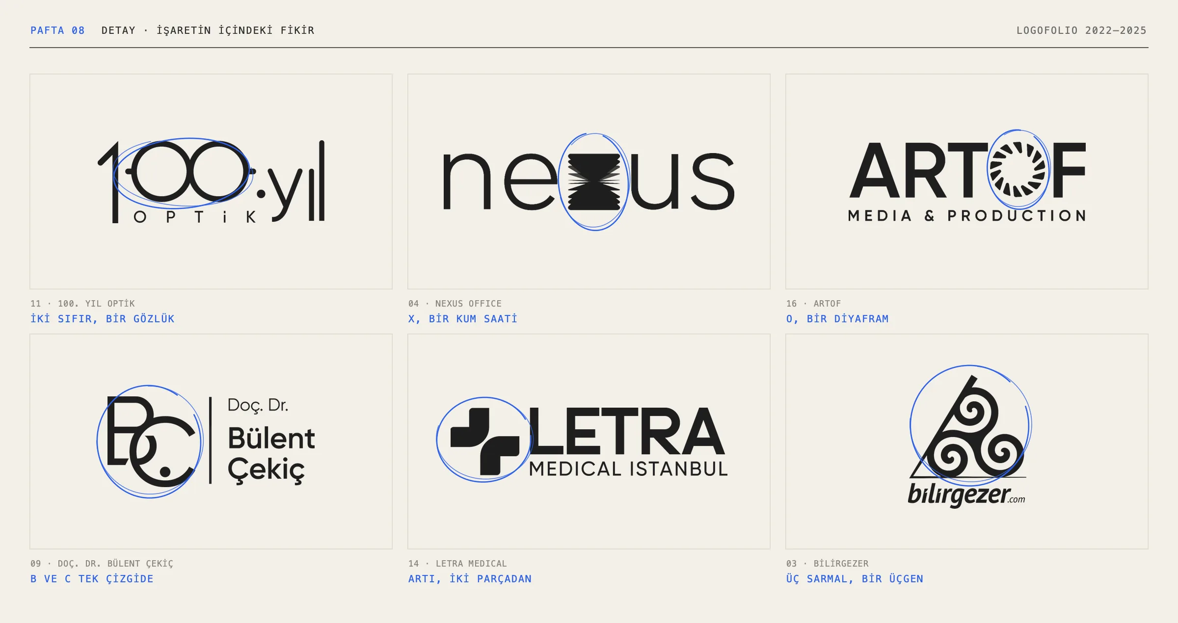
A good mark usually holds a single idea:
- In 100. Yıl Optik, the two zeros become a pair of glasses.
- In Nexus, the x is an hourglass.
- In Artof, the o is a camera aperture.
- For Bülent Çekiç, B and C join in a single line.
- Letra’s plus is built from two pieces.
- In Bilirgezer, three spirals sit inside a triangle.
06 · Delivery
The same 24 marks, this time in white on dark.
In numbers
24 brands · 9 sketches · 42 presented directions · 2022–2025
Applications
09