Esteform Nova Social Media Design
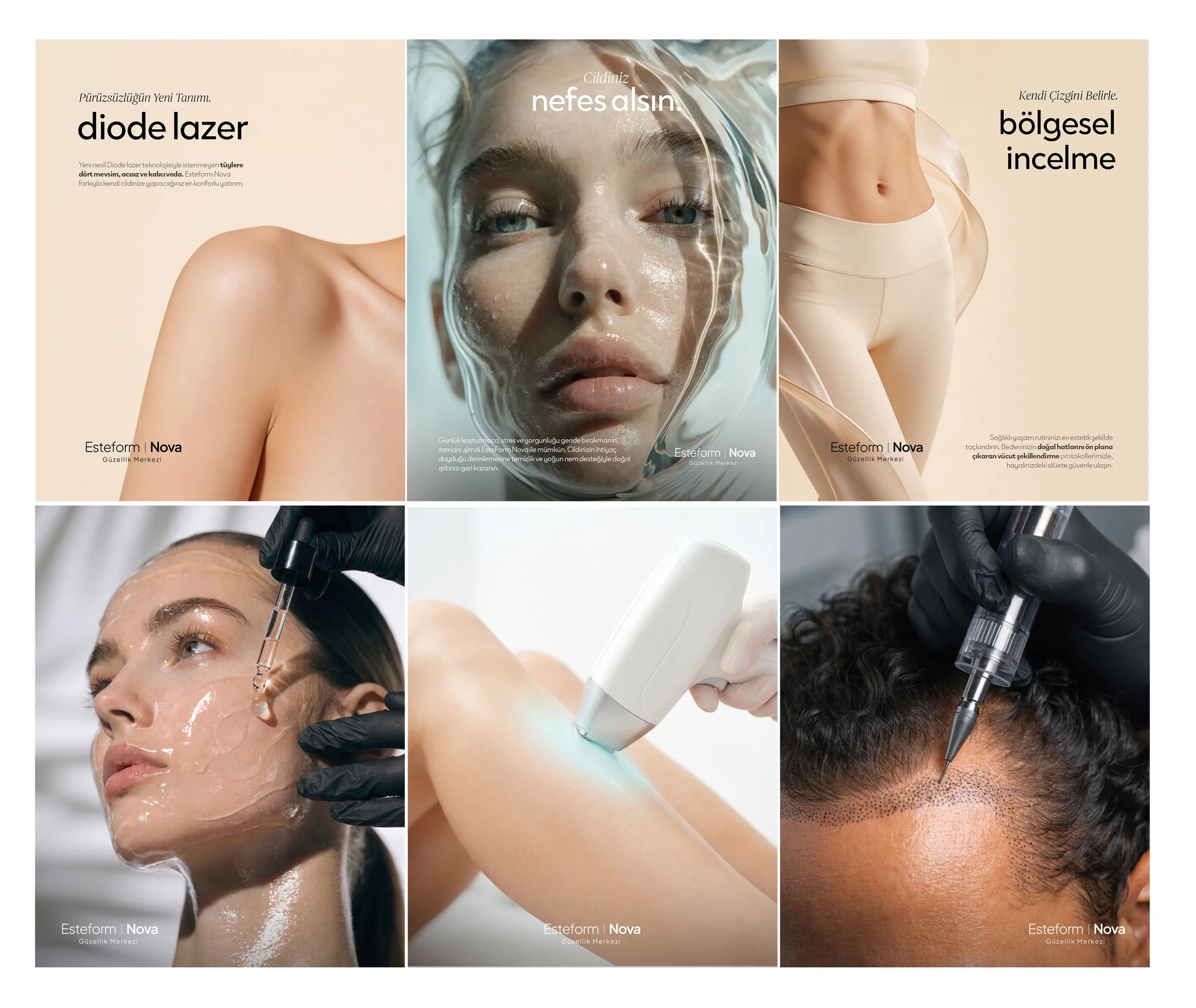
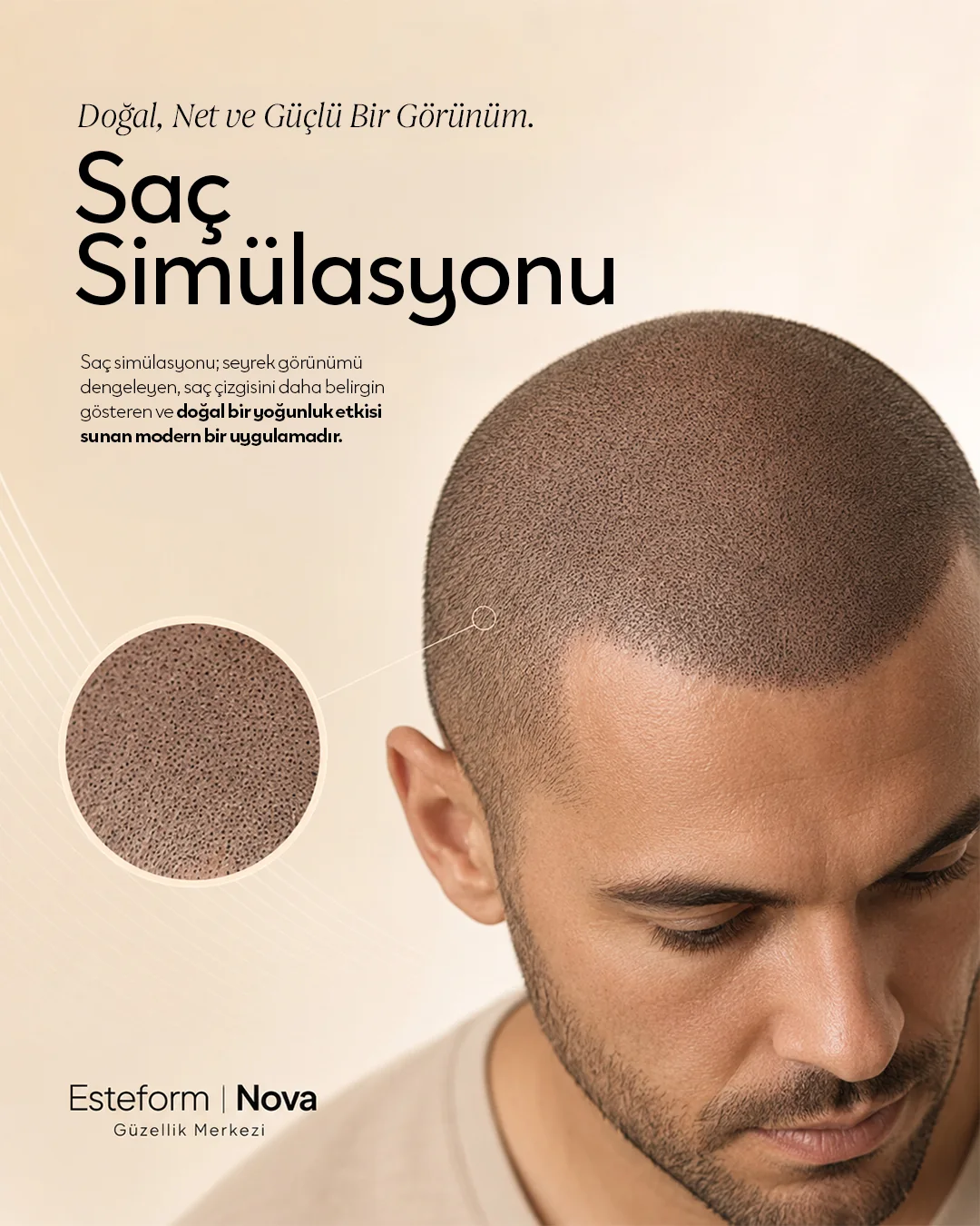
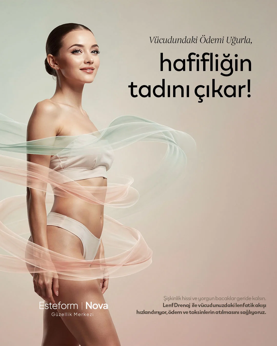
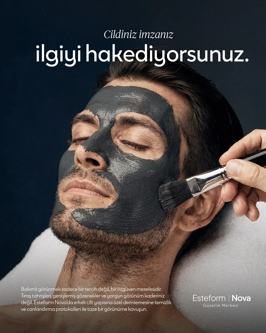
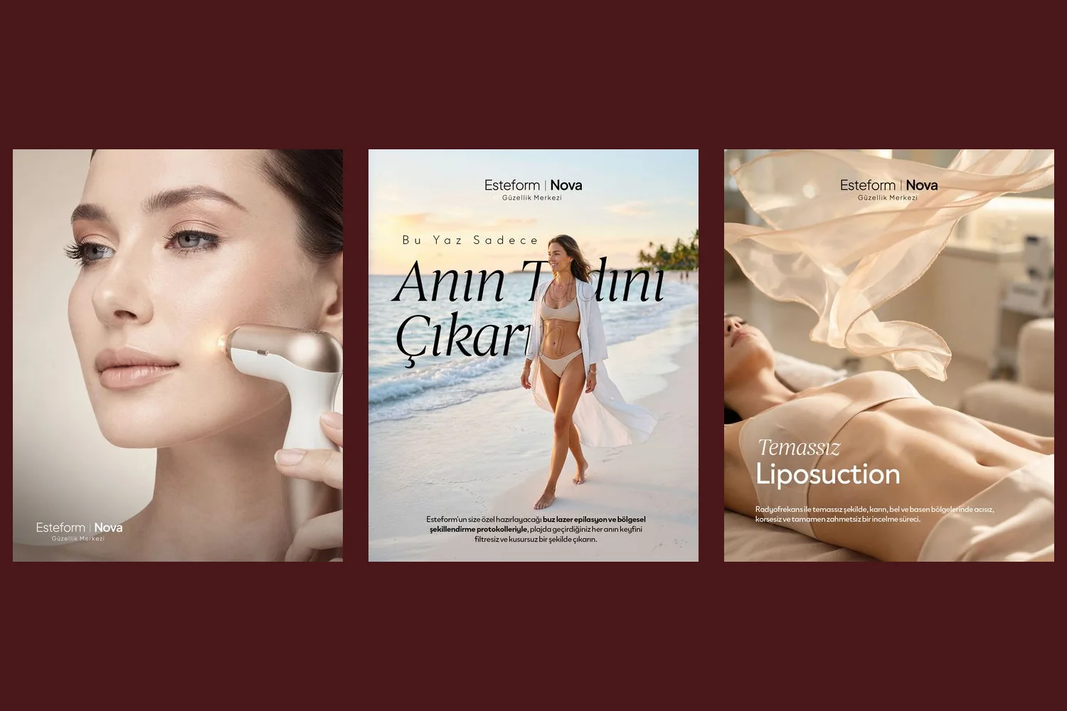
A soft, editorial Instagram language for Esteform Nova beauty centre: beige tones, close-up skin photography, quiet typography and seasonal series.
Brief
Esteform Nova is a beauty centre offering skincare, laser hair removal and body contouring treatments. The brief was a calm, reassuring and premium Instagram identity, moving away from the loud, crowded campaign language common in the sector.
Approach
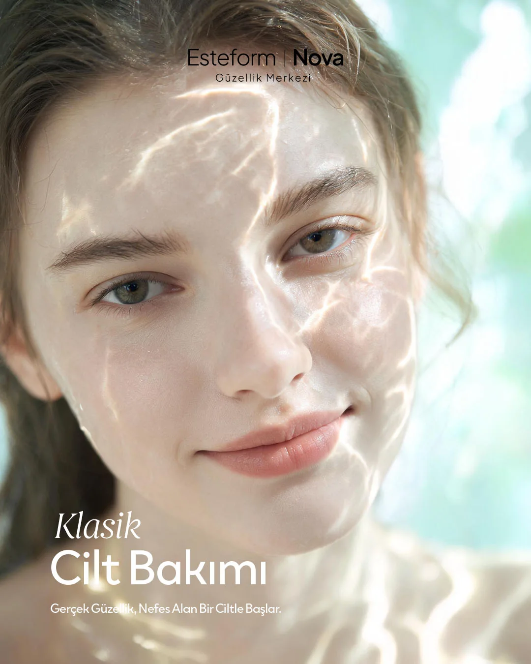
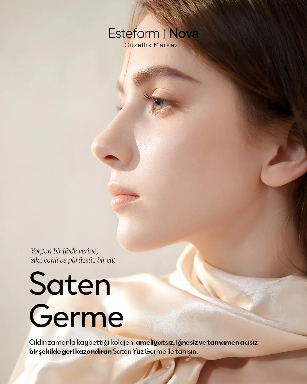
- Colour: beige, cream and skin tones; the whole feed comes from one warm palette, and the visual language stays on the skin itself.
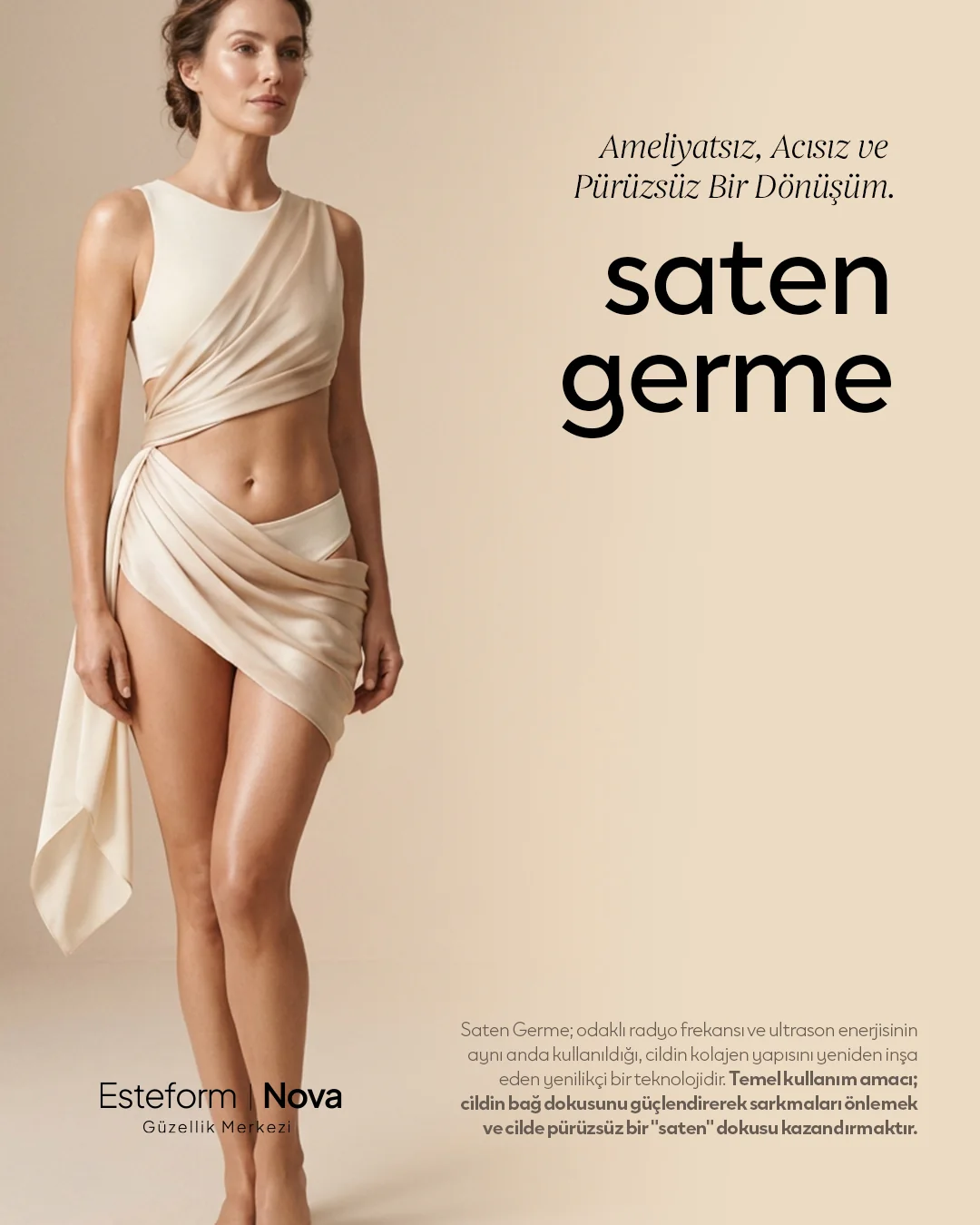
- Typography: a small italic serif kicker and a quiet lowercase headline: “diode lazer”, “bölgesel incelme”, “saten germe”. Little text, lots of space.
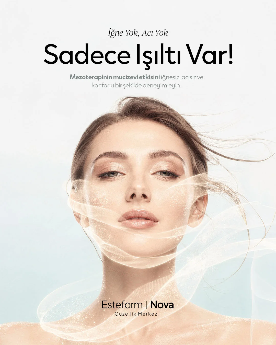
- Photography: soft-lit close-ups of skin; textures like water, light and satin fabric carry the feeling of each treatment.
- Planned as a grid: the profile opened with sets of six posts. In each set the typographic posts sit on the top row and the treatment photographs below, so the profile grid reads as a single composition.
Series
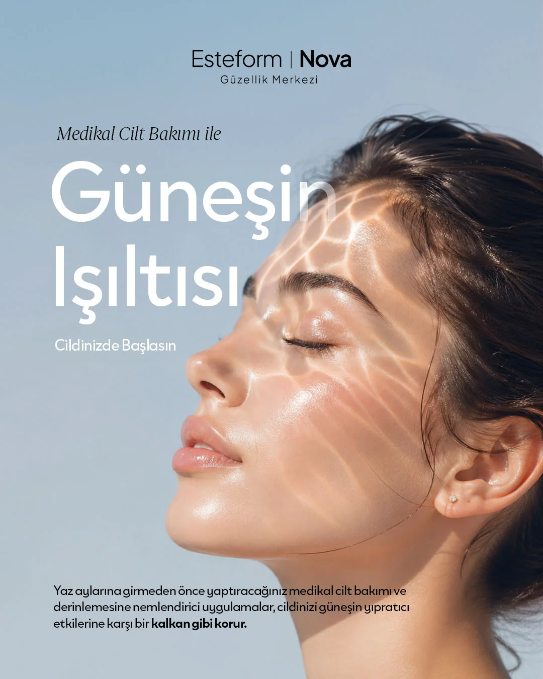
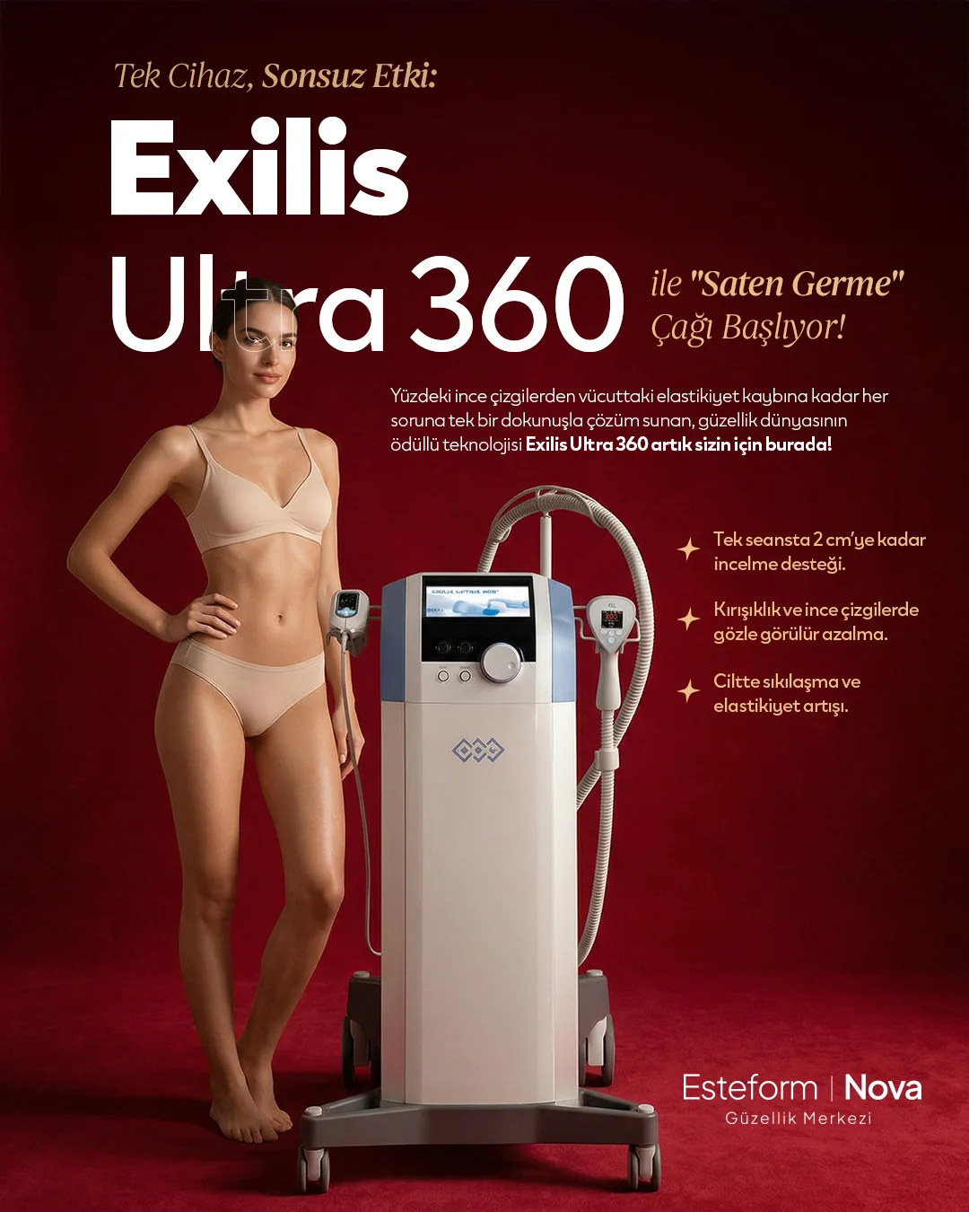
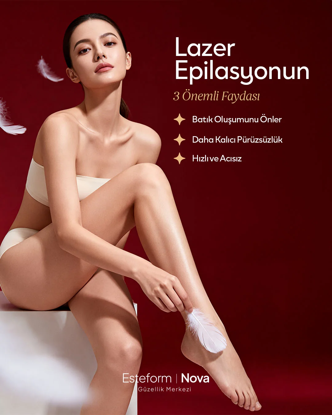
Alongside the main beige feed, seasonal series were produced. The pre-summer series focused on sun, glow and preparing the skin, while the red series built an accent language on deep red for device launches and featured treatments. Selected posts are below.
I led the project as art director and graphic designer at Salus Medya.
Applications
11